How we’re raising the bar for non-profit organizations and small businesses

One of our core values at Rock & Bloom is ‘make a difference’. One of the ways we’re making a difference is by offering pro bono branding services for non-profit organizations and small businesses that might not otherwise have the resources to work with us.

The Who

You might have heard of us, but for those who are new here, we’re a Canadian-based brand studio with a knack for creating beautiful, functional, and results-driven projects. We’ve been fortunate to make a career out of building relationships and creating killer brands for hundreds of clients across the globe. We do everything from new brand identities, to full-blown websites, to crafting game-changing campaigns.

The What

Meet Brand Aid.    

We created Brand Aid with the intention of helping a ‘Champion of Choice’ elevate their brand and tell their story through in-kind donated work. The brands that we choose align with our core values and respect the work that we do. 

Non-profit organizations and small businesses do a lot with a little. They do so much for our communities, and yet very often lack the budget to elevate their brand or even properly communicate their services and skills to potential donors, clients or customers. They might lack the resources needed to create a strong brand identity, build a fully-functional, and user-friendly website, or to tell their story in an effective and far-reaching way. And yet, these are the stories that need to be heard the most. 

Brand Aid’s mission is to give a megaphone to those storytellers; to create positive change within an organization, giving them new tools to grow and succeed. 

The Why 

“At the core of our business is to make an impact. We don’t just want to make things that are pretty – we want to affect change in a client’s business.”

 – Heather Adams, CEO of Rock & Bloom

Brand Aid supports organizations that share our values and vision. Together, we’re able to build a partnership built on empathy and creative collaboration, producing impactful results that would otherwise not be possible. 

Brand Aid is not only meaningful to the client, but also fills the cups of our team members who are passionate about the work they are doing.  

Our mission is to be the best brand studio to work with and work for. Upholding this mission involves continually communicating with our team, rating fulfillment after each project, and really listening to feedback to determine what projects we spend our time and resources on.

The Impact

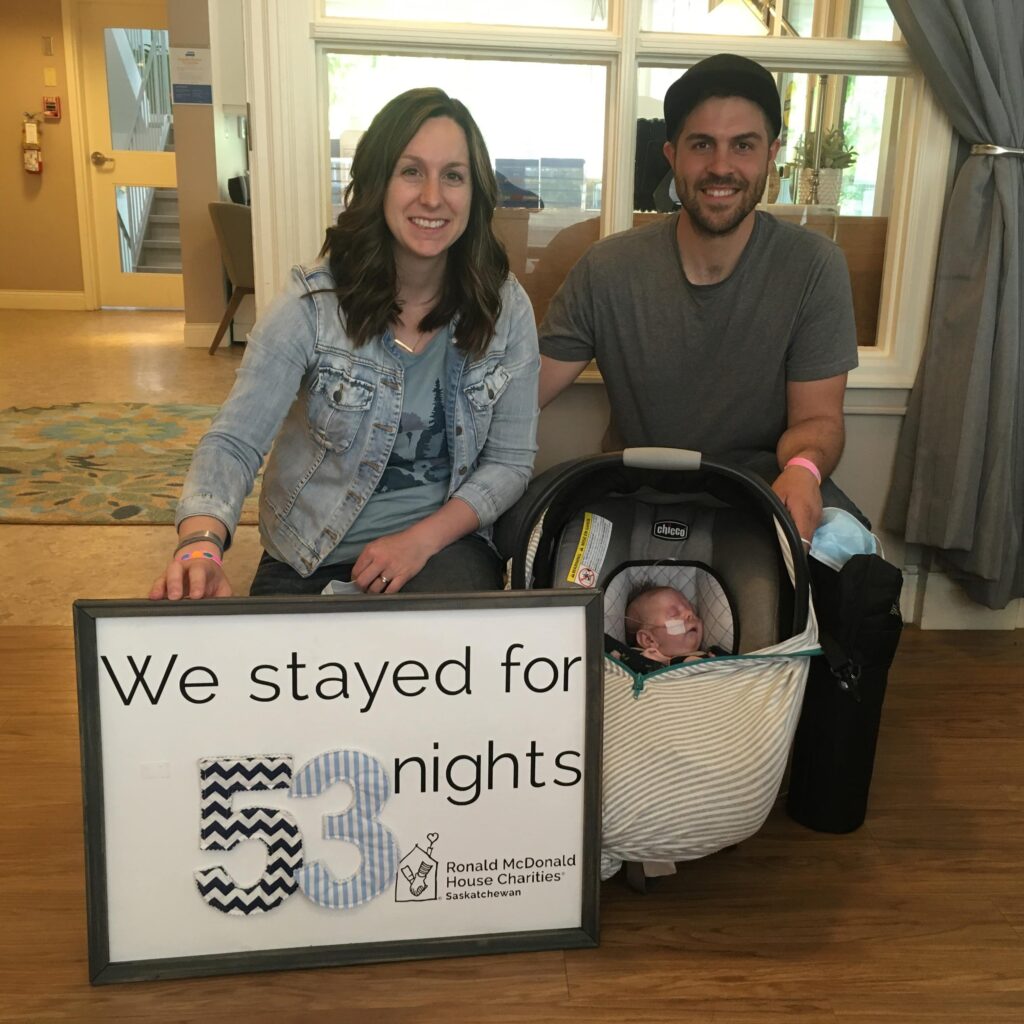
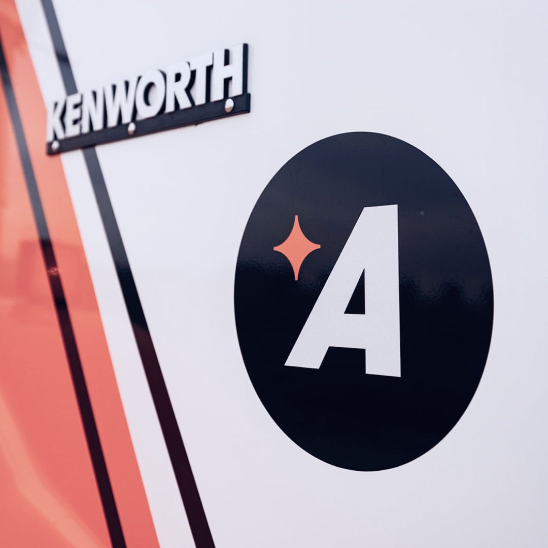
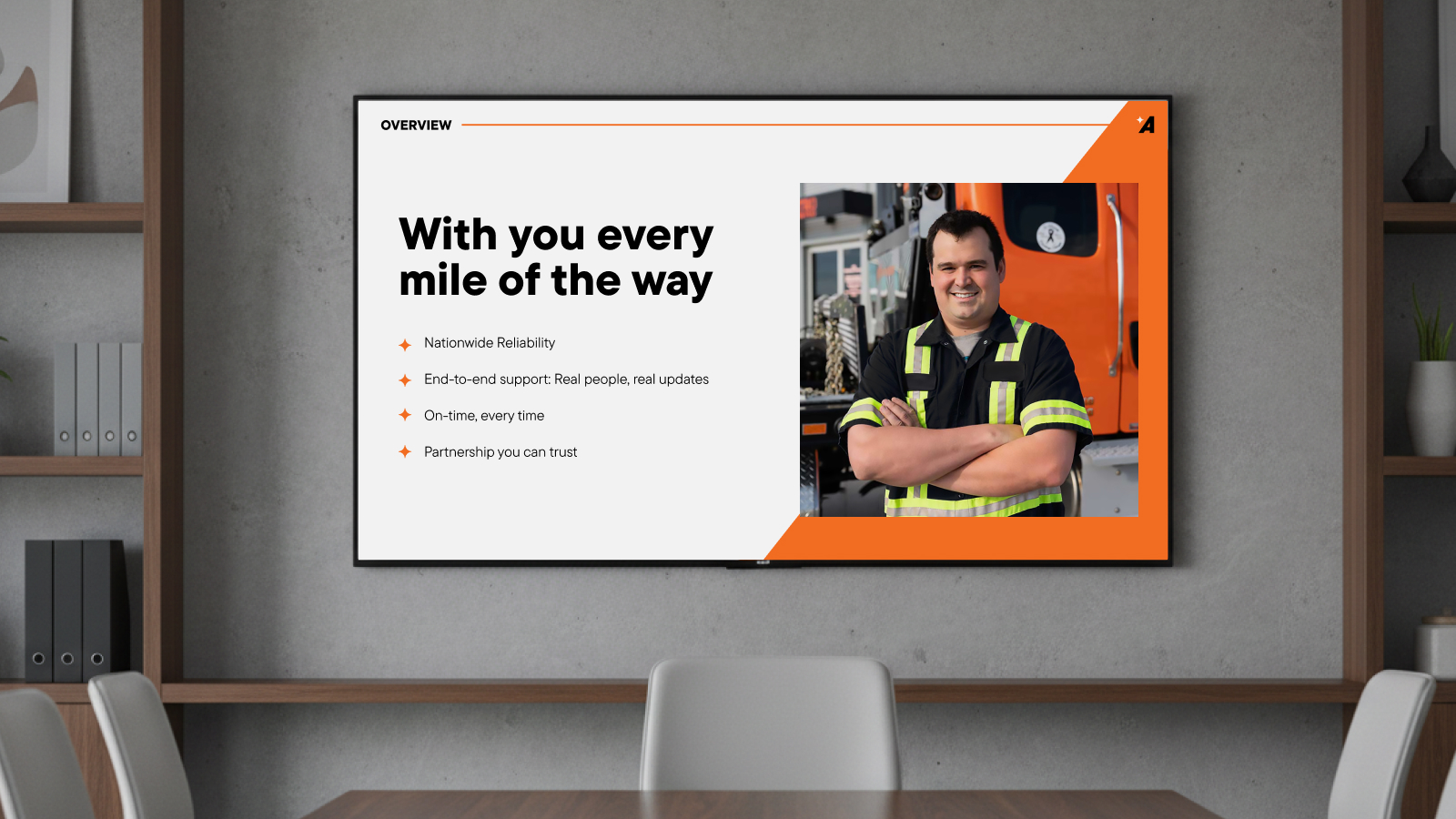
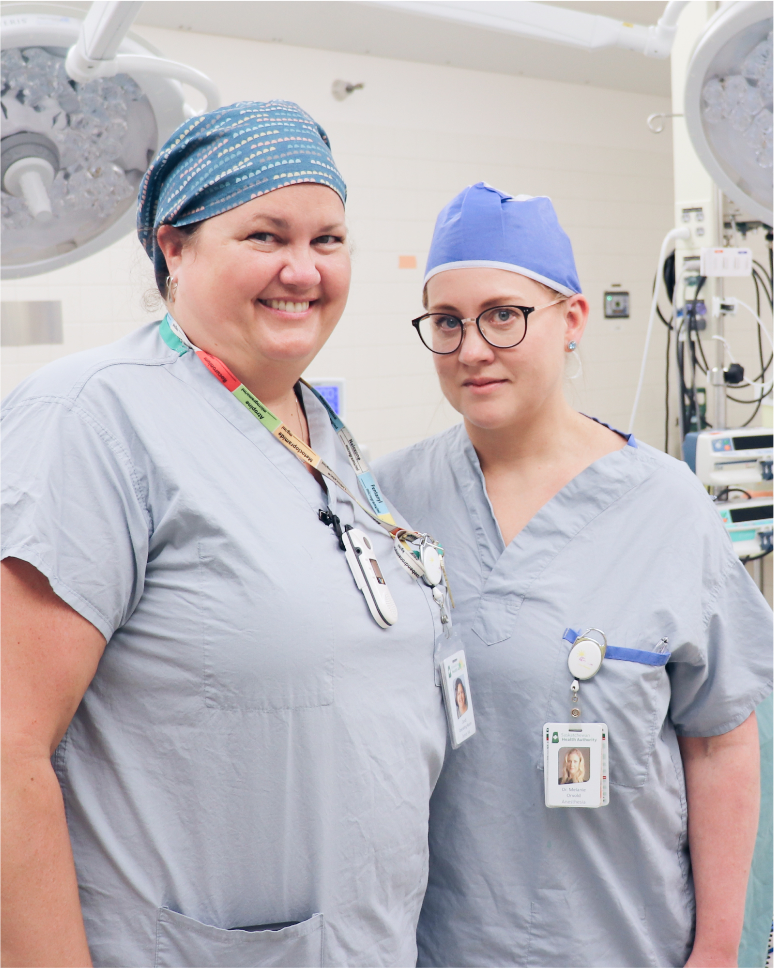
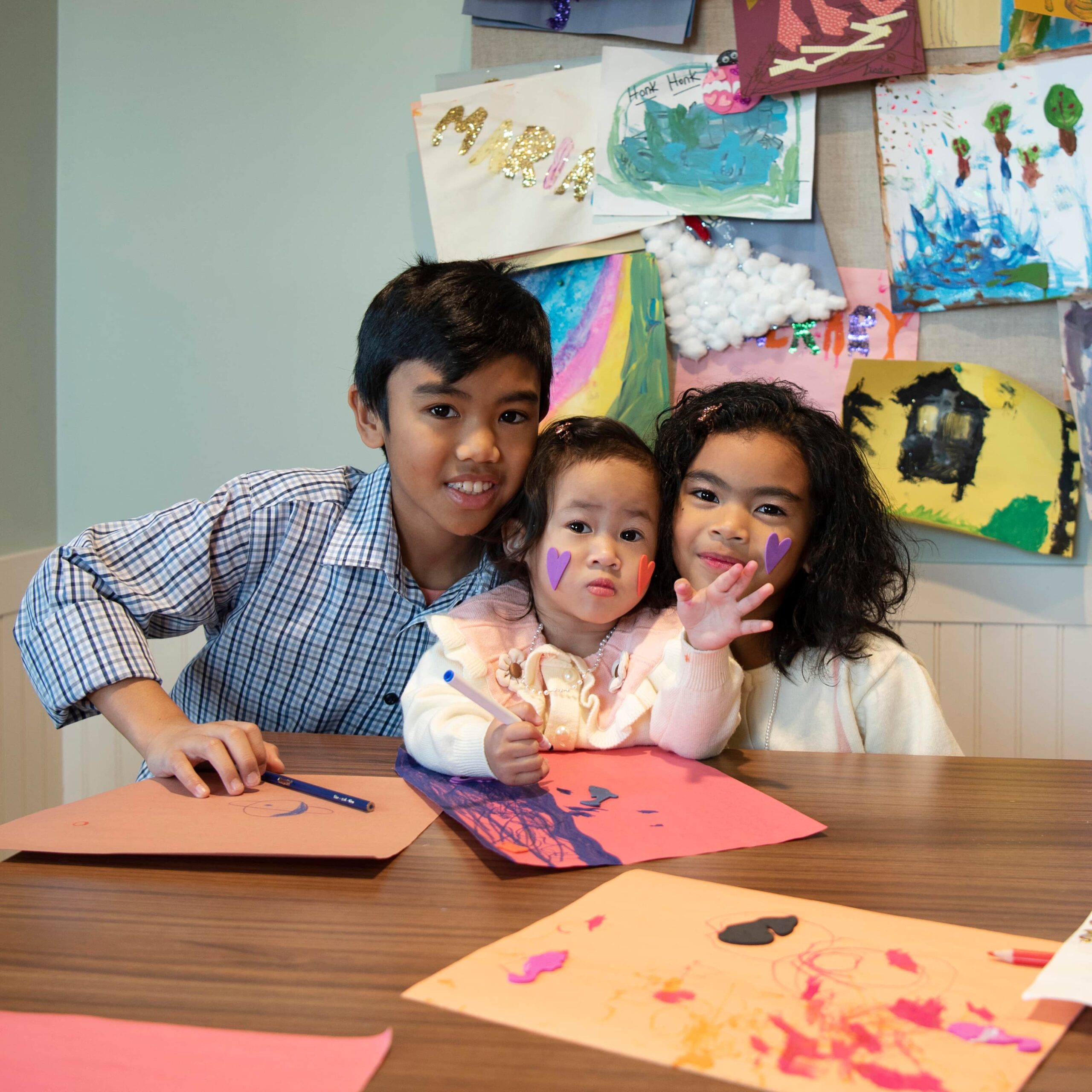
Our first Champion of Choice was Ronald McDonald House Charities Saskatchewan (RMHC-SK). This incredible organization offers a safe, secure, and nourishing environment  for families caring for their sick child receiving medical treatment in Saskatchewan.

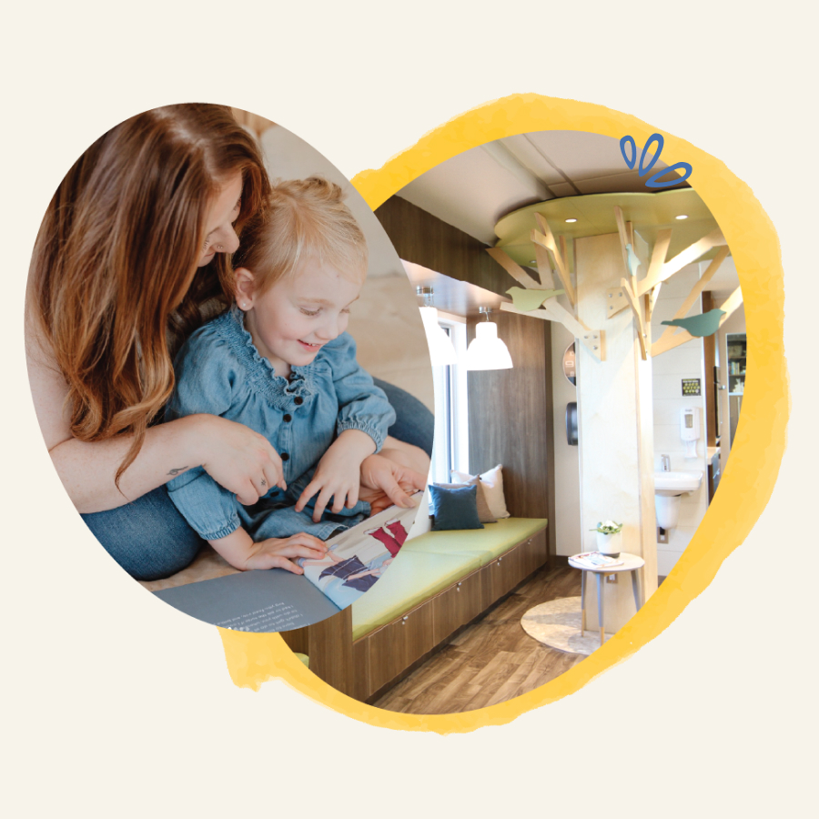
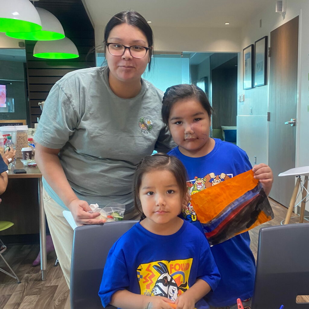
RMHC-SK keeps families together, during what is a stressful and challenging time. The work that they do and programs they provide,  positively impacts the health and wellbeing of the entire family.

“It’s so incredibly rewarding to be a part of a project that is vital to our community and will have a huge impact on families’ lives – even long after they’ve left the house.”

– Mellary Bitner, Designer. 

When it came to choosing RMHC-SK it was an easy decision. We’ve worked with them for years on smaller projects and have developed a collaborative partnership that always results in both teams feeling fulfilled. The work that they do is so impactful and we felt honoured to be able to partner with their team again to tell their story in a truly compelling way. 

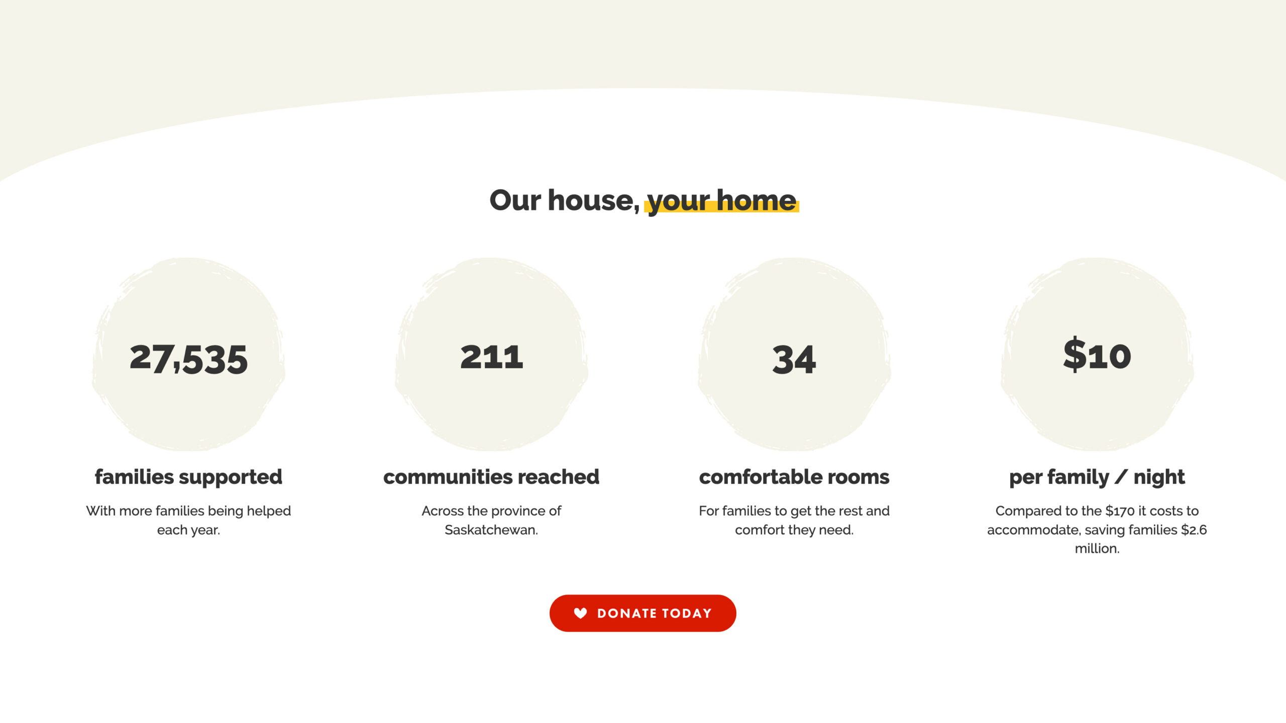
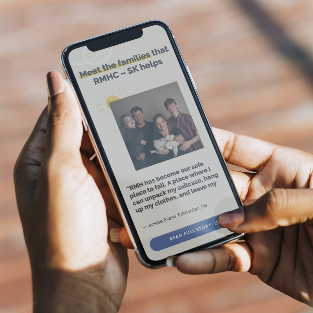
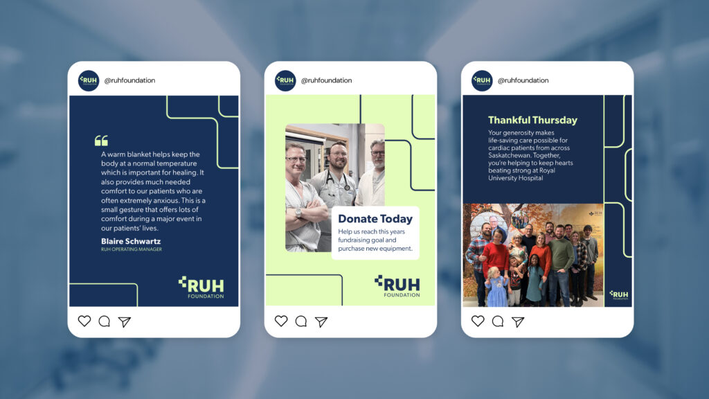
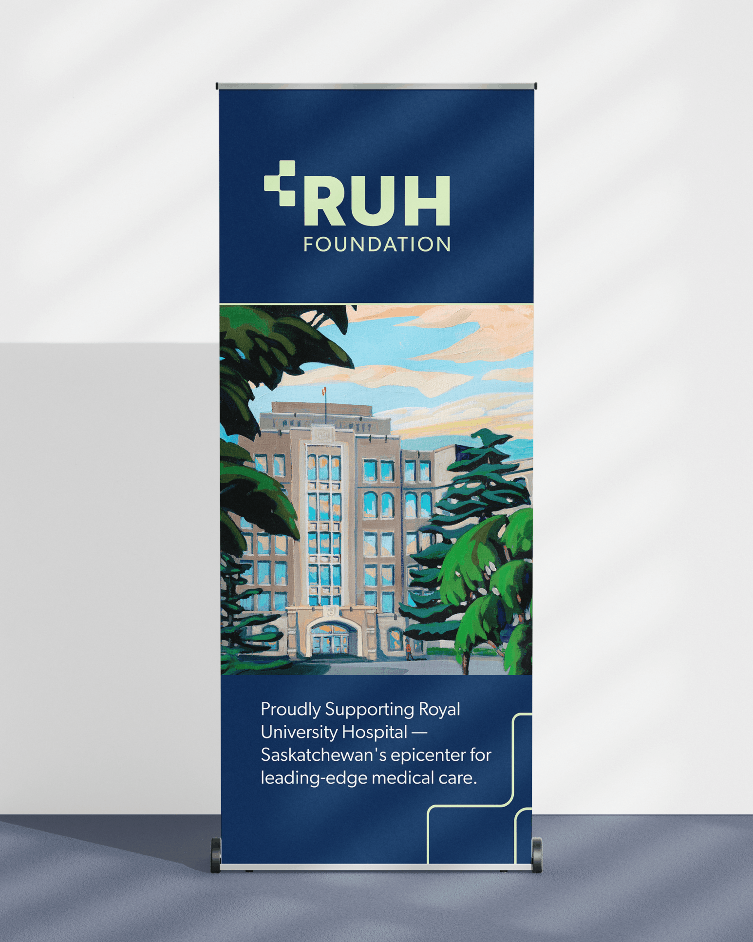
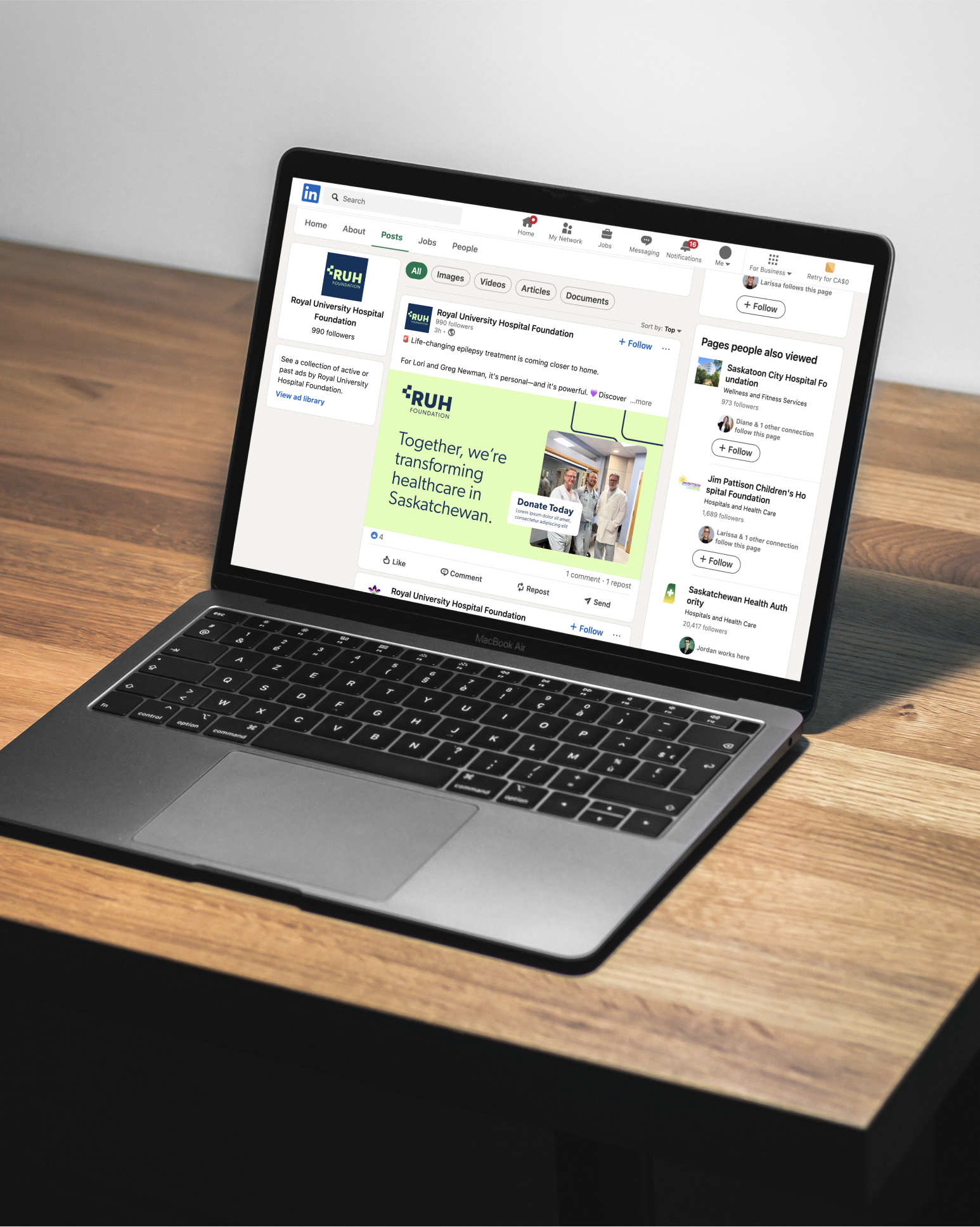
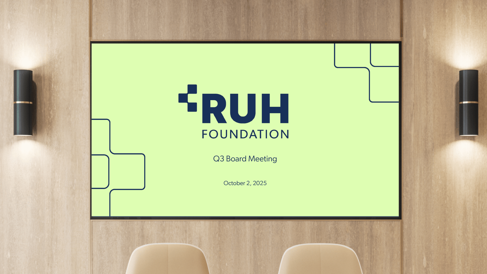
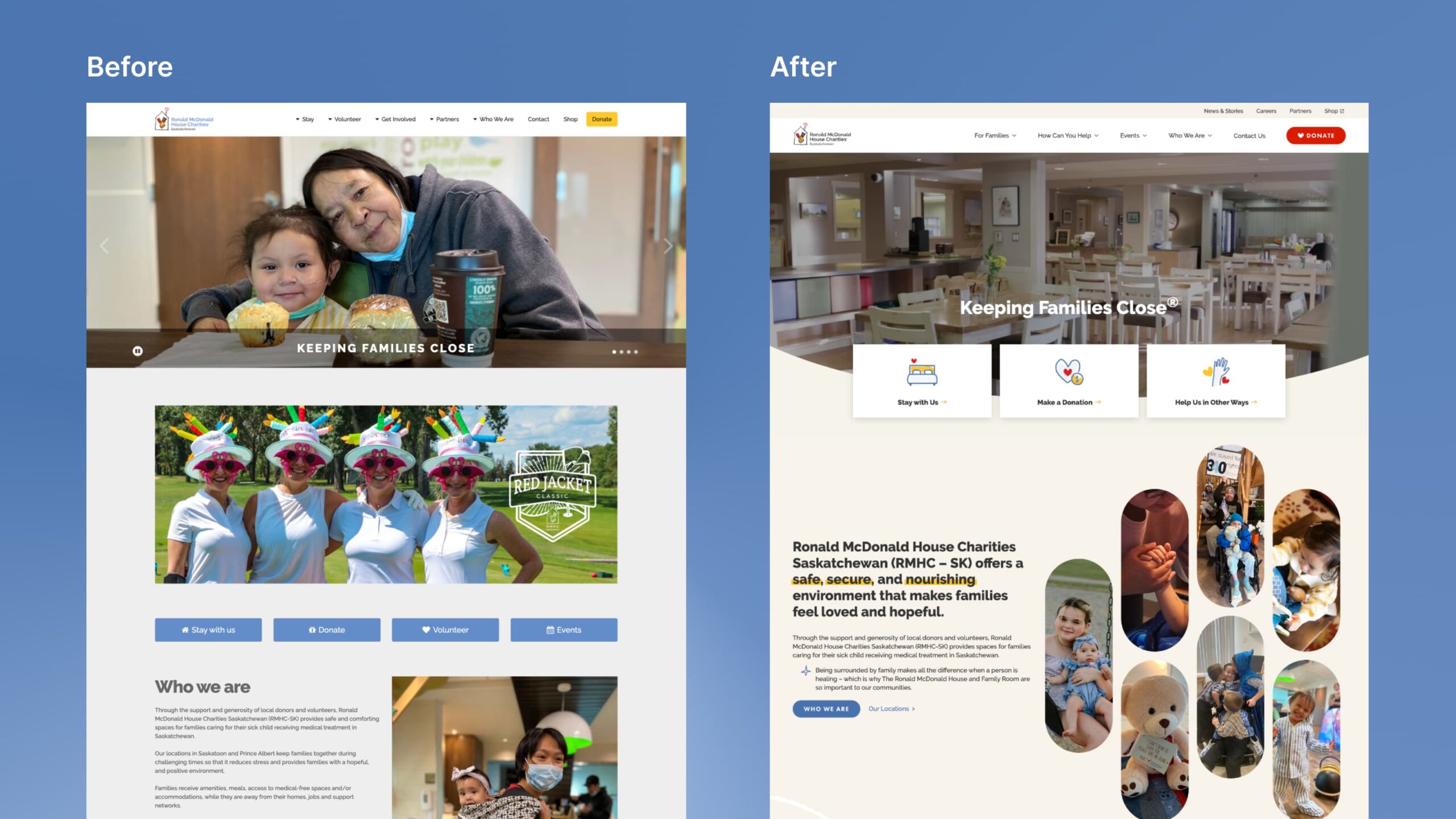
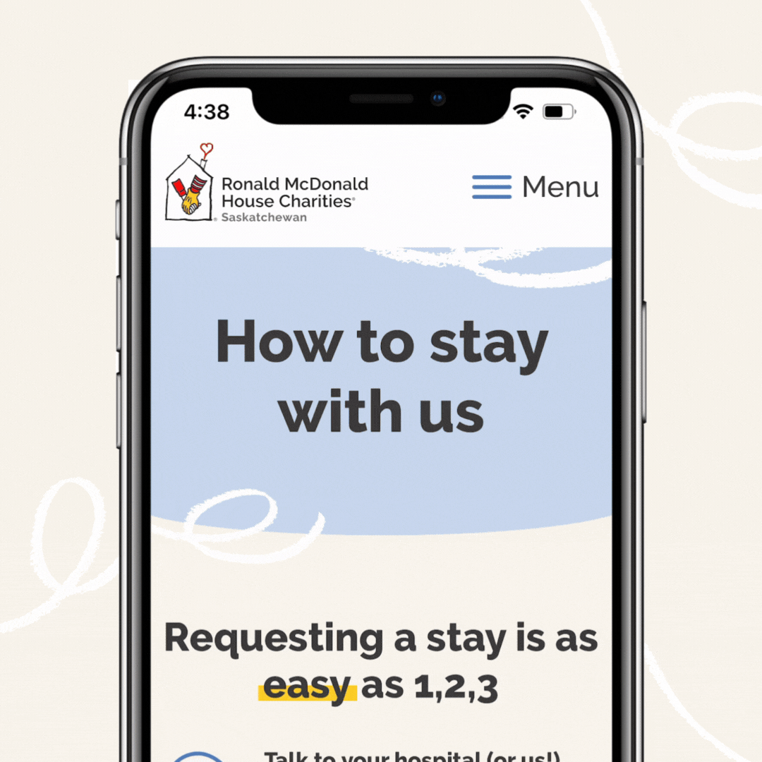
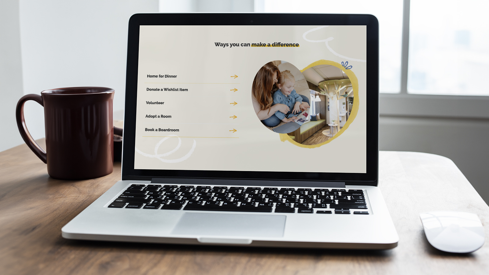
For this project, we built RMHC-SK a new website that is true to their mission, while showing what they do in a way that speaks to their audience. The end result is both functional and beautiful, creating a positive user experience and leaving the user with a lasting impression.

“We have truly enjoyed the time spent in collaboration with Rock & Bloom over the many years we have engaged with their team as our Design Agency. The Rock & Bloom team is incredibly easy to work with and truly understands our brand and mission. The sharing of their expertise as true partners to our organization is valued and appreciated by our entire team.”

– Tammy Forrester, CEO Ronald McDonald House Charities Saskatchewan

Cultivating Success: Ag Company’s Fresh Branding Elevates the Fertilizer Industry 

Vantage Ag is a manufacturer and distributor of liquid fertilizers. Offering a fresh approach and choice over the big companies, Vantage Ag helps increase growers’ chances for success.

Catering to independent ag dealers, agronomists and growers, the team at Vantage Ag are experts at building high-value relationships through high-value products and a customized approach. They understand the unique challenges that farmers face and aim to remove barriers with their new fertilizer technology that’s environmentally-friendly, high-efficiency and liquid technology. 

Vantage Ag wanted to position itself as an independent manufacturer and distributor, appealing to both large and small agricultural companies. Focusing on technology and products, our goal was to gain potential new clients across North America.

Challenge Accepted

Working closely with the Vantage Ag team, we were able to create a new design that reflects their brand, and build a new website that effectively tells their story and conveys why they’re different from other distributors.

Big Goals Lead to Big Gains

The project scope included: 

  • Brand strategy
    • Personas
    • Key messaging
  • Brand identity
  • Marketing assets
    • Business cards
    • Slide deck templates
    • Product packaging
  • Custom design & strategic site architecture
    • Custom infographics
    • Site architecture comprehensively built with users in mind
  • Website design & development

Getting Down to Business  

Brand Identity

Our goals with this brand were to convey a feeling of strength & approachability, while also showcasing how they are technologically advanced & innovative.

We created a scalable design that is professional, yet simple to manage. Without being overly complex, the brand can grow and evolve as the business does.

Logo

The Vantage Ag logo is simple, clean, and recognizable. It is composed of small line shapes, which play homage to the rows in a farmer’s field. These small lines create two larger triangle shapes that represent the letters V and A in the company’s name.

Colour Palette

Colour is an integral part of Vantage Ag’s brand identity, and reinforces the cohesiveness of the brand. The primary colours are Sprout Green and Harvest Green, with Black as the main accent colour. 

Green is symbolic of the prairies of Saskatchewan, and is known to symbolize growth and renewal. The secondary colours complement the primary colours and represent “dusk to dawn” – Dedicated and hard-working, a farmer’s work never ends.

Website

We needed to create a website that features product details with images and concise descriptions, designed to drive potential new clients to contact Vantage Ag’s team. The design is meant to be scalable, flexible, user-friendly, and easy to navigate, all while meeting accessibility guidelines.

Leveraging Vantage Ag’s new branding, we used images and illustrations to further highlight their technology, educating end-users about the benefits of their products.

Photography

The Vantage Ag brand is about supporting farmers through the innovation of fertilizer technology, and strong relationship building. The images are meant to balance the stories of these people and the positive effects of Vantage’s fertilizer product.

The photography is clean, natural and professional. We wanted to focus on 3 main aspects: Showcasing agricultural fields from above, relatable farmers at work, and the macro detailed images of plants and all their parts.

Infographic

Combining design and development, we created a custom animated infographic to highlight and explain how Vantage Ag’s sub nano technology actively works. The infographic visually breaks down technical information in a digestible way. Oh, and did we mention that it’s cool to look at too!

Celebrating The Wins

Our partnership with Vantage Ag was collaborative and creative. We created a bold and refreshing design that sets Vantage Ag apart, while showcasing them as a leader in their industry.

“Rock & Bloom does outstanding work, we have had many compliments from our customers on the site.”

Paul, Founder

Check out their new website to learn more about how they’re changing the game for growers everywhere.

How we helped one of the largest Canadian insurance brokers empower their customers

Butler Byers’ motto is “insurance made easy” – and they do just that.

Dedicated to exceptional service, Butler Byers represents the best and most reputable insurance companies worldwide, helping customers navigate the complex world of insurance in a way that’s easy, peasy, and always breezy.

Founded in 1907, Butler Byers has been serving their community for over 100 years. Not many companies get to claim this feat, and it’s Butler Byers thoughtful approach to insurance that has helped them grow to become one of the largest independent insurance brokers in Western Canada.

Challenge Accepted

We were lucky to have worked with Butler Byers in the past, so when approached with this new website project we were eager to jump on board.

The goals of the website included:

  • Improving the Butler Byers brand
  • Shifting to a focus on self-service
  • Developing strong call to actions 
  • Creating a clear division between personal lines and commercial lines

Getting Down to Business  

Website 

One aspect of this project was ensuring the separation of personal and commercial insurance. We used different brand colours – darker versus lighter blue – to highlight the separation, as well as high quality photography to help tell the story from each perspective. Adding a human element through photography helps to make the site feel relatable and trustworthy. 

Another aspect of the project was making sure the site was as simple as possible for people to navigate. We wanted to approach insurance in a comfortable way that puts the user at ease. 

We did this through a super user-friendly design.The ‘Get a Quote’ section acts as a step-by-step guide, walking the user through the process and ensuring they have what they need from the start. 

Finally, we wanted to highlight Butler Byer’s podcast, further promoting their brand while offering valuable insights to their customers. We used sleek animations throughout to add some character, while keeping the site professional and clean.

Celebrating The Wins

As a repeat partner, our relationship with Butler Byers is filled with lots of trust and open communication.

When I took over the marketing role at Butler Byers, I was lucky to step into a great working relationship with Rock and Bloom. Their expert guidance and deep understanding of our brand and their ability to offer clear, actionable advice truly sets them apart. We have complete trust in their expertise to enhance our brand’s visibility and alignment.

Shelby Pederson – Business Development Coordinator 

This project was a collaboration between the minds of both of our teams, and resulted in a clean, functional website that delivers a positive user-experience. Check out their website to see their unique approach to making insurance accessible for everyone.