Affinity Credit Union is a Saskatchewan-born co-operative financial institution owned by members, for members. Operated solely in Saskatchewan, their advisors understand the unique local needs of their members and believe that people come before profits.
Affinity is the eighth largest credit union in Canada, offering a complete range of accounts, products and services through a network of 56 advice centres (aka branches) in 47 communities throughout the province. Affinity is dedicated to building a better world by improving the lives of people right here at home.
Challenge Accepted
With their mission in mind, Affinity was needing a brand refresh that could increase brand awareness and top of mind recall, differentiate and create a unique branding position in the minds of consumers, and make people think of Affinity first when thinking about a financial institution.
Our task was not a small one. In fact, it might have been our biggest challenge yet. Luckily, we eat big challenges for breakfast, and are always ready for anything.
Big Goals Lead to Big Gains
The project goals included:
- Brand visual refresh
- New graphic elements
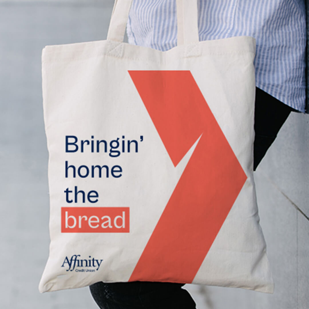
- Logo variations
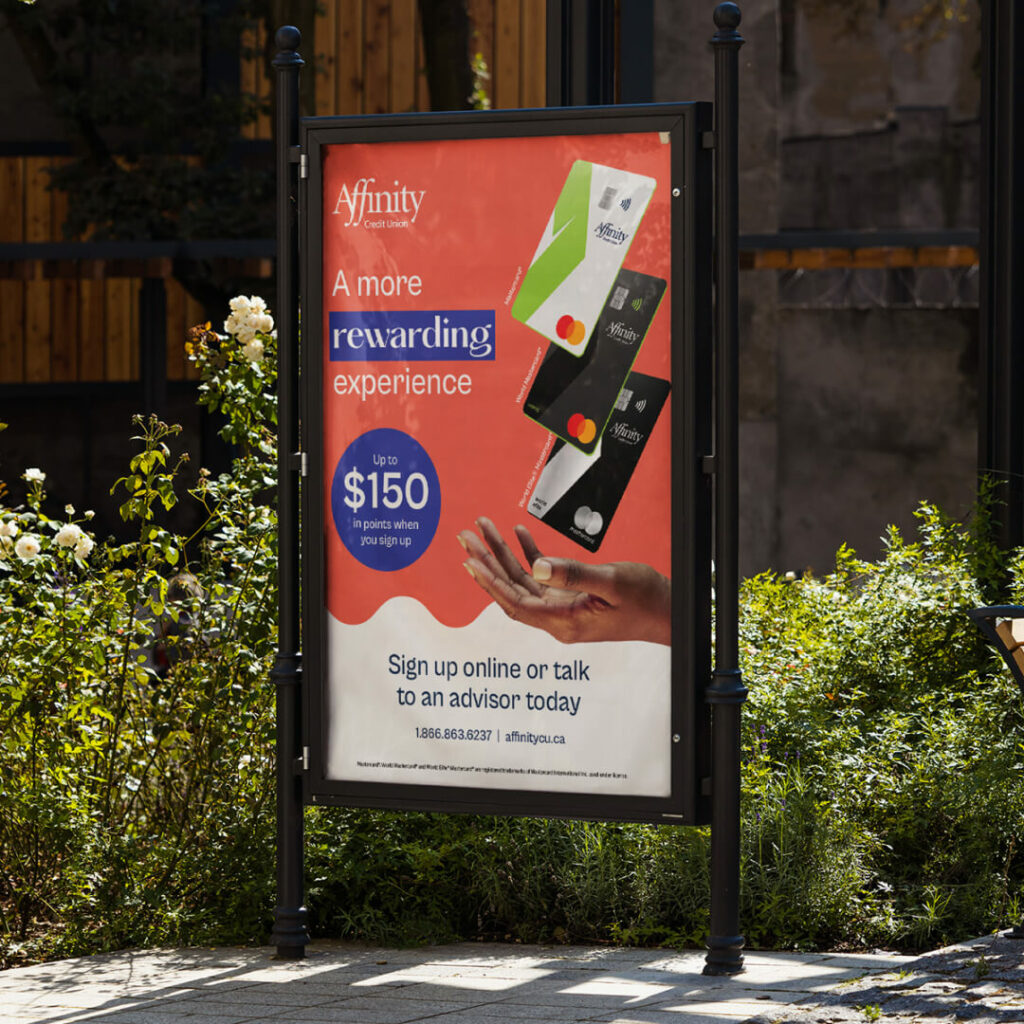
- Print ads
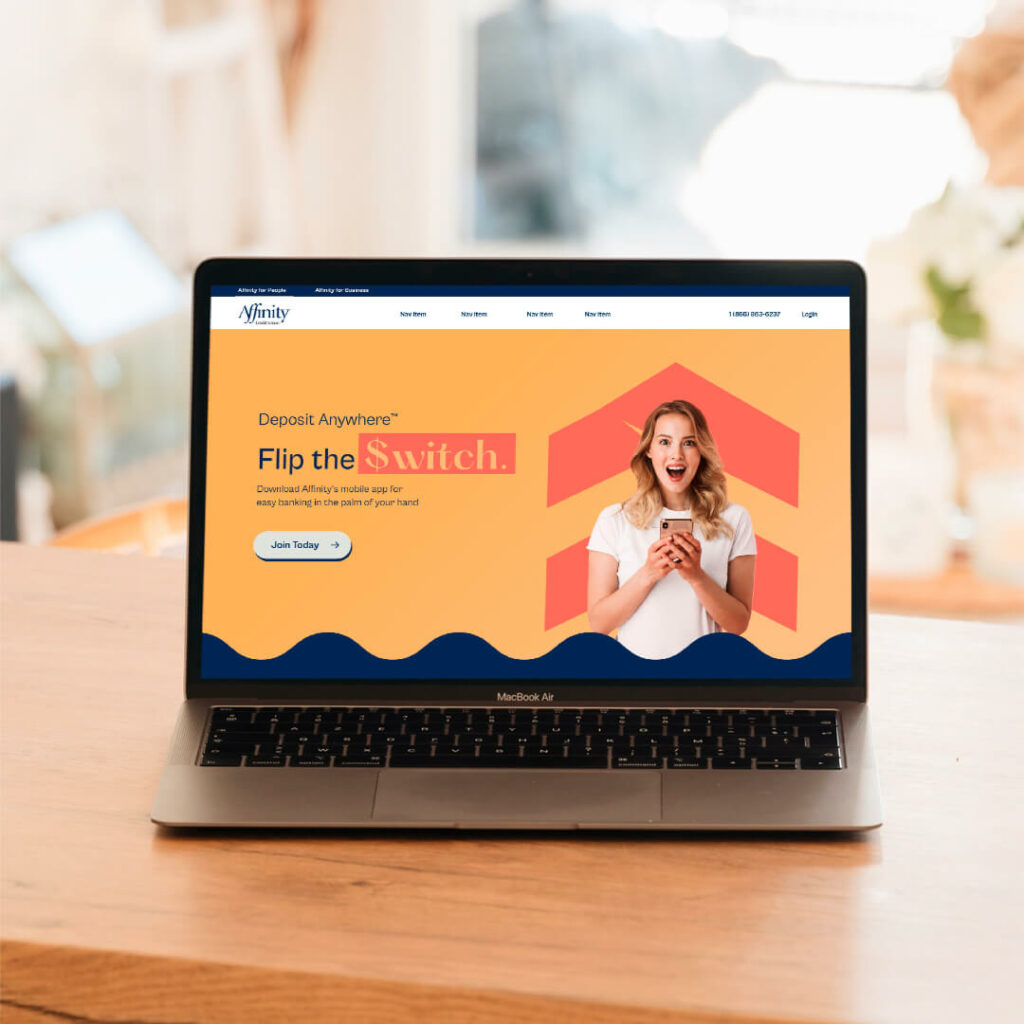
- Web design
- Digital & social ads
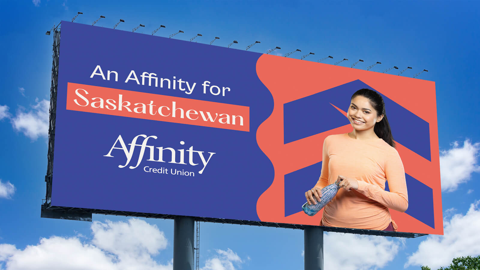
- Banners
- New secondary colour palette
- Brand re-launch campaign
- Internal & external launch
- Communications plan
- Brand messaging
Getting Down to Business
Brand Visuals
Most financial institutions are afraid to show emotion and energy. Affinity’s bold new direction is an instant differentiation in the market.
At their core Affinity is still Affinity – on a mission to build a better world for everyone, every day. On the outside we’ve helped them embody a bigger, brighter, and bolder brand to match their big personality.


Colours
We kept Affinity’s classic blue and green, but wanted to give them more. We added four new bright and optimistic colours to their palette, allowing for more flexibility and helping them stand out from the crowd. Bold, vibrant colours create a dramatic high energy feeling.
Sunset, Terracotta, Chambray and Warm Neutral perfectly enhance their classic, iconic colours, while adding more depth to their personalization and allowing Affinity to tell their story in a truly compelling way.
Icons
Design forward and slightly trendy; the chevron pattern gives Affinity’s look an extra spark. We re-purposed the chevron in interesting new ways to show off just how adaptable and versatile Affinity is.

Microsite
Our goal was to create a microsite that was simple but exciting. It was important to show off the new look, but also to show the thought behind the rebrand. Every colour, every graphic, every photo, and every tagline has been carefully crafted to embody Affinity’s mission and represent their future growth.
Vibrant colours and impactful imagery instantly catch your attention. We wanted to embrace diversity and openness. The people represented are filled with emotion, forming strong connections with the audience.
The imagery is paired with clean, easy to read copy that speaks directly to their audience about how Affinity is here to serve them. It builds confidence that Affinity stays modern in their offerings and is truly people before profits.
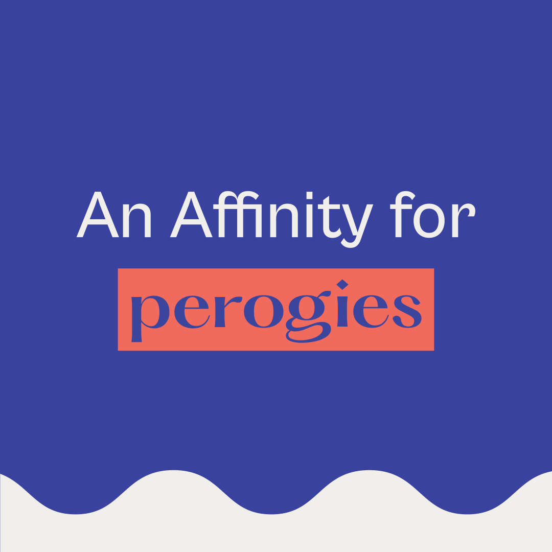
The Tagline
An Affinity For You!
“Affinity” represents the sense of affection or liking for their members. Affinity as the credit union is personalized “for you”.
The tagline fits perfectly with Affinity’s goals. It’s full of enthusiasm; Affinity is the biggest supporter of the people of Saskatchewan and wants to help them achieve their goals.

Celebrating The Wins
From beginning to end, this project was an absolute joy to work on alongside the Affinity Credit Union team. We formed an incredible partnership, pushing each other to new creative heights.
– Cecilia Zerr, Senior Director, Marketing Communications.“Since signing on with Rock & Bloom in 2022, we’ve been beyond impressed with their commitment to understanding our business, our goals and our vision. [They] have become an extension of our team. It’s refreshing and comforting to work with an agency who shares the same values, sense of purpose and desire for success.”
The result is a new brand that helps Affinity break free from the underwhelming credit union mold. Their new brand is full of joy and happiness, and can be instantly differentiated from other financial institutions. Check out their website and keep an eye out in the wild to see this new brand in action!