How to rebrand a multi-generational construction company without losing its history.
T.L. Penner has been building across Manitoba and Saskatchewan for over 50 years. As a third-generation, family-run construction company specializing in rural and remote projects, they’ve earned a reputation for integrity, craftsmanship, and showing up where others won’t. The problem wasn’t their work, it was that their brand had stopped keeping pace with it.
As they looked toward the next chapter, they needed a brand that could carry the weight of their history while positioning them for future growth. The challenge: how do you modernize something that spans three generations without losing the soul of what made it great in the first place?
We started with strategy; digging into who T.L. Penner is, who they serve, and what makes them different in a competitive landscape. From there we built a brand identity that honours their legacy while giving them the tools to grow.
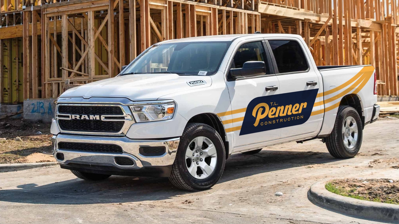
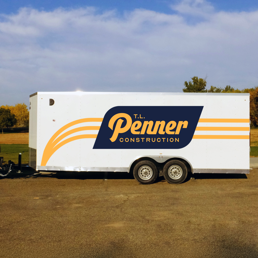
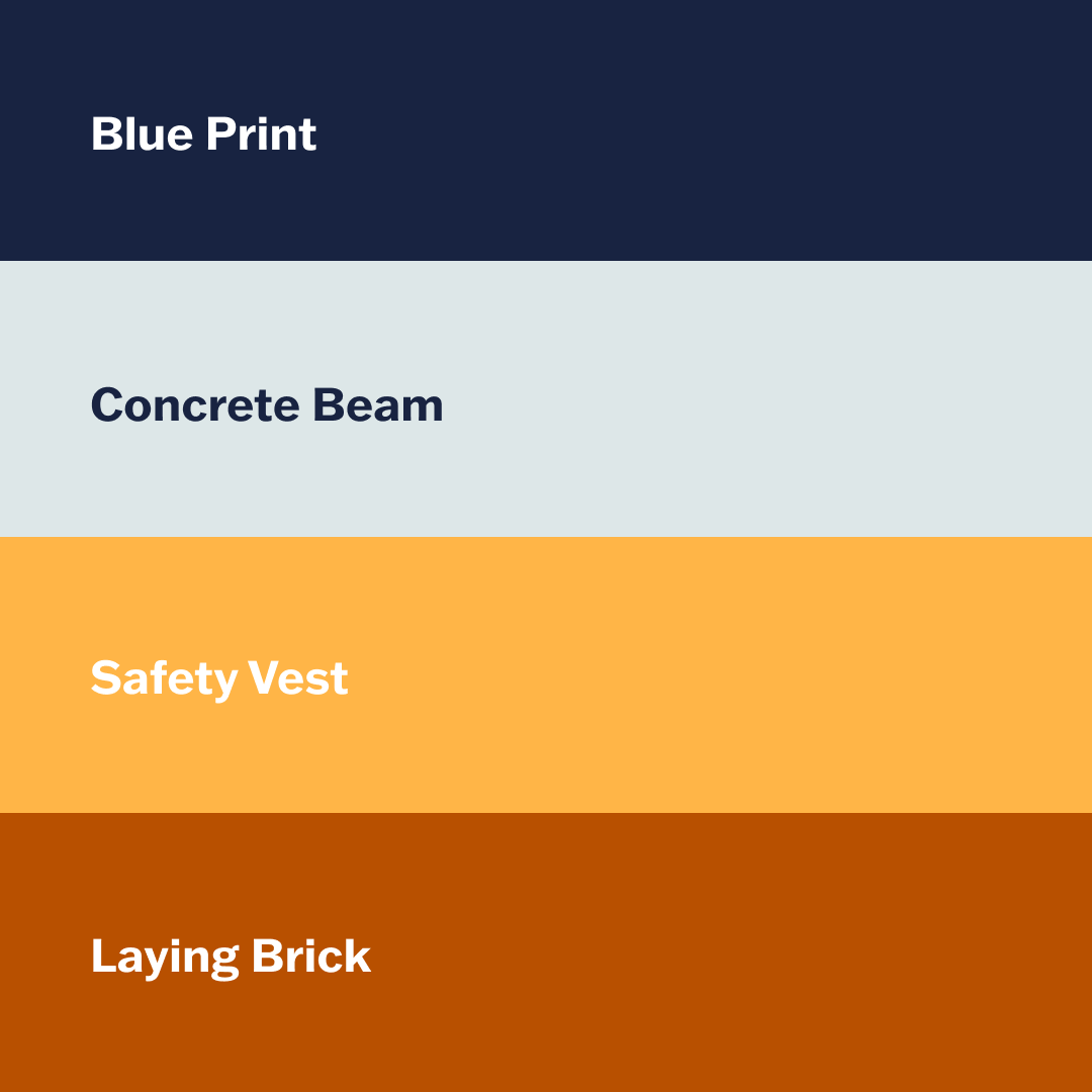
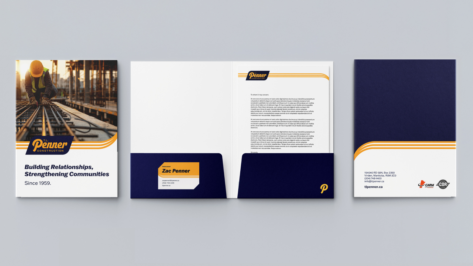
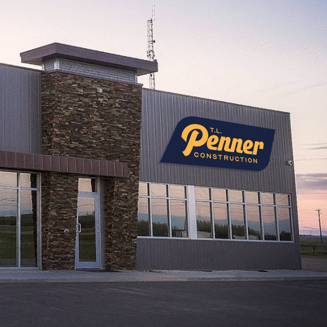
The refreshed logo uses a modern vintage aesthetic with a bold badge mark and modified cursive typography that carries real weight and presence. Three graphic lines woven into the design are a deliberate nod to three generations of Penners; it’s subtle, meaningful, and entirely their own. The colour palette retained their signature blues to maintain recognition in the market, while new accent colours introduced warmth and personality. The website and RFP materials were built to tell the same cohesive story, ensuring T.L. Penner shows up consistently everywhere it counts.
The result is a brand rooted in where they’ve been, and built for where they’re going.