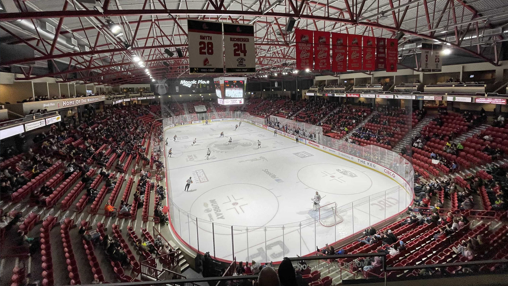
Based in Moose Jaw, SK, the Moose Jaw Warriors are a community-owned franchise that has been a proud member of the Western Hockey League (WHL) since 1984.
The Warriors and the WHL have been a leading supplier of talent for the National Hockey League, and a leading provider of hockey scholarships to assist players in their pursuit of post-secondary education of their choice.
On July 5, 2022, the Moose Jaw Warriors released a new brand logo ahead of the 2022-23 Western Hockey League season. The logo change comes after the Warriors announced an official review of their primary logo on October 1, 2020.
Rock & Bloom is honoured and privileged to have worked alongside the Moose Jaw Warriors on this rebrand, creating an inclusive logo that represents Moose Jaw’s history. This type of work aligns with our personal values, and we are proud of what we have accomplished together.
The Problem
“As we move forward with a new era and logo, we need to remind ourselves that it’s our responsibility to educate ourselves about Truth and Reconciliation for a better tomorrow.”
– Chad Taylor, Moose Jaw Warriors President and Governor.
Once it was determined that the Moose Jaw Warriors would be changing their current logo in order to create an inclusive and meaningful brand identity, the next phase was to bring the new logo to life.
Our team collaborated closely with the Moose Jaw Warriors’ team to ensure that the new logo could last for years to come and become a key symbol and affiliation with the Moose Jaw community.
The team wanted to create new revenue opportunities, from merchandise to sponsorship, and reignite a new sense of pride in the Moose Jaw community.
The Scope
The project scope included:
- Brand sprint
- Personas
- Key messaging
- Communications strategy
- Video concept and script
- Logo (primary, secondary, wordmark)
- Social post design templates & content ideation
- Microsite
The Process
- Brand Identity
We began our process as we usually would – with a brand sprint, audience personas, and key messaging. The brand sprint aligns both teams on what the goals are for the project, and allows us to build a roadmap to success. Personas and key messaging are crucial components of a successful rebrand, as personas determine who we are speaking to, and key messaging determines what we are trying to say.
Both processes are iterative, taking in feedback from both sides, encouraging conversation, and building on ideas to create an end product that is strong and representative of where the brand is going.
- Content Strategy
This project involved a lot of content strategy; from key messaging to PR, script writing to microsite content development – we had to tell the story in a variety of ways.
Change can be hard, and we knew early on that we needed to drive the narrative from a positive place. We focused heavily on the rich history of Moose Jaw and how it ties into our new rebrand. We also focused heavily on community; reminding people how this new brand brings excitement and pride to their city.
The result is a story that resonates long after the words on the page have been scrolled. It’s a story that sinks deep into the hearts of the community and is lived out in the actions of the Snowbirds’ and Warriors’ loyal supporters.
- Visual Identity
A strong content strategy needs strong visuals to match. Taking on a rebrand of a beloved WHL team comes with its own set of challenges, and requires thought, intention, and careful consideration.
Logo
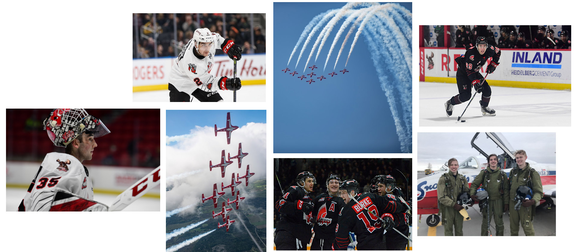
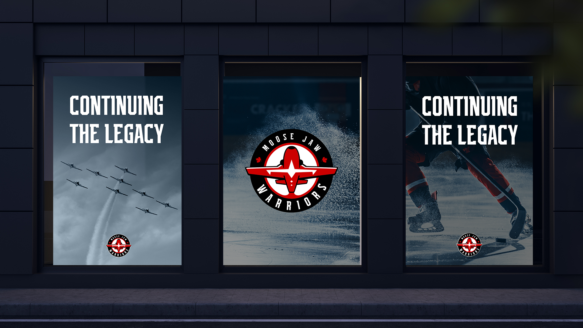
A lot of thought and attention to detail went into the new logo. The design is inspired by the organization and the community’s connections with the Royal Canadian Air Force, 15 Wing Moose Jaw, and the Canadian Forces Snowbirds, 431 Air Demonstration Squadron.
Over the years, the organization and the Snowbirds have built a strong relationship. In 2019, the Warriors were officially appointed as members of the Honorary Snowbird Society.
The Snowbirds are the “Warriors of the Sky”, and the Moose Jaw Warriors are the “Warriors of the Ice”.
The new logo features the iconic Snowbirds symbol, which can be seen on the underbelly of the CT-114 Tutor jet. We needed the plane to be super distinct so that people would know that it’s a Snowbird, and not just any other plane. We positioned the logo to see the underside – with the Snowbirds distinctive markings.
We also included two maple leafs – a nod to the team’s Canadian pride – and two hockey sticks, which are hidden in the wings of the plane.
The typeface is a nod to historic aviation font styles, while the Warriors’ classic colours of black, red and white remain to continue the team’s legacy.
Video
The Moose Jaw Warriors logo reveal video was a collaboration between the team at Rock & Bloom and the team at Sik Pics Productions. Led by our vision and their creative guidance, we collaborated on a storyboard that would showcase the new brand reveal in an exciting and powerful way.
We wrote the script for the video and Sik Pics’ worked their videography magic, stitching together new footage of iconic Moose Jaw scenery and the Snowbirds, with archival footage of the team and their history.
The result will give you chills – and serves as the perfect introduction to the new logo.
Microsite
Working on the microsite was a fun challenge for our team, as we don’t often get the chance to do microsites like this. The site has no call to action – it’s simply about telling a story.
The challenge here was to make the microsite an unforgettable experience for everyone who visits it. It’s a big contrast from the Warriors’ previous brand, but still holds many of the same underlying values – it’s fierce, energetic, and bold.
The microsite is rooted in history, but is surrounded by a cast of modern elements – a flair that speaks to a new generation of fans. The energy and liveliness of the site leaves visitors with a feeling of excitement. It’s a brand that Moose Javians can feel proud to call their own.
- Launch
The Moose Jaw Warriors new logo was revealed on July 5, 2022 to an eager and excited audience. The new brand represents an exciting new chapter for the Warriors, further connecting them with the community and strengthening relationships. Together we can continue the legacy.
Check out the Moose Jaw Warriors Microsite to see the new logo, watch the video, and learn more about this exciting rebrand.