Building a path towards reconciliation through Indigenous sport in Canada

Sask Sport has shown a long-standing commitment to supporting reconciliation in collaboration with Indigenous communities, working to promote inclusion and participation in sports.

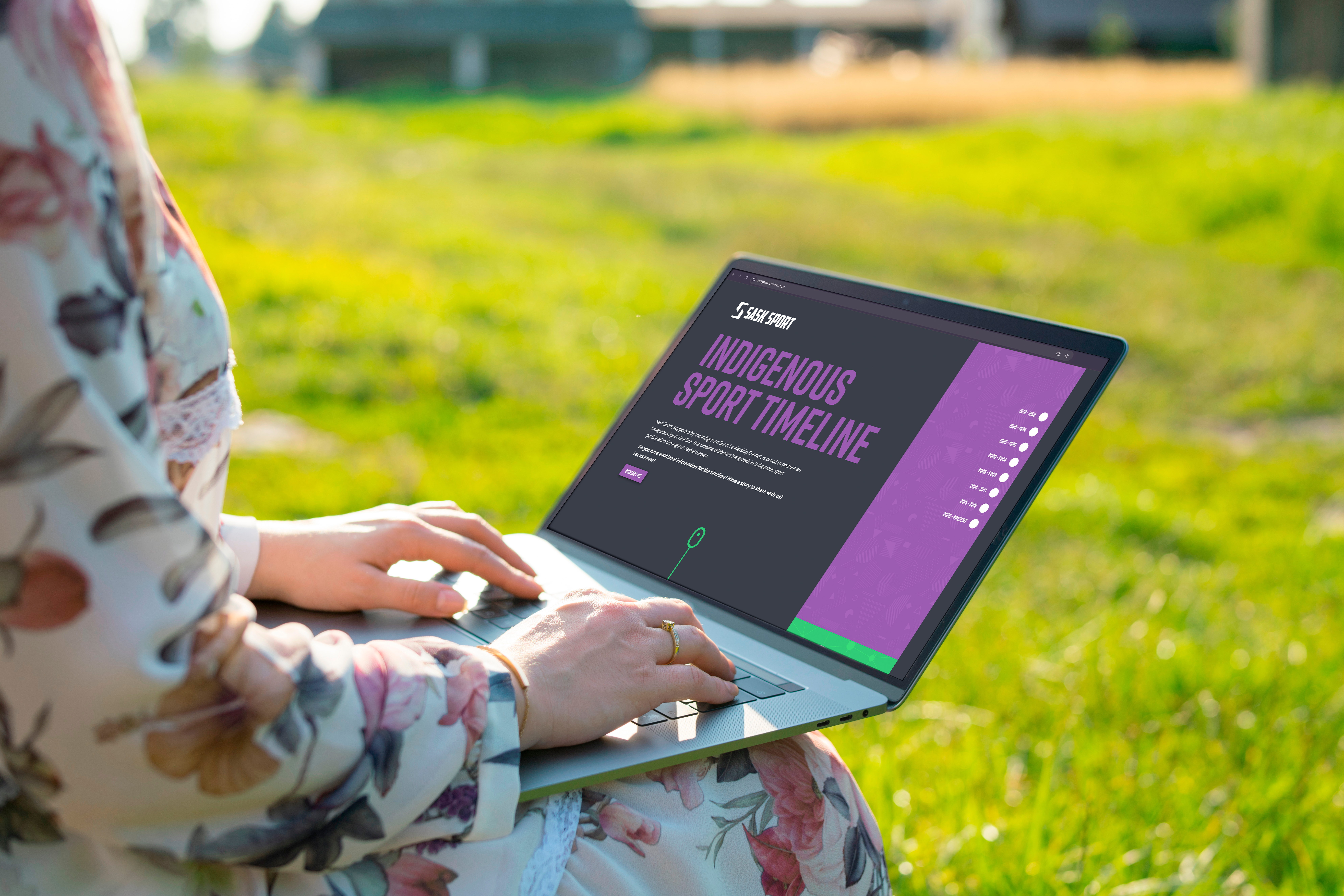
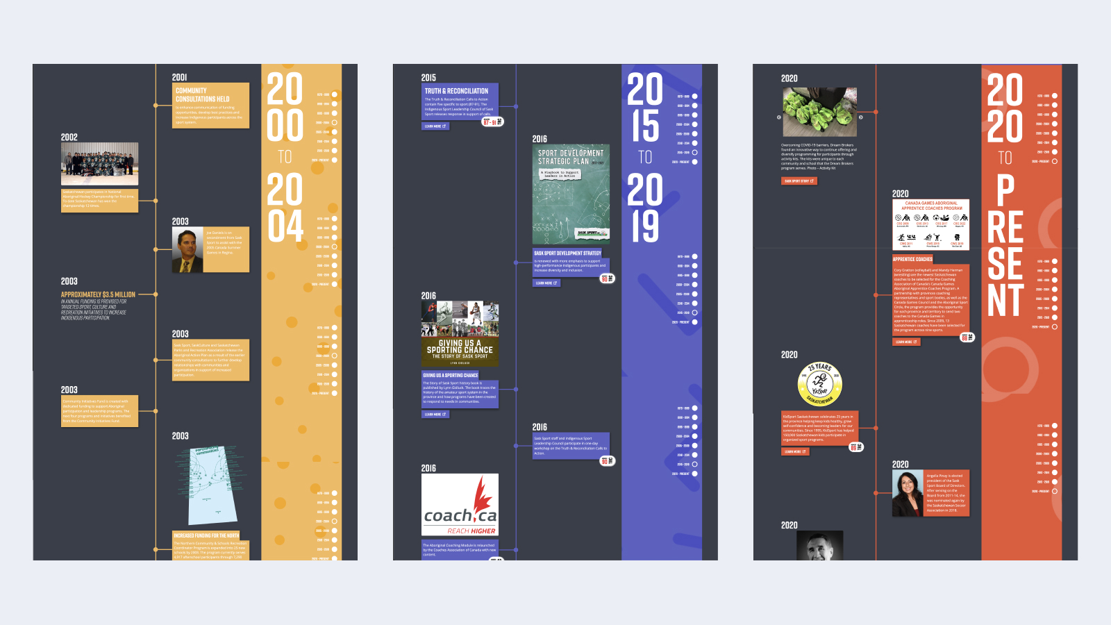
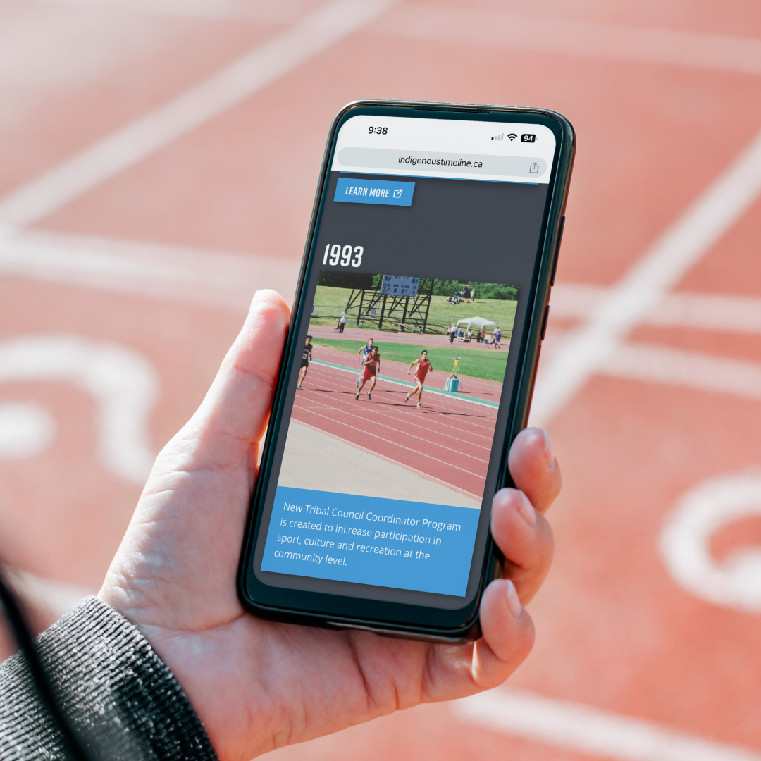
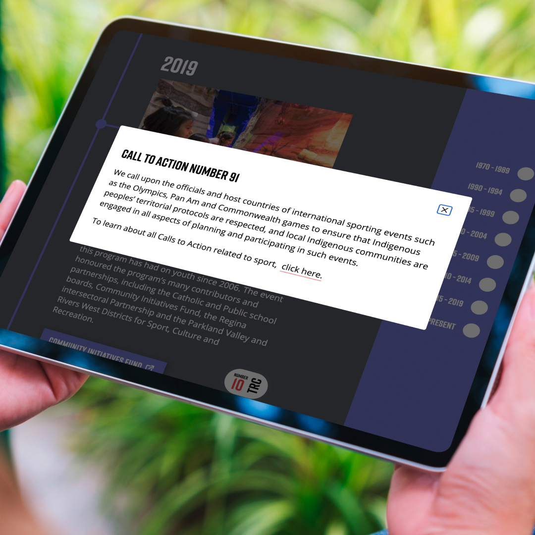
In partnership with Indigenous leaders and the Rock & Bloom team, Sask Sport created an Indigenous Sport Timeline. This timeline aligns with the Truth and Reconciliation Commission of Canada’s Calls to Action, serving as an educational tool that highlights key moments in Indigenous sport while fostering ongoing engagement in reconciliation efforts.

Our Opportunity

Our relationship with Sask Sport, rooted in collaboration and shared goals, has enabled us to participate in weaving the Truth and Reconciliation Calls to Action into the fabric of sport in Saskatchewan. Sask Sport’s emphasis on Calls to Action 87 to 91 reflects its dedication to Indigenous participation in sport and the ongoing journey of reconciliation.

Collaboration is key

Our approach was to center Indigenous voices and needs, ensuring the Calls to Action were integrated in ways that are accessible and rooted in the resources and histories of Indigenous peoples. Sask Sport’s dedication to ‘walking the talk’ in this process shows their genuine commitment to action over symbolism. Together, we’ve developed a timeline that is more than just a project—it’s a learning journey for all of us, creating space for reflection and action in daily life through sports.

Our work is never done  

Though progress has been made, there is still much to learn and do. Sask Sport’s timeline is just one step on the long road of reconciliation, providing an ongoing invitation to educate and engage communities. It is a reminder that reconciliation is a shared responsibility that requires continuous effort, listening, and action. We are proud to support Sask Sport in amplifying Indigenous voices and ensuring that this work remains authentic, grounded, and meaningful.

We are grateful for the opportunity to learn through this collaboration with Sask Sport. Their leadership has provided us, and many others, with the tools to integrate the Calls to Action into everyday actions. We invite you to explore Sask Sport’s Indigenous Sport Timeline to celebrate and deepen your understanding of Indigenous sport in Saskatchewan.

Elevating a Non-Profit’s Impact with Strategy, Story, and Killer Design

Vancouver Food Runners is a non-profit organization on a mission to reduce food waste by redirecting surplus food to those who need it.

As part of our Brand Aid initiative, we set out to create a brand and digital experience that’s as meaningful and efficient as the work they do—amplifying their message, engaging new partners, and paving the way for future expansion.

Services

  • Brand Strategy 
  • Brand Identity 
  • Content Strategy
  • Website Redesign & Development

Results

  • A vibrant new brand identity that clearly communicates the organization’s mission, impact, and values
  • Refined messaging that connects with audiences through themes of sustainability, community, and food justice
  • A modern, easy-to-navigate website built for growth, featuring automation, streamlined user journeys, and clear calls to action
  • Increased visibility and connection with new partners, volunteers, and donors across BC

Client: Vancouver Food Runners

Industry: Registered Charity

Location: Vancouver, BC, Canada

Working with Rock & Bloom through their Brand Aid initiative has been a game-changer for Vancouver Food Runners. As a small charity focused on food recovery across Metro Vancouver, having the right tools to communicate our mission, impact, and values is essential—and Rock & Bloom delivered that and more.

Their team provided us with a full suite of services including brand strategy, brand identity, content strategy, and a complete website redesign and development—all pro bono. The result? An elevated brand presence that truly reflects who we are and what we stand for. Our new website is not only beautifully designed and easy to navigate, but it’s also a powerful tool that will help us grow our community of volunteers, donors, and partners.

From start to finish, the Rock & Bloom team was engaged, professional, creative, and deeply passionate about helping us succeed. They are true leaders in their field, and we are incredibly grateful for their generosity, expertise, and unwavering support.

Michelle Reining, Executive Director, Vancouver Food Runners

How We Helped British Columbia’s Literacy Program Transform Their Legacy Fundraiser into a Nostalgic Brand

ONE TO ONE is a unique children’s literacy program that provides free one-to-one tutoring by trained volunteers to elementary school students in BC. Through these connections, the organization helps BC children develop literacy skills and reading confidence.  

This ONE TO ONE Literacy Program hosts a team spelling fundraiser, supporting kids across BC. Business professionals, entrepreneurs and educators come together to network and compete for prizes, while working to improve opportunities for kids to succeed.

We partnered with ONE TO ONE as part of our Brand Aid Initiative, which helps a ‘Champion of Choice’ elevate their brand and tell their story through in-kind donated work. Our challenge was to create a distinct yet complementary brand for the Spelling Bee, one that intrigued potential donors, energized participants, and amplified the core values of ONE TO ONE.

Challenge Accepted

The goals of the project included:

  • Build a new Spelling Bee brand that helps ONE TO ONE to engage potential donors
  • Create intrigue, excitement, and notoriety of Spelling Bee among tutors, parents, donors, and students themselves
  • Align with ONE TO ONE overall brand, while maintaining its own identity and messaging
  • Continue to amplify the ONE TO ONE program, creating engaging visuals, copy and strategy for the Spelling Bee
  • Develop a suite of engaging materials: event promotional assets, including social media graphics, email templates, and posters to ensure success.

Getting Down to Business  

Brand Strategy

Our process began with comprehensive strategy development, including persona creation and key messaging tailored to diverse audiences.

We crafted profiles for key audiences to ensure our messaging resonated across all touchpoints. We also crafted key messaging that highlighted the transformative power of literacy and the direct impact of the event.

Brand Identity

We designed a distinctive identity for the Spelling Bee Challenge that evoked warmth, nostalgia, and a sense of community.

We chose a bold typeface that is friendly, approachable, fun, and reminiscent of story book text. We paired this with a handwritten typeface, less polished, yet still approachable – a nod to children’s handwriting.

The letter imagery balances nicely with the logo. Playful and vibrant, the bubble letters represent diversity, childhood memories, and pair with our messaging: ‘How do you stack up against the competition?’

We used the original blue and green from the ONE TO ONE colour palette, but added more colours for flexibility and variety. The bright and fun colours pair nicely with the friendly fonts and subtle use of happy characters – peep the adorable smiley face.

Celebrating The Wins

The Spelling Bee Challenge stands out on its own, while reinforcing ONE TO ONE’s crucial mission. By blending nostalgia with purpose, our approach transformed the Spelling Bee into a strong brand identity that will last for years to come.

“Working with Rock & Bloom was a wonderful experience. We feel so fortunate to be part of their Brand Aid program. From the first time we connected, they were clear on expectations and scope, made it easy to contribute to the process, and provided lots of updates along the way.

Their creative team took on the tricky work of re-imagining and reviving the brand of our legacy fundraising event. We had an ambitious dual goal: creating something we could introduce to new audiences while holding on to what makes it special so previous attendees still felt welcome.

They more than hit the mark, creating a new brand that feels joyful, fresh, inviting and engaging!”

Carol, ONE TO ONE

Learn more about ONE TO ONE’s important mission on their website and read more about our transformative Brand Aid Initiative.