Building a path towards reconciliation through Indigenous sport in Canada

Sask Sport has shown a long-standing commitment to supporting reconciliation in collaboration with Indigenous communities, working to promote inclusion and participation in sports.

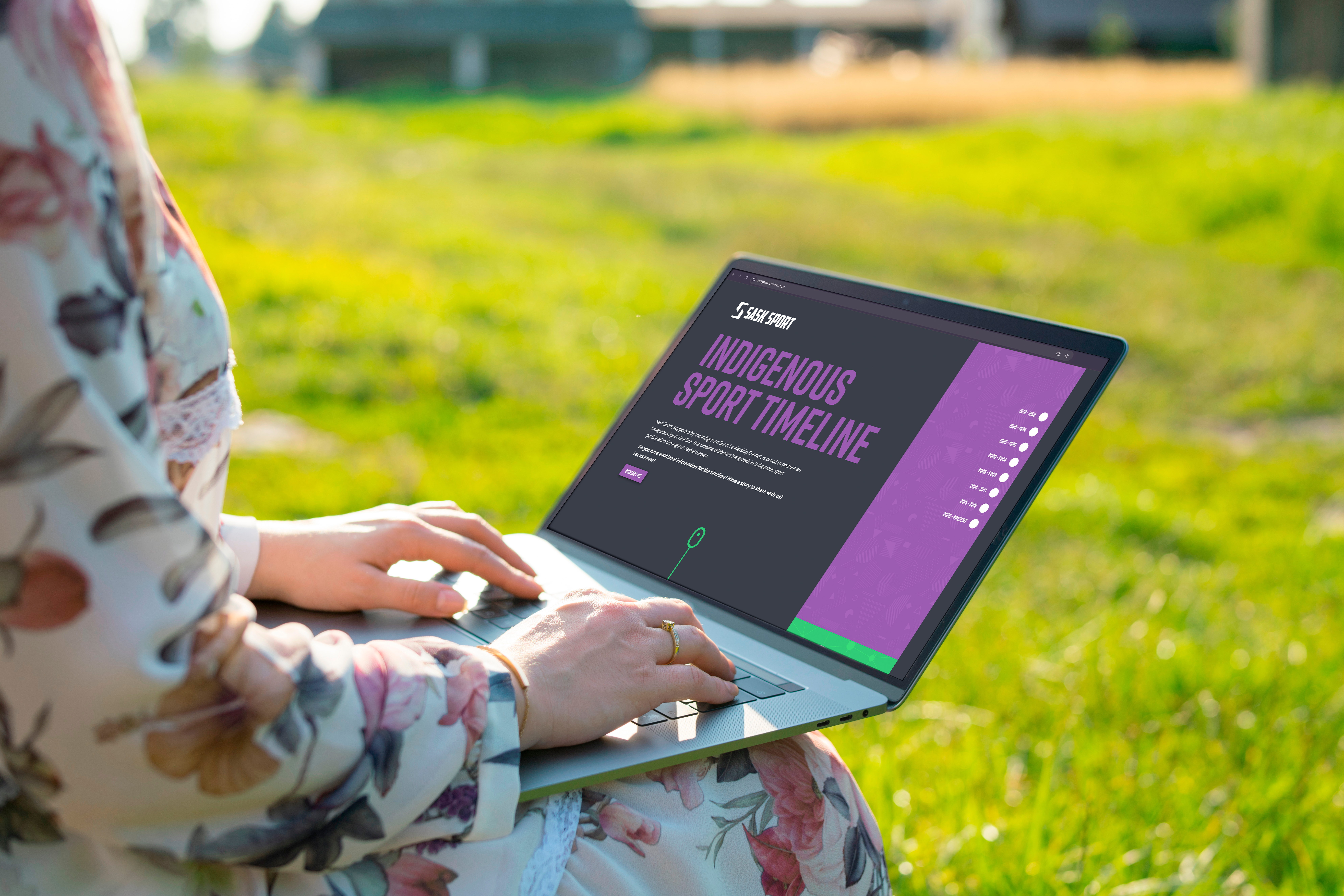
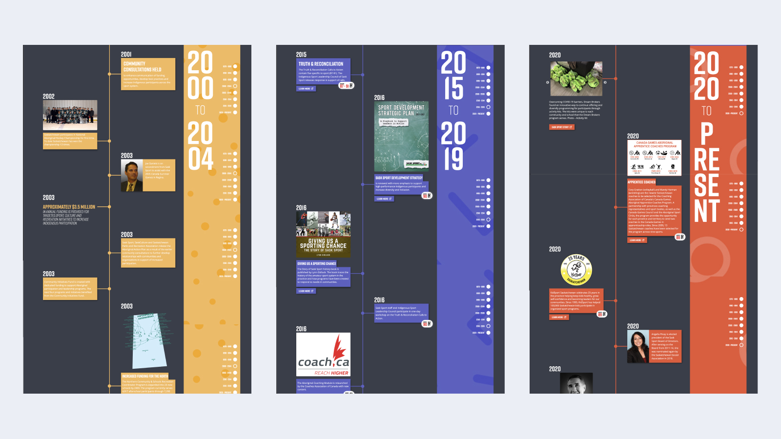
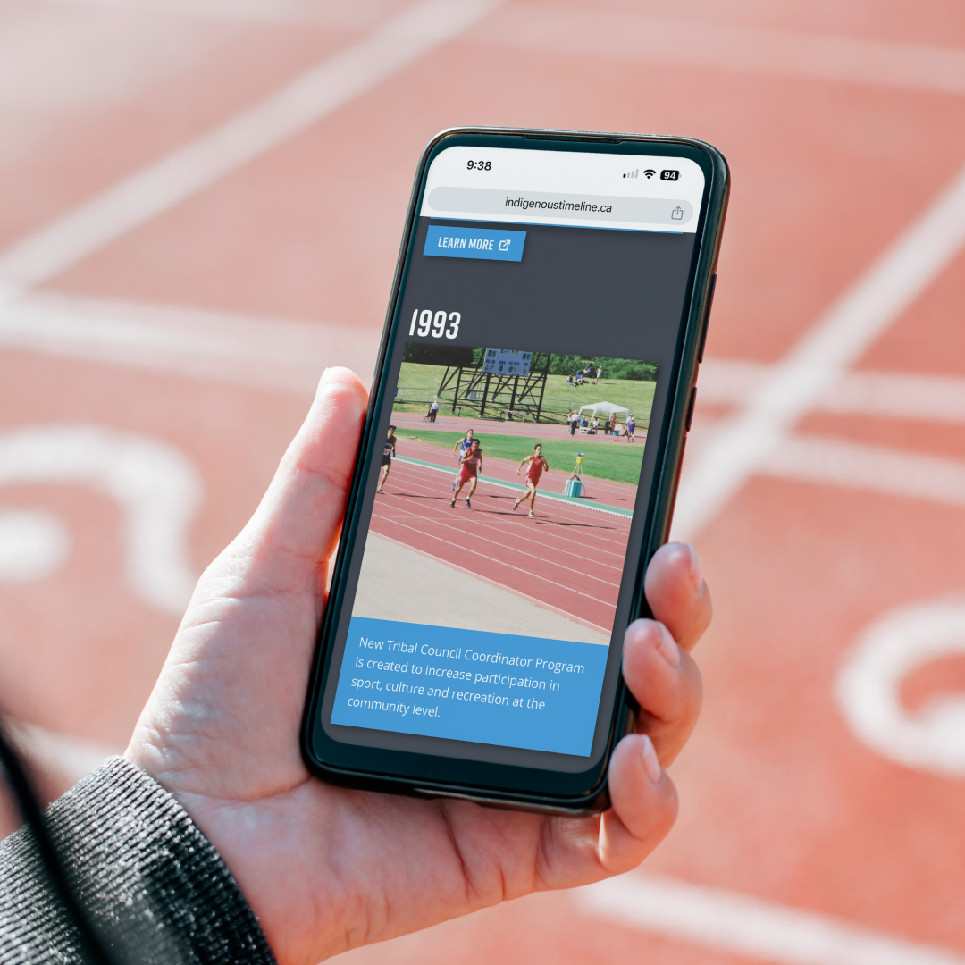
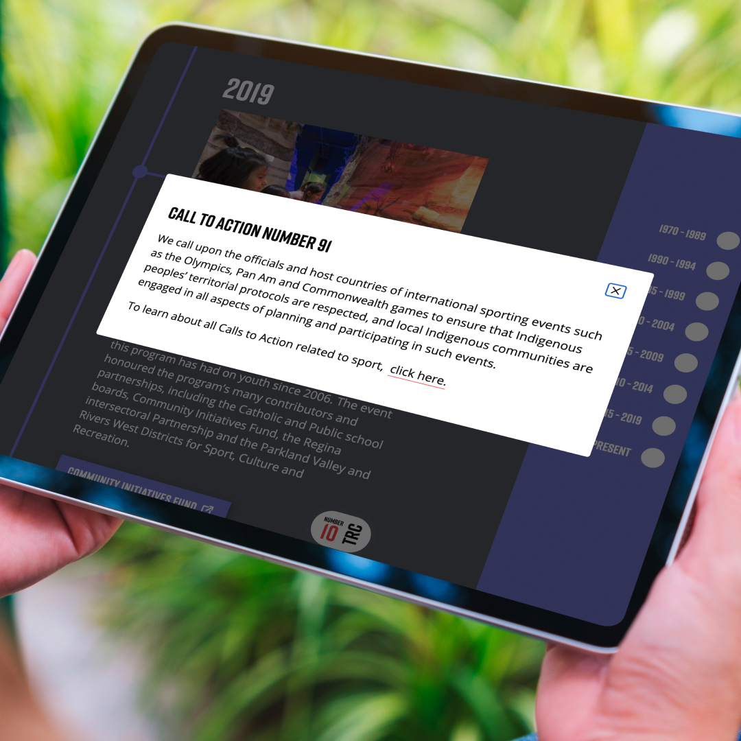
In partnership with Indigenous leaders and the Rock & Bloom team, Sask Sport created an Indigenous Sport Timeline. This timeline aligns with the Truth and Reconciliation Commission of Canada’s Calls to Action, serving as an educational tool that highlights key moments in Indigenous sport while fostering ongoing engagement in reconciliation efforts.

Our Opportunity

Our relationship with Sask Sport, rooted in collaboration and shared goals, has enabled us to participate in weaving the Truth and Reconciliation Calls to Action into the fabric of sport in Saskatchewan. Sask Sport’s emphasis on Calls to Action 87 to 91 reflects its dedication to Indigenous participation in sport and the ongoing journey of reconciliation.
Collaboration is key

Our approach was to center Indigenous voices and needs, ensuring the Calls to Action were integrated in ways that are accessible and rooted in the resources and histories of Indigenous peoples. Sask Sport’s dedication to ‘walking the talk’ in this process shows their genuine commitment to action over symbolism. Together, we’ve developed a timeline that is more than just a project—it’s a learning journey for all of us, creating space for reflection and action in daily life through sports.
Our work is never done  

Though progress has been made, there is still much to learn and do. Sask Sport’s timeline is just one step on the long road of reconciliation, providing an ongoing invitation to educate and engage communities. It is a reminder that reconciliation is a shared responsibility that requires continuous effort, listening, and action. We are proud to support Sask Sport in amplifying Indigenous voices and ensuring that this work remains authentic, grounded, and meaningful.

We are grateful for the opportunity to learn through this collaboration with Sask Sport. Their leadership has provided us, and many others, with the tools to integrate the Calls to Action into everyday actions. We invite you to explore Sask Sport’s Indigenous Sport Timeline to celebrate and deepen your understanding of Indigenous sport in Saskatchewan.
Designing a Winning User Experience For Eight Casino Websites

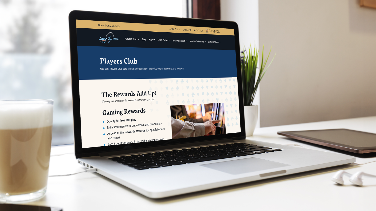
The Saskatchewan Indian Gaming Authority (SIGA) operates seven casino properties, each with a distinct identity.

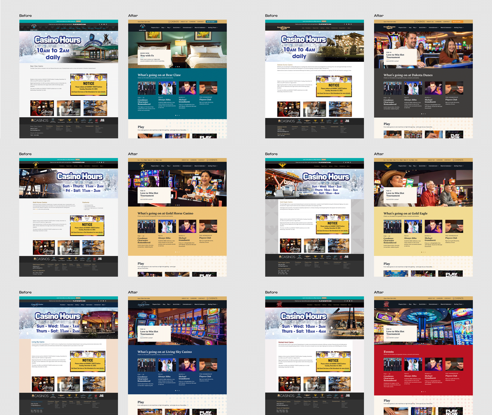
SIGA needed to refresh each website, including their corporate site, to ensure brand cohesion across all of their properties.

Challenge Accepted

Our goals were to improve the overall user experience across all SIGA casino websites. We needed to ensure cohesive branding across different properties, while also allowing each brand to stand out on its own. 

Our team collaborated with SIGA to create a strong design, seamless user experience, and robust content strategy, providing guidance that their team used to complete the development of the websites.

Big Goals Lead to Big Gains

The project scope included: 

  • Strategic organization
    •  Card sorting & tree testing
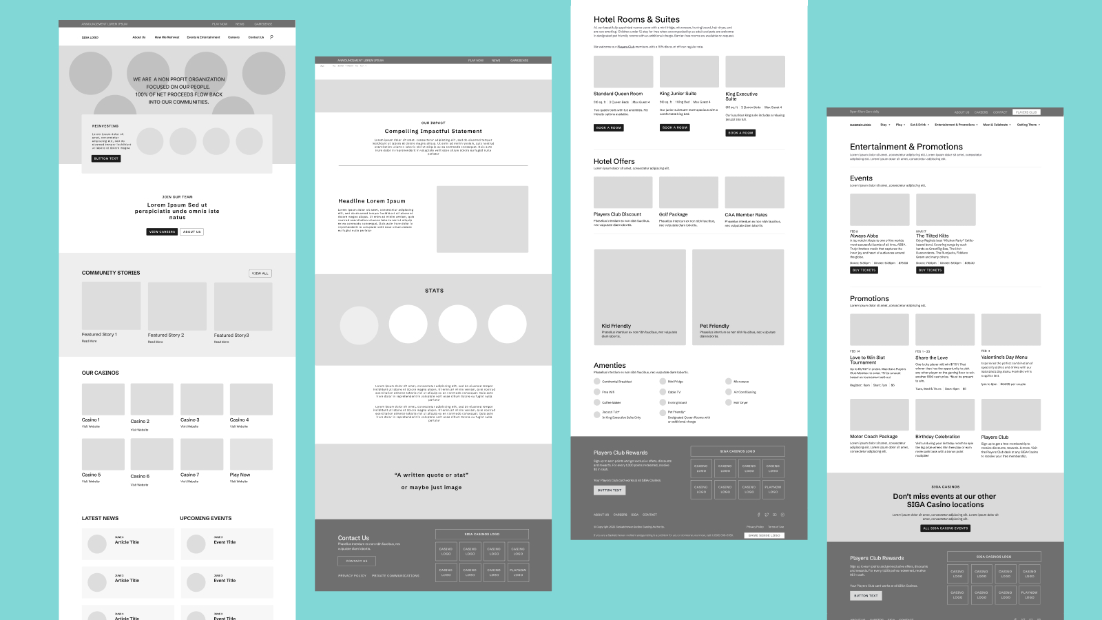
  • Research & Wireframing
  • Strategic site architecture
  • Website design
  • Content strategy

Getting Down to Business  

Strategic Organization

We conducted card sorting and tree testing exercises to understand how users categorize and navigate information. This process informed the restructuring of site architecture to align with user expectations and behaviors.

Looking at user needs, preferences, and industry best practices we designed a site architecture that organized information logically and intuitively. We wanted to ensure easy access to key information and services, enhancing user satisfaction and engagement.

Website Design

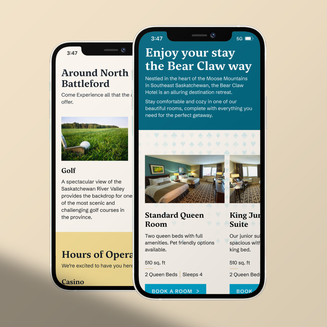
After a thorough strategy phase, we were able to dive into website design. We created visually appealing and brand-consistent designs for all seven casino properties, as well as the corporate site. 

Keeping in mind SIGA’s branding and messaging goals, we developed a robust content strategy to ensure that content was engaging, relevant, and optimized for search engines.

Website Execution

We designed the websites for SIGA’s internal team to build. In order to ensure a smooth and successful handoff, we worked closely with SIGA’s internal team to ensure our design and strategy recommendations were implemented effectively. Providing detailed guidance for development, we enabled their team to build and deploy the new websites successfully.

Celebrating The Wins

Our collaboration with the Saskatchewan Indian Gaming Authority resulted in several website refreshes that met their goals of improving user experience and ensuring cohesive branding across all casino properties, strengthening SIGA’s overall brand identity and setting them up for continued success.

Check out the Bear Claw Casino website, or any of the individual casino websites to see our work in action.

Cultivating Success: Ag Company’s Fresh Branding Elevates the Fertilizer Industry 

Vantage Ag is a manufacturer and distributor of liquid fertilizers. Offering a fresh approach and choice over the big companies, Vantage Ag helps increase growers’ chances for success.

Catering to independent ag dealers, agronomists and growers, the team at Vantage Ag are experts at building high-value relationships through high-value products and a customized approach. They understand the unique challenges that farmers face and aim to remove barriers with their new fertilizer technology that’s environmentally-friendly, high-efficiency and liquid technology. 

Vantage Ag wanted to position itself as an independent manufacturer and distributor, appealing to both large and small agricultural companies. Focusing on technology and products, our goal was to gain potential new clients across North America.

Challenge Accepted

Working closely with the Vantage Ag team, we were able to create a new design that reflects their brand, and build a new website that effectively tells their story and conveys why they’re different from other distributors.

Big Goals Lead to Big Gains

The project scope included: 

  • Brand strategy
    • Personas
    • Key messaging
  • Brand identity
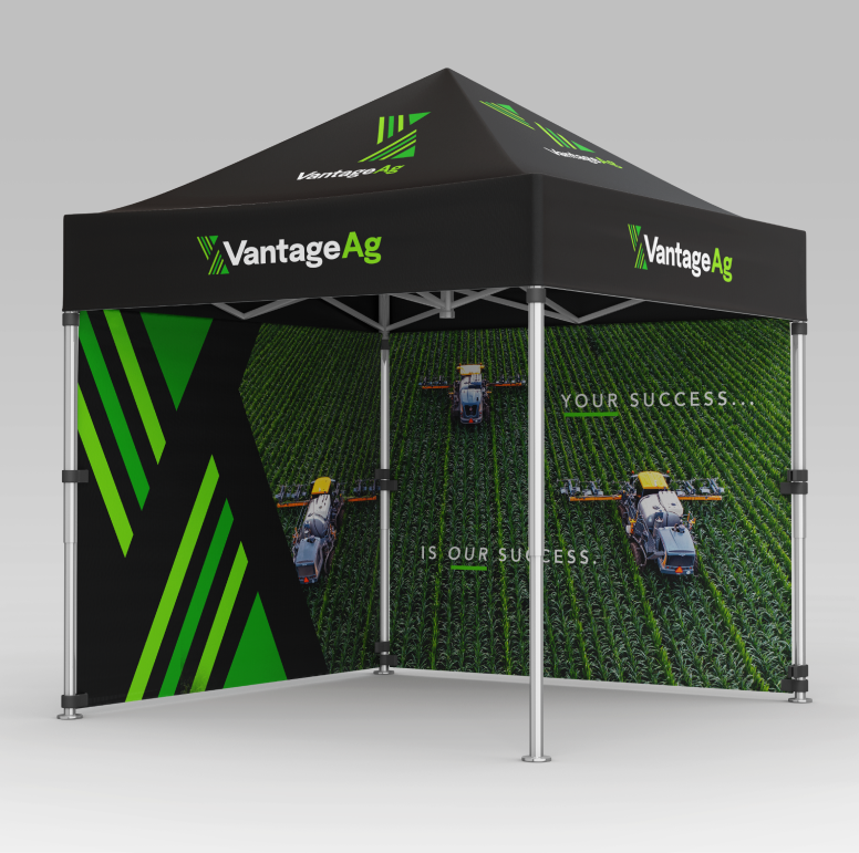
  • Marketing assets
    • Business cards
    • Slide deck templates
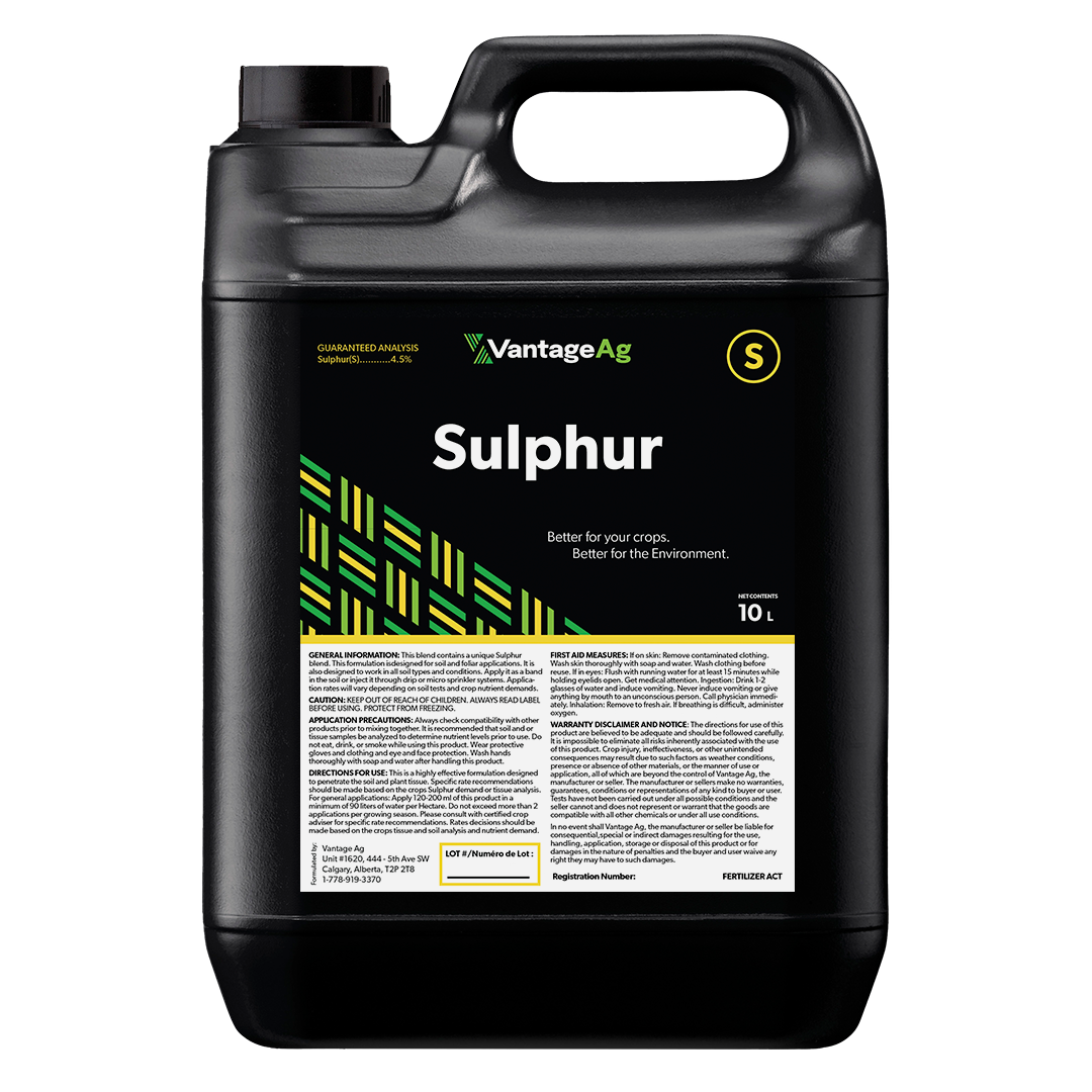
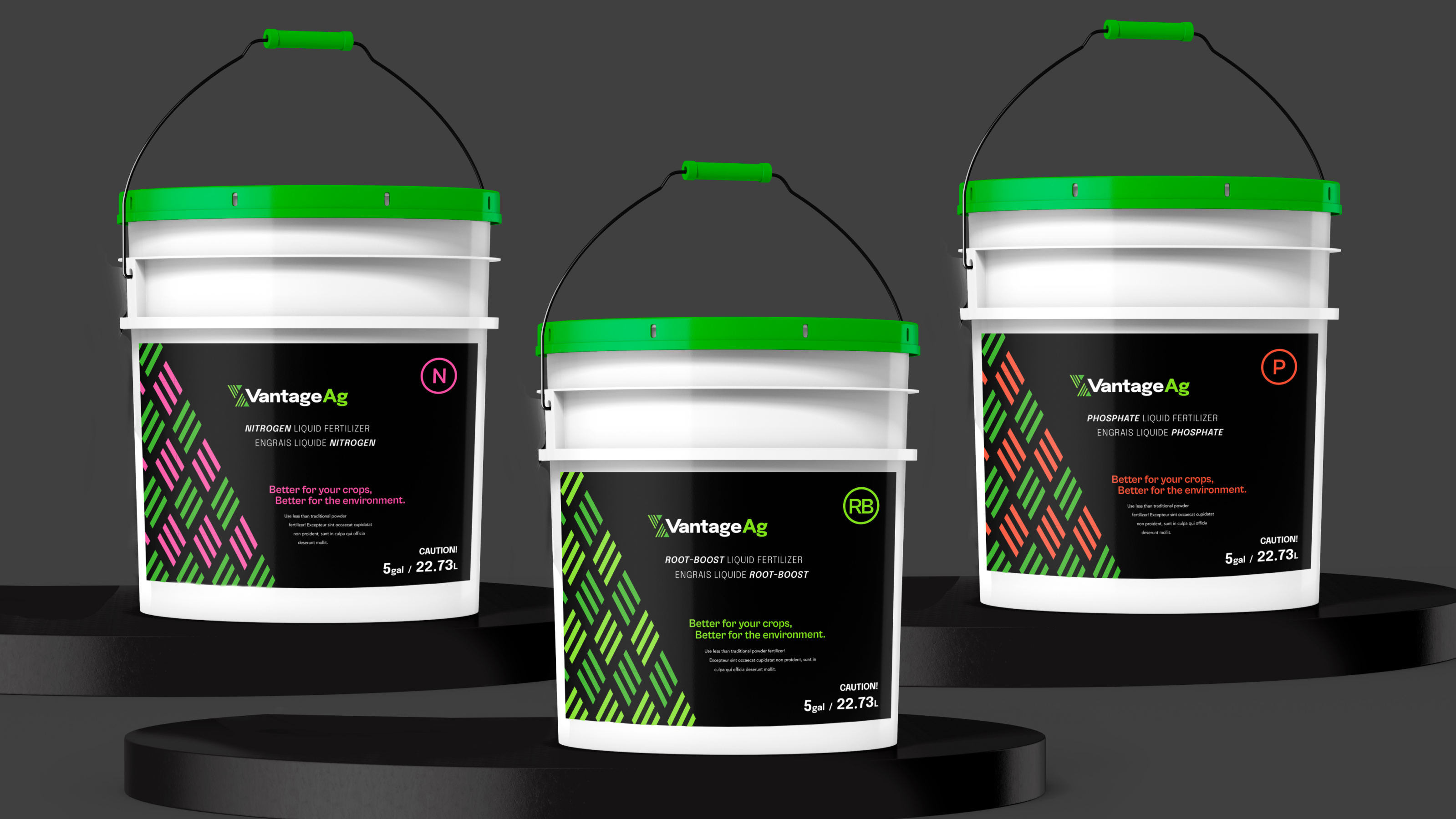
    • Product packaging
  • Custom design & strategic site architecture
    • Custom infographics
    • Site architecture comprehensively built with users in mind
  • Website design & development

Getting Down to Business  

Brand Identity

Our goals with this brand were to convey a feeling of strength & approachability, while also showcasing how they are technologically advanced & innovative.

We created a scalable design that is professional, yet simple to manage. Without being overly complex, the brand can grow and evolve as the business does.

Logo

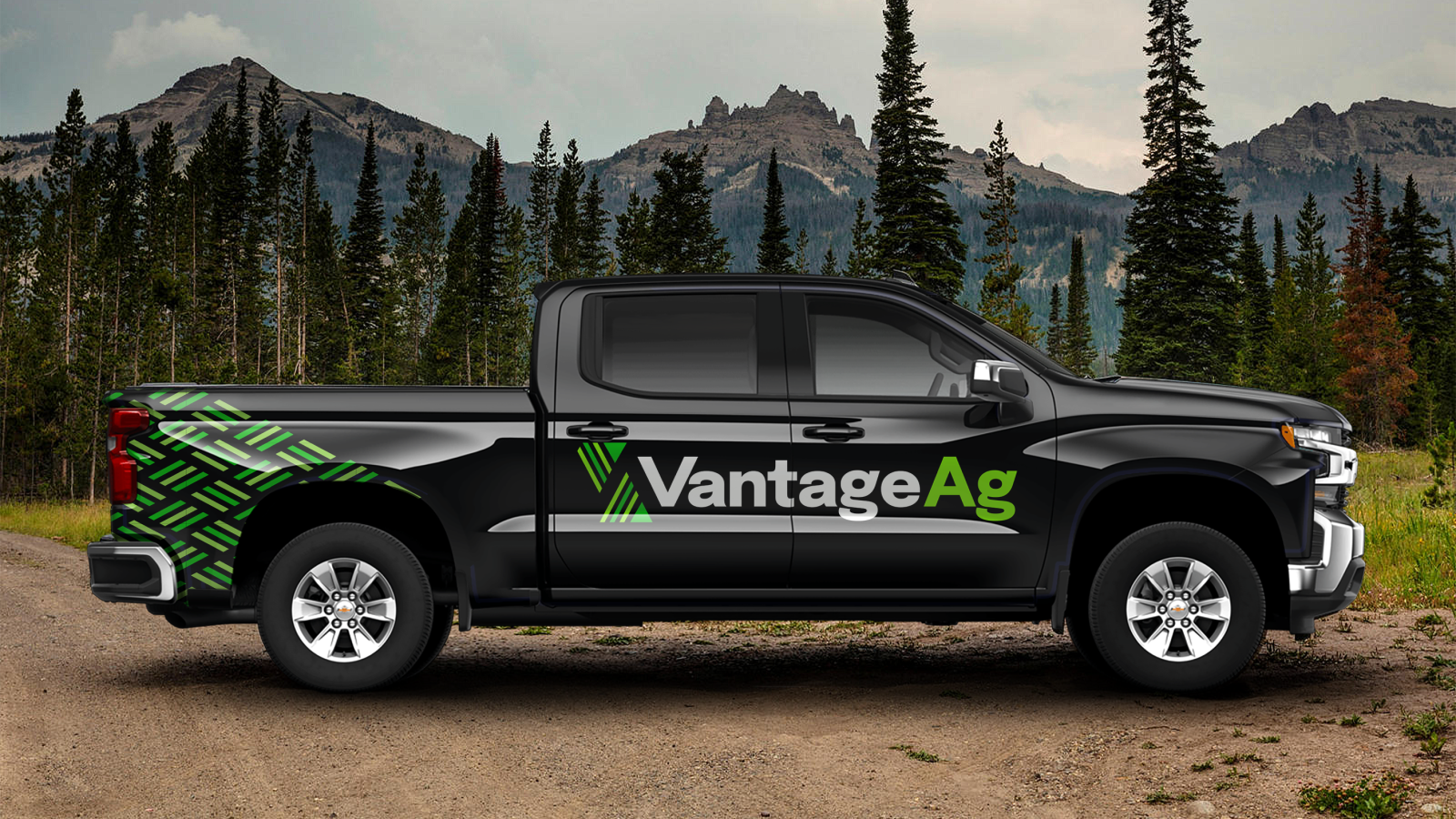
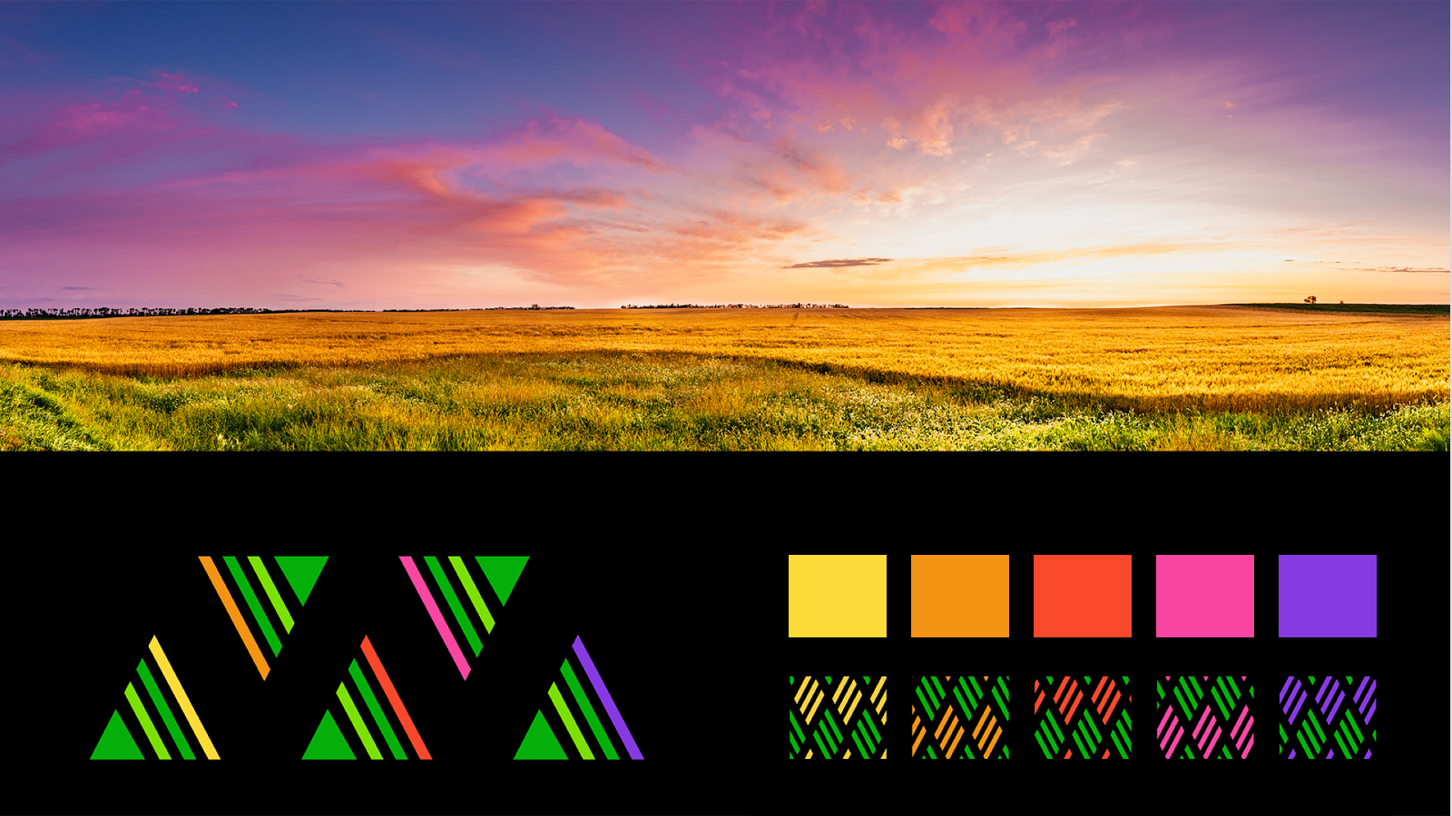
The Vantage Ag logo is simple, clean, and recognizable. It is composed of small line shapes, which play homage to the rows in a farmer’s field. These small lines create two larger triangle shapes that represent the letters V and A in the company’s name.

Colour Palette

Colour is an integral part of Vantage Ag’s brand identity, and reinforces the cohesiveness of the brand. The primary colours are Sprout Green and Harvest Green, with Black as the main accent colour. 

Green is symbolic of the prairies of Saskatchewan, and is known to symbolize growth and renewal. The secondary colours complement the primary colours and represent “dusk to dawn” – Dedicated and hard-working, a farmer’s work never ends.

Website

We needed to create a website that features product details with images and concise descriptions, designed to drive potential new clients to contact Vantage Ag’s team. The design is meant to be scalable, flexible, user-friendly, and easy to navigate, all while meeting accessibility guidelines.

Leveraging Vantage Ag’s new branding, we used images and illustrations to further highlight their technology, educating end-users about the benefits of their products.

Photography

The Vantage Ag brand is about supporting farmers through the innovation of fertilizer technology, and strong relationship building. The images are meant to balance the stories of these people and the positive effects of Vantage’s fertilizer product.

The photography is clean, natural and professional. We wanted to focus on 3 main aspects: Showcasing agricultural fields from above, relatable farmers at work, and the macro detailed images of plants and all their parts.

Infographic

Combining design and development, we created a custom animated infographic to highlight and explain how Vantage Ag’s sub nano technology actively works. The infographic visually breaks down technical information in a digestible way. Oh, and did we mention that it’s cool to look at too!

Celebrating The Wins

Our partnership with Vantage Ag was collaborative and creative. We created a bold and refreshing design that sets Vantage Ag apart, while showcasing them as a leader in their industry.

“Rock & Bloom does outstanding work, we have had many compliments from our customers on the site.”

Paul, Founder

Check out their new website to learn more about how they’re changing the game for growers everywhere.