
Colour has power. Studies have shown It can impact how we learn, think, and behave. Colour can tell us what to pay attention to and even influences our purchasing behaviours. By using the right consistent colours, your brand can establish trust, familiarity, and evoke emotional cues from your customers.
Yes, you can choose a few colours based on what you like, but if you want to build a great brand, choose your colours strategically with your customers and business goals in mind. Try this trusted and true process for choosing brand colours that resonate with your audience and propel you toward your company’s vision.
The 6 Step Process to Choosing the Perfect Colours for Your Marketing, and Your Brand:
- Determine your brand personality
- Determine your audience
- Know your competitors
- Select colors based on psychology
- Test it
- Keep it consistent
Think about how you want people to talk about your business when you are not in the room. Is your business playful or serious? Young or mature? Elite or for the masses? Colour can help convey how your brand is perceived.
Step 1: Know Your Personality
Mcdonald’s is a brand built on happiness. They want every interaction with them to be a “feel good moment.”. Historically they have been a red brand with a touch of yellow. In their latest brand reveal, McDonald’s has shifted the emphasis to yellow instead. This refocus helps their brand evoke more feelings of warmth, joy, optimism, and excitement. It also helps differentiate their brand from others in the restaurant industry, which has defaulted to red. “Too much red in the brand felt aggressive and shouty,” says Colin Mitchell, VP Director Global Brand, McDonald’s. “You can’t help but feel happy when you see the sunshine yellow.”

Step 2: Know Your Audience
Who are you trying to reach? Where is your market? What kind of emotions do you want them to feel? Is there a colour that resonates more to them? Think about who your main audiences are, and put yourselves in their shoes. Or better yet, ask them if you can! Keep in mind that colour can mean different things in different cultures. Knowing your audience is key. Beyond their background and demographic info, include things like their goals, challenges, what a day in their life looks like, routines and online behaviours, personality, brand affinities, quotes, and marketing messages.
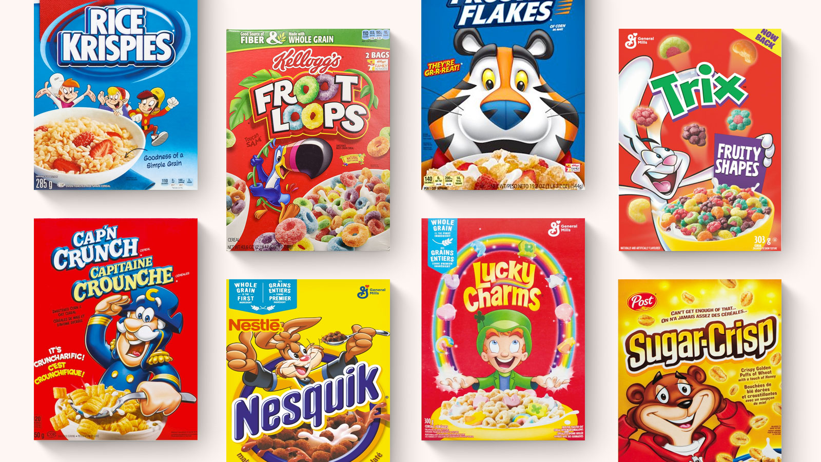
Food packaging is a huge factor in our purchasing decisions. Brand colours need to be cohesive and memorable —eye-tracking studies show that consumers read on average only seven words in an entire shopping trip, buying instinctively by colour, shape and familiarity of location. Think of a wander through the cereal aisle. What do the Trix rabbit, Tony the Tiger, Toucan Sam, and Cap’n Crunch have in common? They’re all bright, cheery cartoon characters. That’s because they all have the same audience — young children. Would a black and white cereal box be picked off the shelf by an eight-year-old? Doubtful.
Step 3: Know How You Compare
If your main competitor is using the colour red, you likely do not want do the same. Whether you are rebranding or creating something new, test your brand next to your competitors. It’s important to be memorable and catch your target audience’s eye. Standing apart is great, but it’s important that your brand still fits in –- using colours that are too unique can actually have a negative impact on your brand.
Step 4. Know Colour Psychology
Colour has an impact on how we think, feel, and behave. There are many studies on the psychological effects of colours, but when it comes down to it, we all have our own personal experiences that shape our view perspective and affect purchasing decisions. In different contexts, we do not all react to colours in the same way because of our background, culture, and personal experiences. Generally, though, the majority of people respond to colour in these ways:
Red
Strength, Power, Passion, Energetic, Attention-grabbing
- Triggers appetite
- Conveys strength, energy, and confidence
- Attention getting and high visibility
Brands: Coca-cola, Target, Netflix, Youtube
Orange
Positivity, Warmth, Cheerful, Enthusiasm, Innovation
- Attention getting — used in construction settings
- Association with warmth of the sun and refreshing citrus
- Friendly and adventurous feeling
Brands: Home Depot, Amazon, jbl, Fanta, Crush, Harley Davidson
Yellow
Intellect, Joy, Energy, Creativity, Optimism, Warmth
- Can be attention getting — think highlighter
- Can be difficult to read
- Can often be described as cheery and warm
Brands: Mcdonalds, Nikon, Post It, Sprint, Subway, Shell, Best Buy, Natural Geographic, Cheerios, No Name
Green
Growth, Freshness, Environmental, Relaxing
- Links us back to nature — can be refreshing and calming
- Used in Health-based stores
- Sign of growth — both plants and money
Brands: Spotify, Starbucks, Wholefoods, BP, Animal Planet, Spotify, Heineken, Tic Tac
Blue
Loyalty, Trust, Intelligence, Stability Calm
- One of the most liked colours around the world and most preferred by men
- Seen as calming, stable, and reliable, but can also feel cool or sad
- Intelligence and trust is used extensively in the tech and medical industry
Brands: Dell, At&t, WordPress, Facebook, Twitter, Kleenex
Purple
Wealth, Royalty, Imagination, Wisdom, Magical
- Tends to rarely occur in nature, so it is viewed as rare and intriguing
- Known to be a polarizing colour– people either really love it or hate it.
Brands: Cadbury, Fedex, Hallmark, Yahoo, Wonka
5. Test It
When it comes to choosing colours, test it out! Try colours that are associated with your brand’s personality, change combinations and placement to see what fits best. In the end, always bring it back to your business goals. Ask yourself these questions:
- Are these colours bringing out my brand’s personality?
- How will this make my customers feel?
- How do my colours compare to my competitors?
6. Keep it Consistent
After you decide on a colour palette, keep it consistent. By using the same colours throughout your branding and marketing, your customers will become more familiar with you. Better brand recognition also increases the trust you establish with your customers.
There is much more that can be learned about colour theory in branding and marketing. From audience to industry to placement to objectives, there is a lot to think about. We love talking colour and brand — If you have more questions, contact us!