
SK Startup Institute, formerly known as Square One, is committed to helping entrepreneurs, whether they’re starting their first business or growing an existing one.
Led by an incredible team of business advisors and industry experts, and backed by critical research data, SK Startup Institute supports entrepreneurs every step of the way and connects them with the tools and resources they need to make their dreams a reality.
Delivered by SREDA, the SK Startup Institute has helped over 4,000 entrepreneurs and small business owners with the first steps of starting, operating, and growing their business in Saskatchewan since 2014.
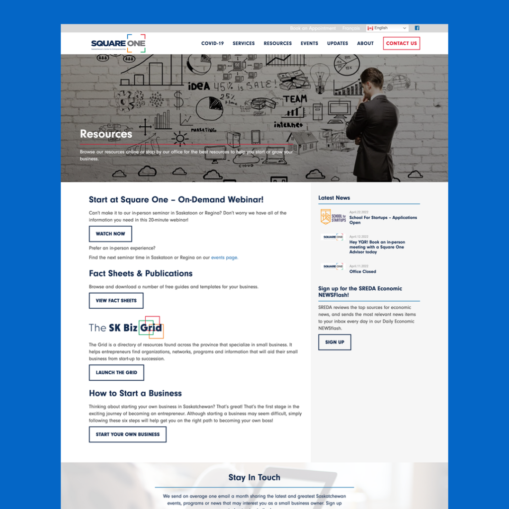
The team at SREDA came to Rock & Bloom as Square One, with the goal of renaming and rebranding the program in the hopes that it would reach more entrepreneurs across Saskatchewan.
The Problem
The ‘Square One’ name and brand wasn’t having the impact that the organization had envisioned. They really wanted to focus on the Saskatchewan aspect, and make it clear that the program is available province-wide. The second piece was to ensure that it was clear who the program is for – entrepreneurs in the starting phase of their business.
“The goals were, first and foremost, to really create a brand that entrepreneurs in Saskatchewan could relate to, felt comfortable with, and that there was an understanding that this program is province-wide,” says Erin Lawson, Vice President of SREDA.
“When we looked at the rebrand, we wanted to find an agency that was passionate about creating something local. The SK Startup Institute is a local organization, province-wide, supporting Saskatchewan entrepreneurs. So we wanted someone who had that kind of energy and excitement about creating something special.”
The Scope
The project scope included:
- Brand Strategy, including Key messaging & personas
- Website Strategy
- Naming
- Visual identity
- Card sorting & tree testing surveys
- Website redesign
The Process
- Naming & Brand Strategy
Naming
When coming up with a new name for the program we wanted to ensure that we would generate interest from key audiences, create an easy to recall, self-explanatory and memorable name, and ensure that the program is positioned as the first place entrepreneurs visit.
Through collaboration and iteration we landed on SK Startup Institute. The name speaks to the target audience, is clear and concise, and identifies that the program is province-wide, which was a particular pain point of the former name.
Brand Strategy
Our brand strategy involves a brand sprint, audience personas, and key messaging. The brand sprint aligns both teams on what the goals are for the project, and allows us to build a roadmap to success. Personas and key messaging are crucial components of a successful rebrand, as personas determine who we are speaking to, and key messaging determines what we are trying to say.
“It’s the first time since I’ve been at SREDA that we really stopped and sat down and thought through our target audiences and our messaging and what we want to be,” shares Lawson. “In the past, I think we’ve all known it, but we really haven’t talked about it as a group. So that was nice because I think that uncovered some things that maybe we all knew, but without saying it out loud we weren’t able to give it the full potential.”
The brand strategy process is iterative, taking in feedback from both sides, encouraging conversation, and building on ideas to create an end product that is strong and representative of where the brand is going.
“I really enjoyed the initial stages of discovery and just really getting a chance to talk about what this brand means for us as an organization and as a team, and also, what it means for our clients and this province,” says Lawson. “So from that I think we walked away with a better understanding of what we are and what we could be.”
- Visual Identity
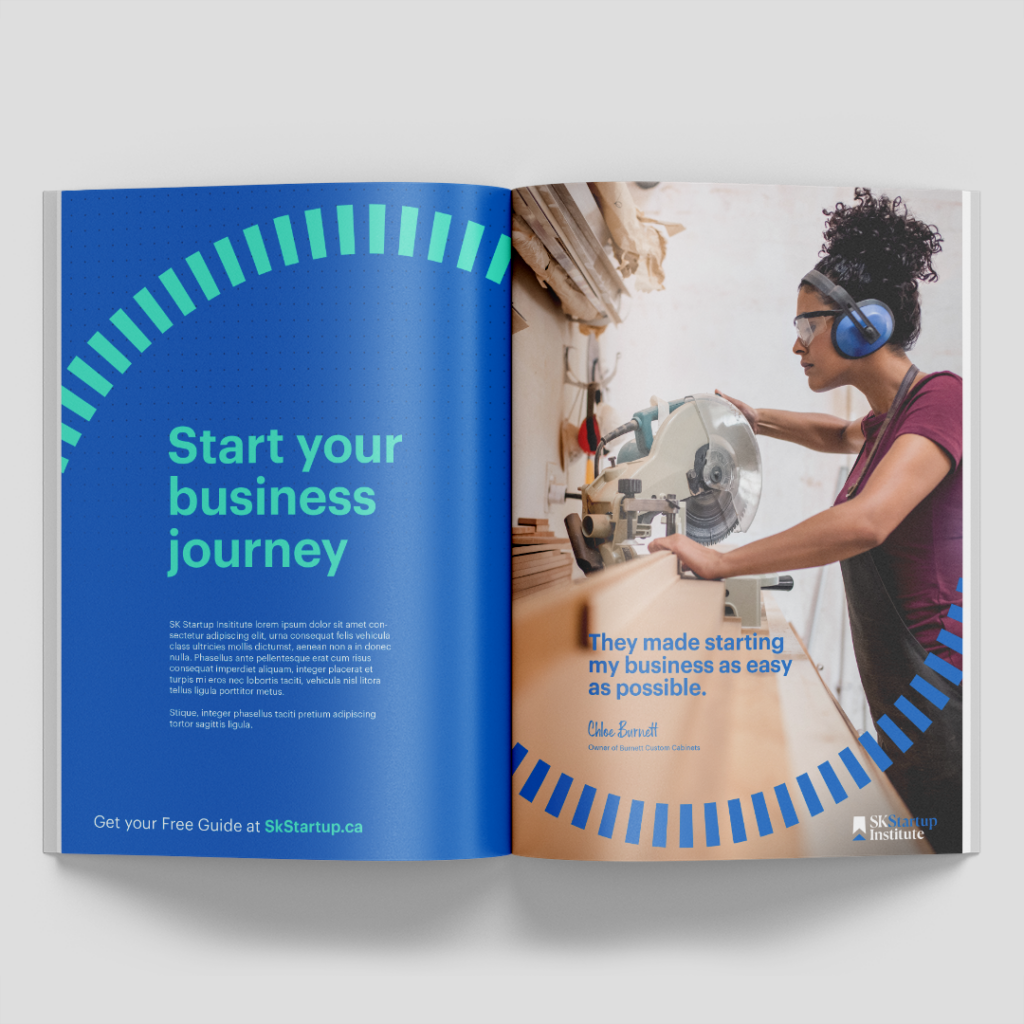
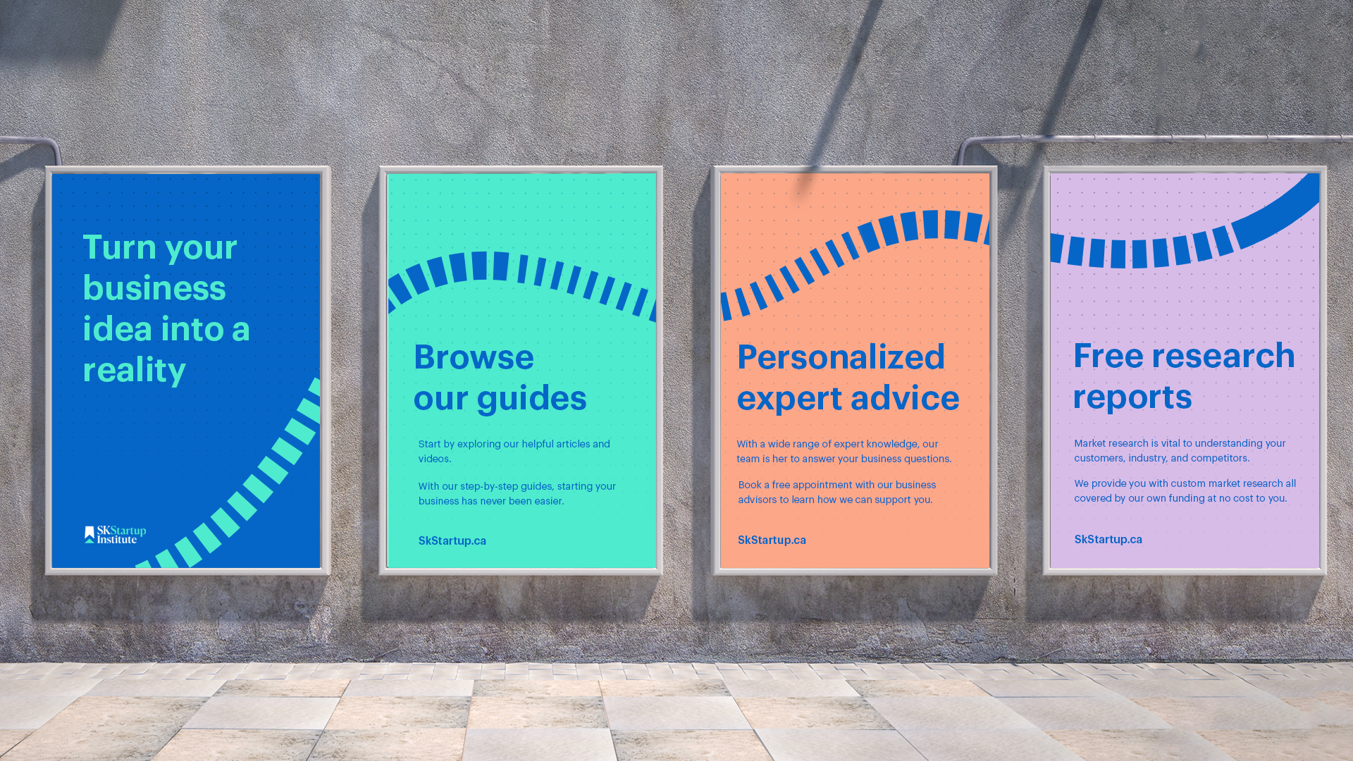
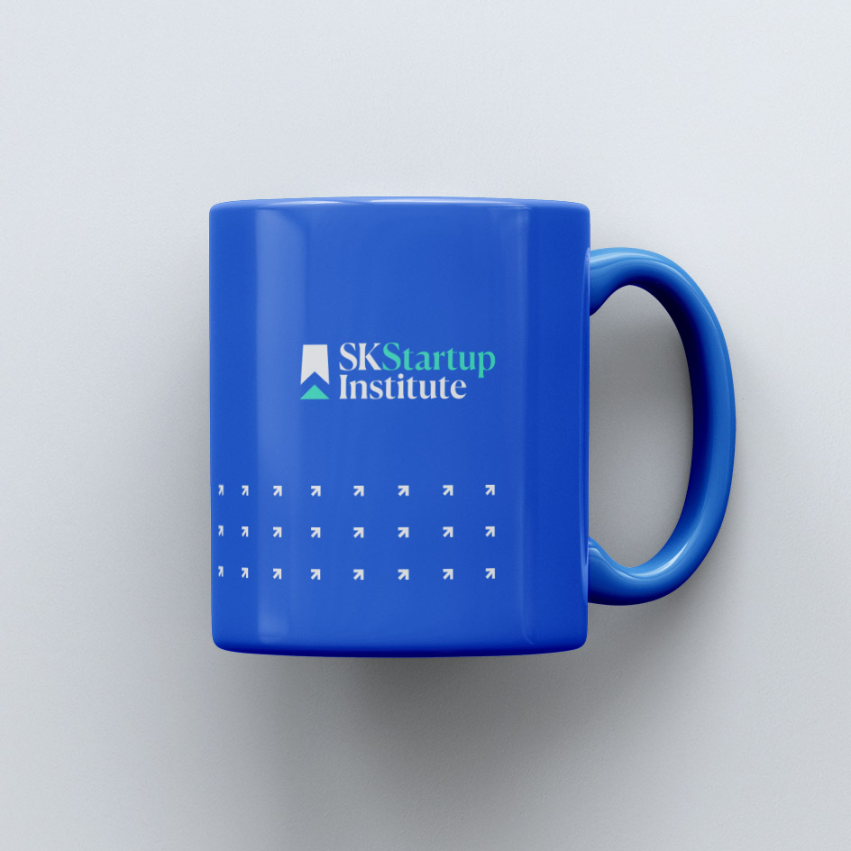
We knew we needed to make SK Startup Institute stand out. Featuring rich blues and bold pastels, friendly icons, as well as fun textures and shapes, we were able to add personality to the brand and the website.
“We talked about this brand being a mix of a professional, really strong knowledge source, but then also having that whimsical, approachable vibe,” says Lawson. “That mix was really important to us because, yes, we are certainly experts in what we know, but we also want to be really approachable.”
Logo
The Logo is simple, yet powerful. The Saskatchewan icon representing our Prairie home sits next to the wordmark. Both work on their own, but come together to create a logo that perfectly encapsulates the program.

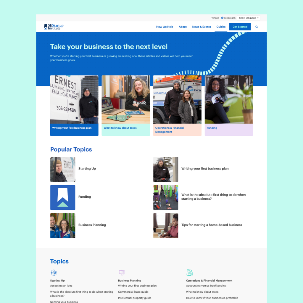
With brand strategy and visual identity under our belts, it was time to move on to the website redesign. We infused life and personality into the design to make it as approachable as possible. The photography, colours, icons, and textures all work together to create a seamless experience.
We worked hard to ensure that the user experience would be a positive one from a functionality standpoint as well. This meant simplifying the navigation, carving out a path that would require the fewest clicks, and creating an easy-to-use repository for the guides section.
“With the new website, people – whether they’re entrepreneurs or business partners or lawyers or accountants or Chambers of Commerce – all now see themselves as part of this program or a potential partner on it. And that’s been huge for us.”
Visit their website here.
- Launch & Outcomes
Just three weeks after launching SK Startup Institute, SREDA’s new entrepreneurship program received over 125 inquiries from entrepreneurs across Saskatchewan for guidance on starting their business.
“It’s been huge for us. Bigger than we imagined,” shares Lawson. “ It’s amazing how a name change and a new brand can wake up people to things that have always been here. We’ve always provided these programs and services, and we’ve always been Saskatchewan-wide, but yet that change and that switch made people reach out to us and say, ‘Hey, I’d like some more information’, as well as open doors for new partnerships.”
We were super excited to work with SREDA and SK Startup Institute on this project. Supporting local businesses in Saskatchewan is what both of our teams are most passionate about. We’re incredibly honoured that they trusted us with this rebrand.
“I thoroughly enjoyed the experience from start to finish,” says Lawson. “I felt like we were one team working together and that the Rock & Bloom team was really good at asking the questions to really understand who we are – and then that was shown throughout the website and brand. We’re happy to have someone like Rock & Bloom in our city helping small businesses and entrepreneurs with their marketing strategies. It’s really important for the growth of our city.”
Our collaboration with SK Startup Institute was a perfect match. To check out the new rebrand visit the website. Together we built something that we all can be proud of, and that will help Saskatchewan entrepreneurs succeed, long into the future.
