As trusted leaders, aodbt excels at designing and developing spaces with impact. Their diverse team is dedicated to delivering practical and creative solutions to a full range of architectural and interior design challenges for a broad range of clients throughout the prairie region.
As a Saskatchewan staple, aodbt is well-known and revered for their high-quality work. Rather than reinvent the wheel, we wanted to elevate their current brand to match the quality of the work they put out.
Challenge Accepted
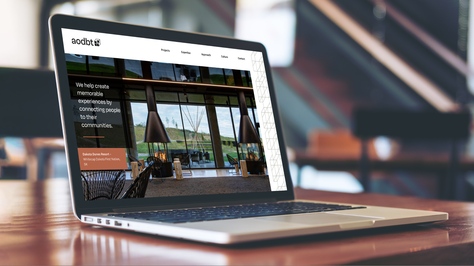
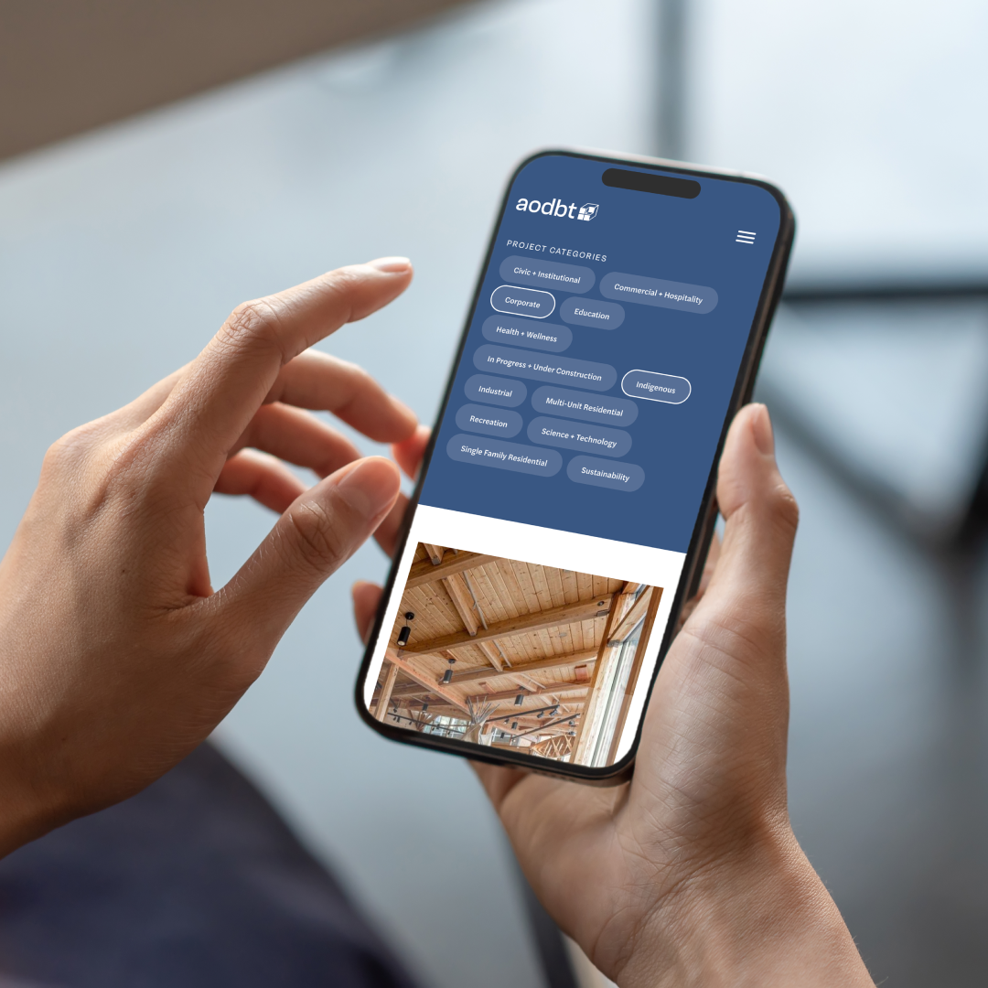
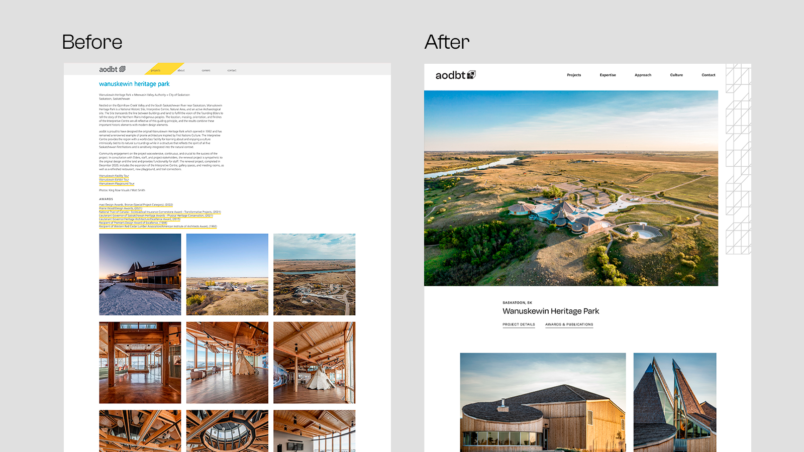
aodbt’s website was outdated and hard to update, offering their team little autonomy. We needed to create a website that combines function and form, much like aodbt does in their own work.
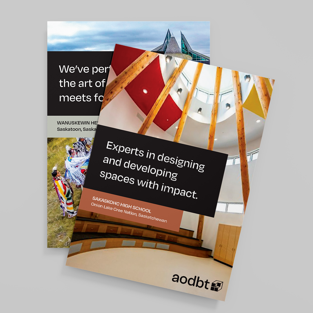
By refreshing the logo and redesigning the website, we were able to show off their diverse portfolio of work, highlight the experience of working with aodbt, and enhance the overall user experience.
Big Goals Lead to Big Gains
The project scope included:
- Brand strategy
- Key messaging
- Personas
- Brand & logo refresh
- Website redesign
Getting Down to Business
Logo
When refreshing the logo, we wanted to ensure that we were paying homage to aodbt’s history and their current recognizable brand.
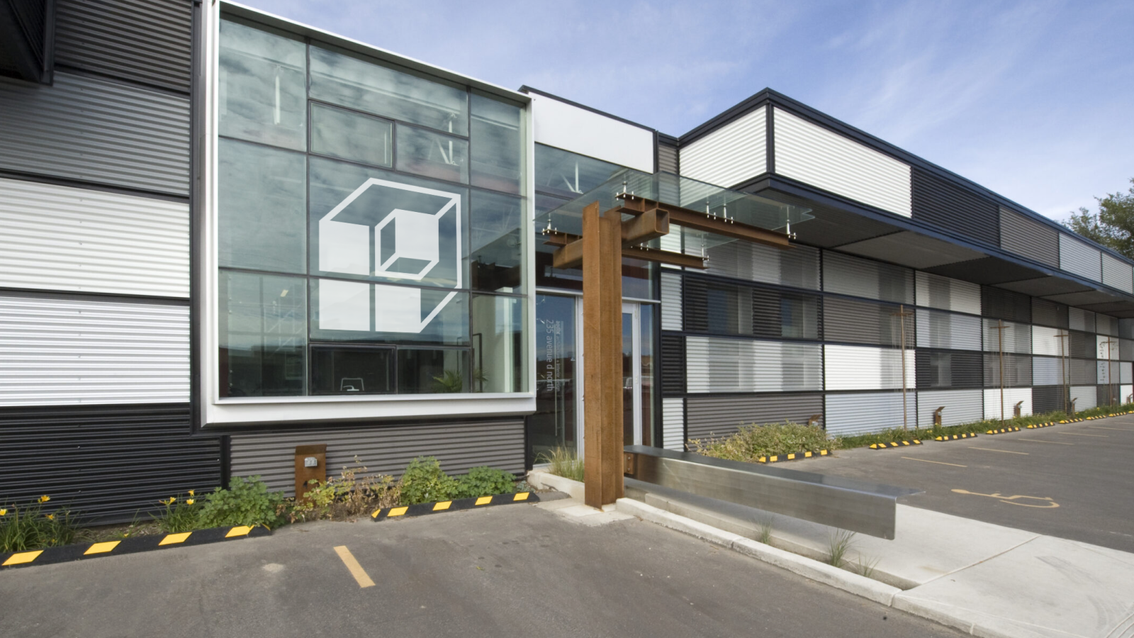
We decided to keep the iconic cube, but update it to allow for future growth. We started by stripping the logo down to its foundation and rebuilt it from there. Inspired by their long service award, we used less lines, allowing for improved scalability. We wanted the cube to be versatile so that it could work with a variety of projects.
Colours & Fonts
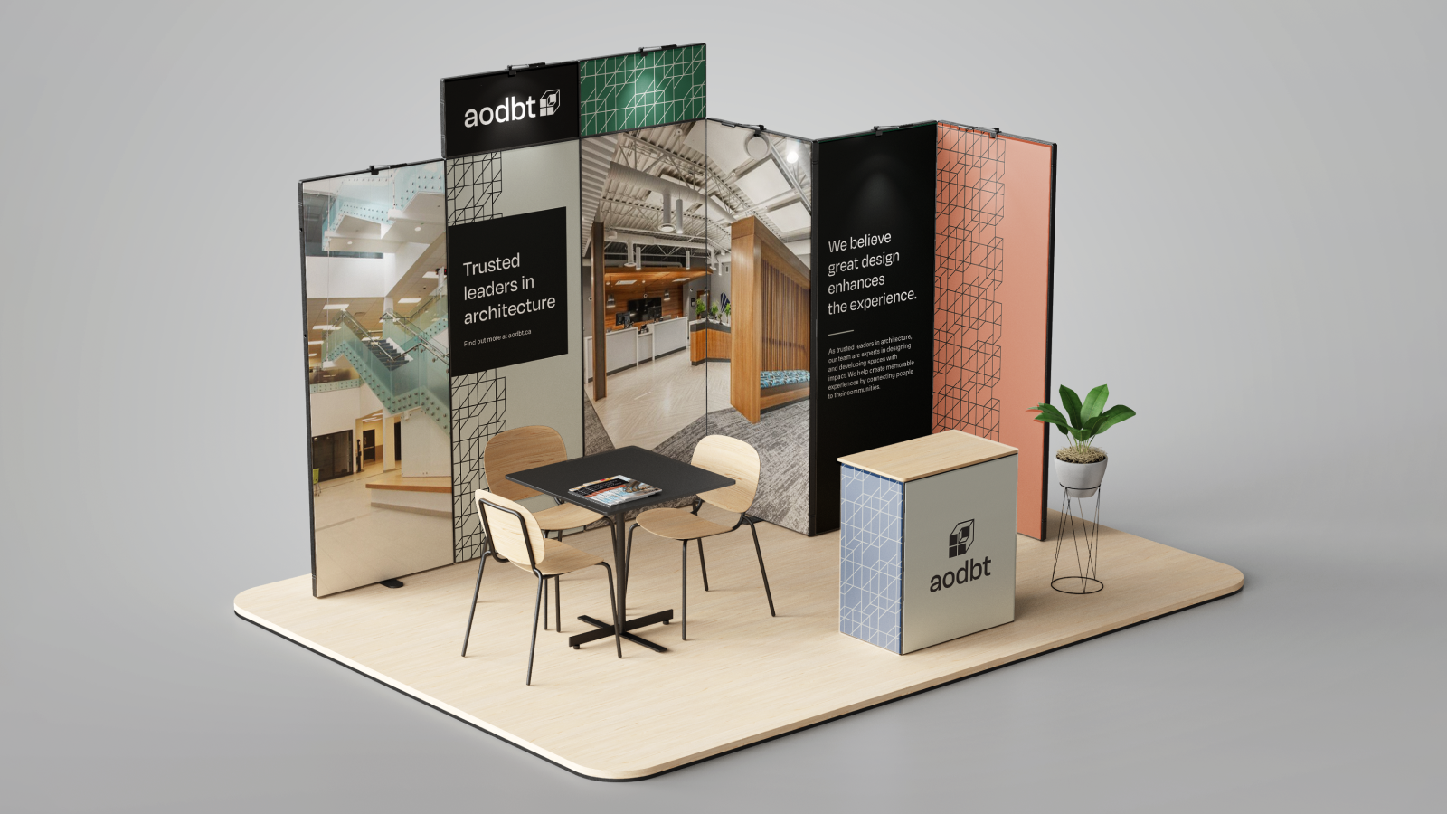
To complement the new logo, we chose modern colours and fonts, embodying a young and innovative look, while remaining polished and professional.
The color palette was inspired both by building materials, such as the ones used in the aodbt office, as well as the sustainability, warmth and community aspects of their finished spaces.
We chose a larger font with larger counter forms (the spaces inside the letters), which help with scalability and makes it easy to read at a range of sizes. The font also features squared off corners, enhancing the elements of the cube.
Website
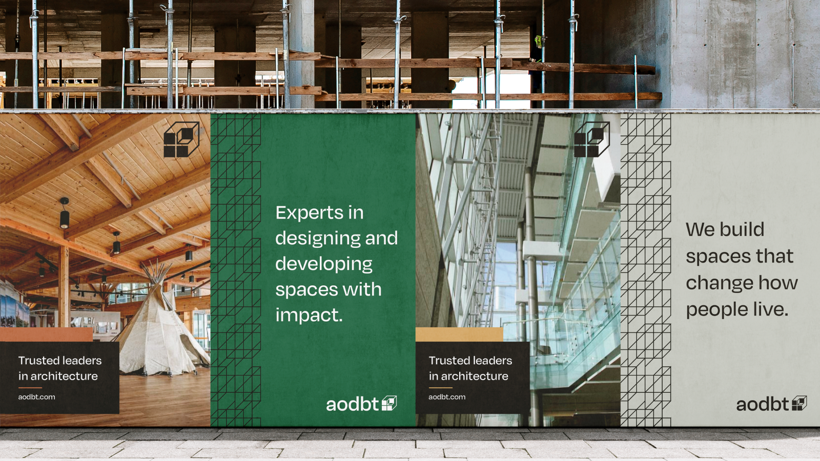
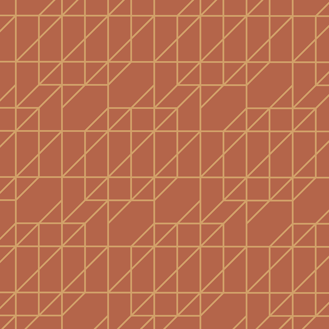
We used subtle design elements through the website such as the graph wallpaper, which is reminiscent of the old logo, while providing an expansion to the visual language for the brand.
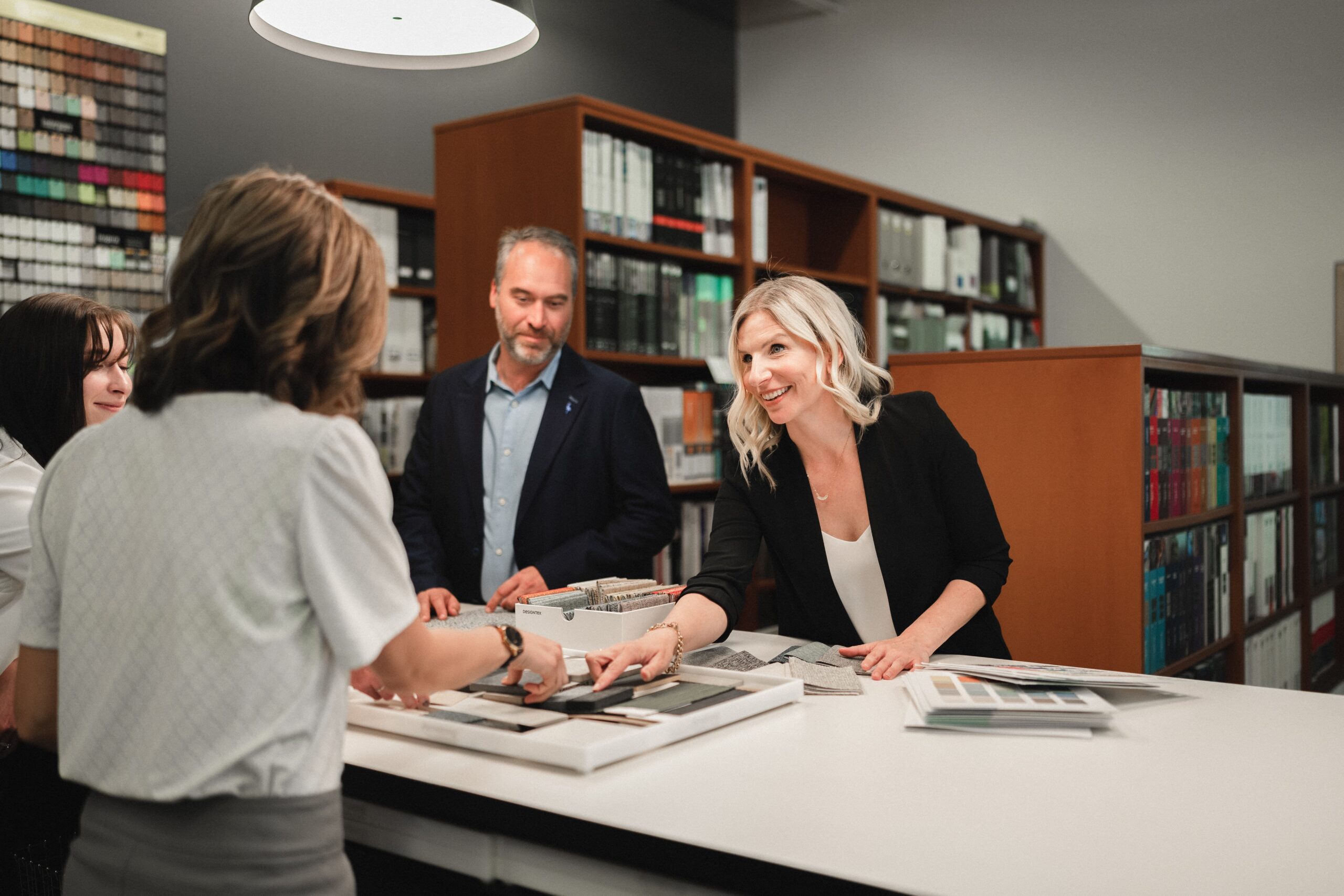
One huge piece of the website redesign was the addition of more human aspects. We really wanted to convey the experience of working at and with aodbt. To showcase this, we focused on their unique approach and culture, emphasizing community and connections, as well as their commitment to diversity and inclusion.
“We help create memorable experiences by connecting people to their communities.” – aodbt
Celebrating The Wins
Our partnership with aodbt was collaborative and creative. Their team offered us their trust, allowing us to innovate and ideate a website that leaves a lasting impression.
Check out their new website and experience the incredible impact they leave on their community