Based in The Netherlands, WMC Energy leverages their network, market knowledge and financial engineering capability to bring the raw materials produced by mining companies around the world to the processors and end-users that help build a cleaner future.
In other words, they provide the resource solutions needed for the global energy transition to an efficient, stable and sustainable society.
A vital mission such as this one needs a strong brand, a functional website, and impactful messaging to support and drive their efforts. We were honoured to take on the challenge and position WMC for growth.
Challenge Accepted
WMC has continued to gain traction; our challenge was to build off of the momentum that has been generated, while attracting and retaining key partners with a credible, professional brand.
Through a balance of professionalism, sophistication and innovation, we wanted to build a strong and confident brand that generates excitement and energy, acting as a foundation for the business as it continues to evolve.
Big Goals Lead to Big Gains
The project scope included:
- Brand strategy
- Key messaging
- Brand identity
- New logo
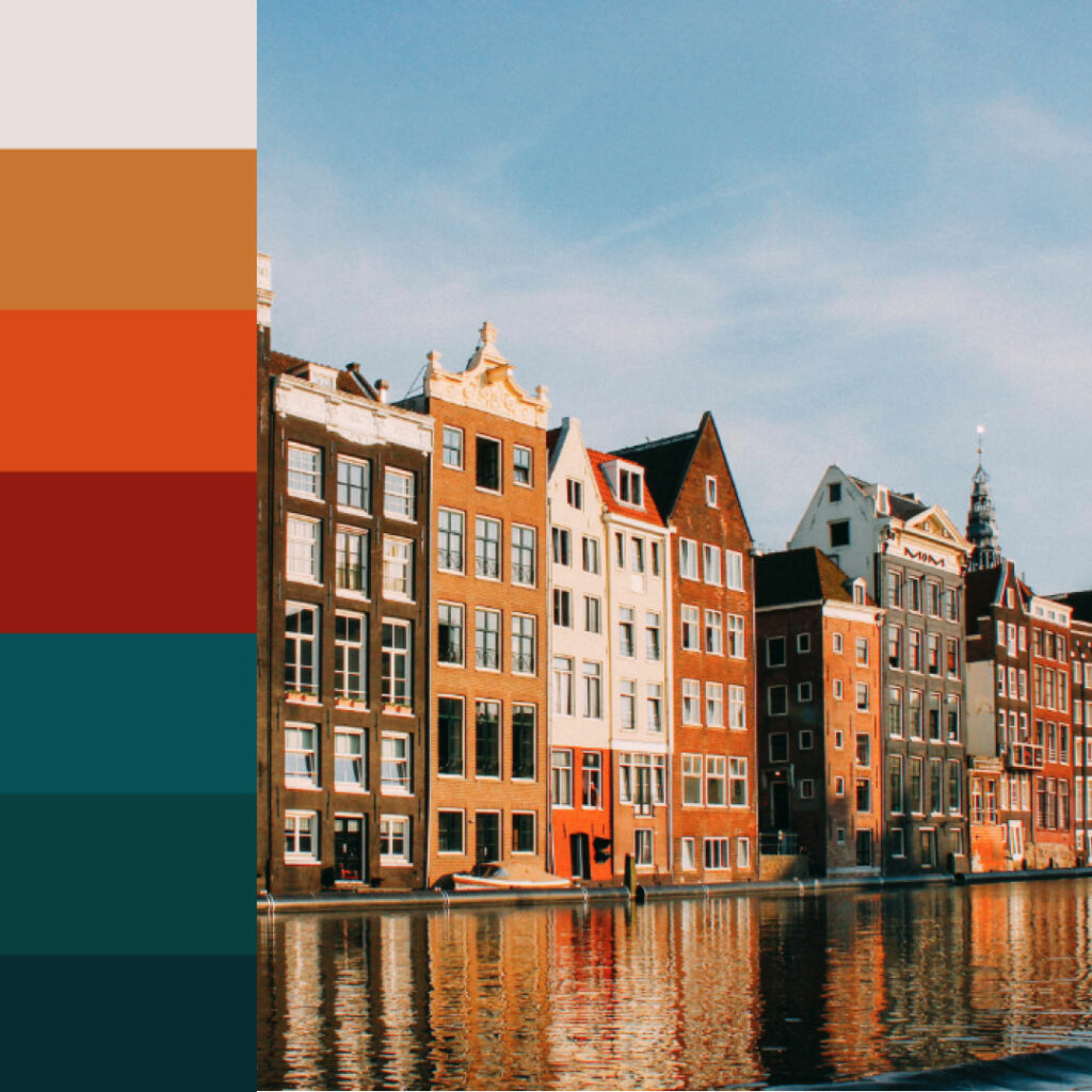
- Colour palette
- Font selection
- Brand guidelines
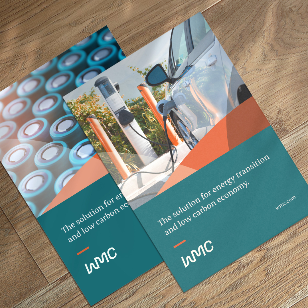
- Marketing collateral
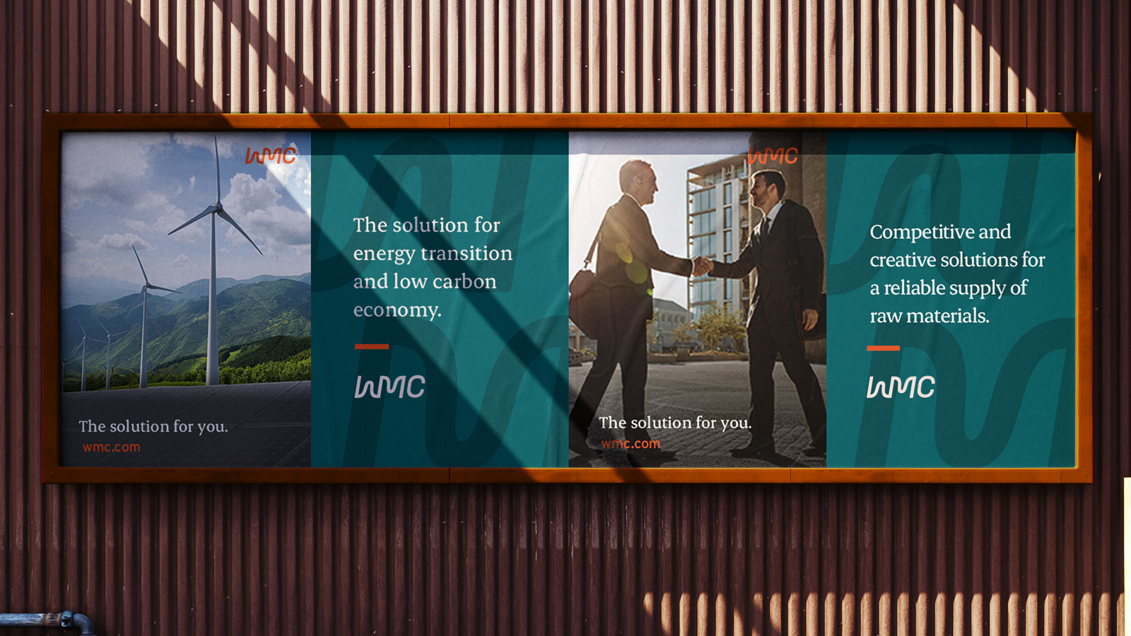
- Website redesign
- Photography creative direction
Getting Down to Business
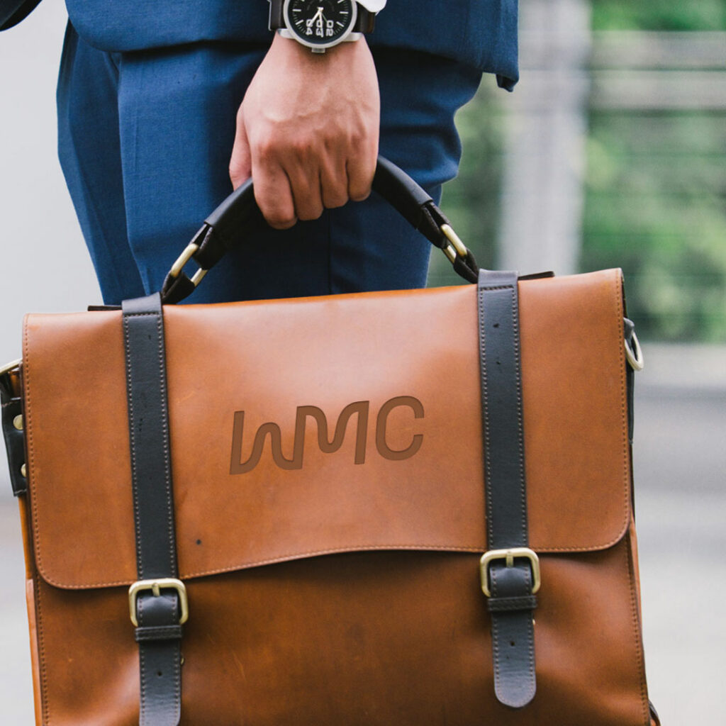
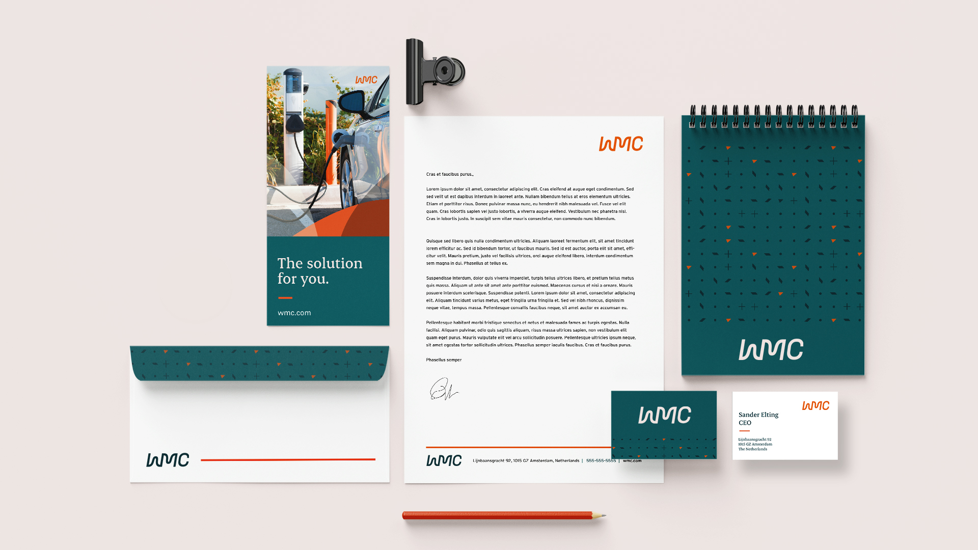
Logo
The WMC logo is simple, clean, and recognizable. We opted for a modern take, while clean lines represent a strong and timeless aesthetic.
The logo is in movement; it’s fluid and flexible. The ‘W’ and ‘M’ connect, representing the link that they provide to a cleaner future.
Colours & Fonts
To complement the new logo, we chose modern colours and fonts, embodying a fresh and exciting feel, while remaining polished and professional.
Colour is an integral part of WMC’s brand identity and reinforces the cohesiveness of the brand. The color palette was inspired by Amsterdam, where it all started. The old palette was cold, whereas the new palette – featuring oranges, reds and golds as accents – is warm and inviting.
Typography is a powerful brand tool when used consistently. We chose a font that perfects the balance of rugged and weathered, creating a sophisticated trustworthiness. Our secondary font is purposefully plain, prioritizing legibility and balancing the expressiveness of the other fonts.
Leah Laxdal, WMC Group, Amsterdam“We are glad to have chosen Rock and Bloom as our rebranding partner. They have done an amazing job in designing a brand and logo that reflects our company vibe, values and most important—ENERGY. We are a dynamic group, who cares about our world’s energy transition, and we feel that our new brand captures this sentiment and drive.
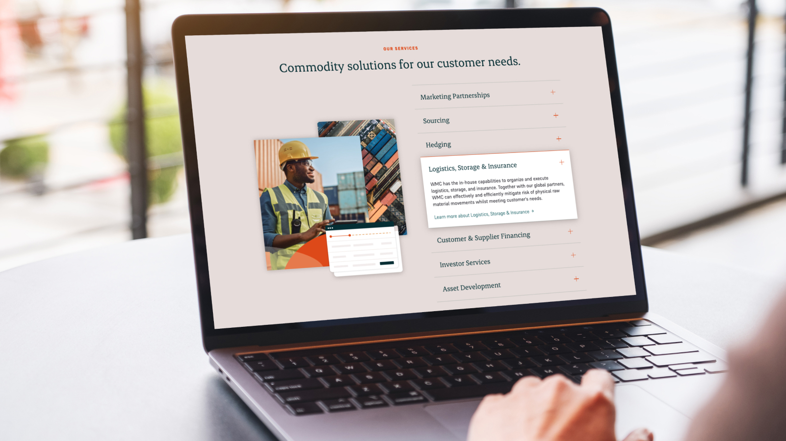
Website
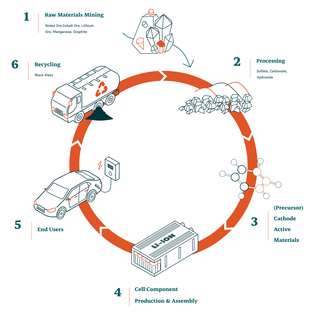
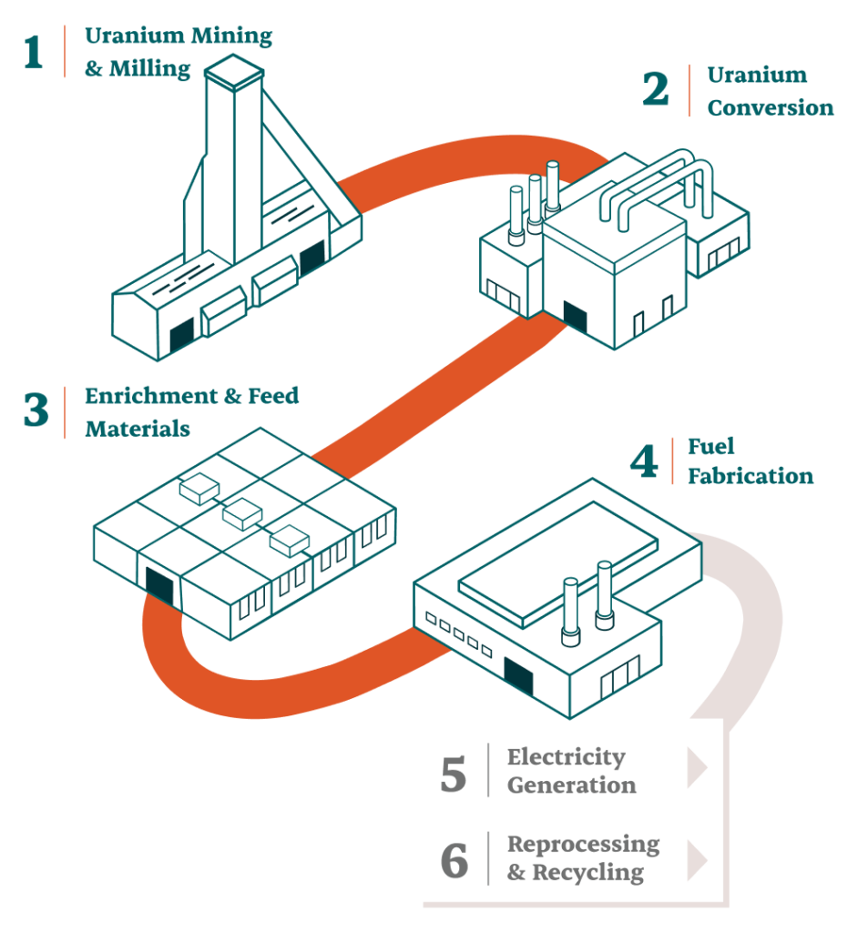
One aspect of this project was ensuring that WMC didn’t come across as a startup. They have the challenge of competing with massive players in the space, and we wanted to make sure they stood out for the work they do.
This meant breaking down a complex business model and making it easy to understand. We created visually appealing infographics that explain their process in a concise and easily digestible way. We also used key messaging to tell their story in a compelling way that would resonate with users.
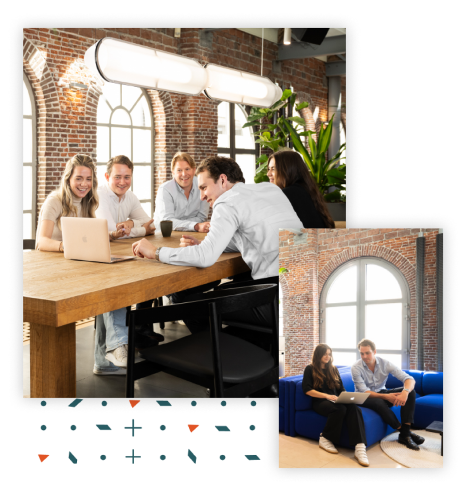
Photography played a pivotal role in conveying WMC brand’s essence and values. We wanted to focus on showcasing people in their visual storytelling, as it aligns with their core business value of building strong and lasting relationships.

Celebrating The Wins
We loved working with this international team. Through thoughtful collaboration and intentional design choices we created a brand that really makes a splash in their industry, helping them stand out from the competition and positioning them for future growth.
WMC is building a reliable business that will continue to grow and expand for many years – this new brand will set them up for success, helping contribute to global energy sustainability and security.
Leah Laxdal, WMC Group, AmsterdamDespite being a company based in Amsterdam, Rock and Bloom were flexible to work around our time difference and facilitate digital meetings that accommodated our busy schedules and varied availability. They provided regular communication and project updates, and they were able to pivot with our feedback throughout the entire project.”
Check out their new brand and website to learn more about how they’re changing the world.