Your brand’s identity is its personality. A brand identity is the basic foundation for brand awareness, it differentiates you from other competitors in the market, and it plays an essential role in all of your marketing efforts.
A brand identity is so much more than just a logo. It’s all of the values and brand elements that go into creating a cohesive branding experience. However, in this journal we will focus on the importance of the logo.
They say never to judge a book by its cover; unfortunately that doesn’t apply to brands. Your brand’s logo is the face of your brand. It’s the first thing that people see and is often used to capture attention. The difference between a good logo and a bad logo can truly make or break your business.
A strong logo is memorable, builds customer loyalty, and communicates your brand’s story. When done right, it should communicate exactly who you are and what you stand for.
At Rock & Bloom, we specialize in helping brands find their voice and tell their story. Sometimes that means building from nothing and sometimes that means evolving and growing. In the case of these brands – their old logos were no longer serving them. They didn’t align with their future goals, didn’t reflect their values, and didn’t tell the right story.
Here are five before & afters of brands who changed their logo to strengthen their brand identity.
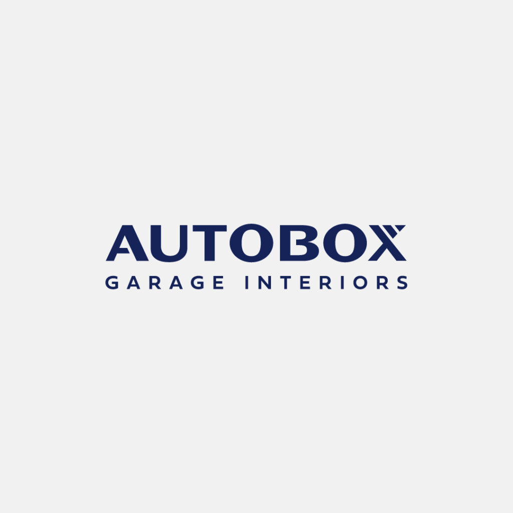
Autobox
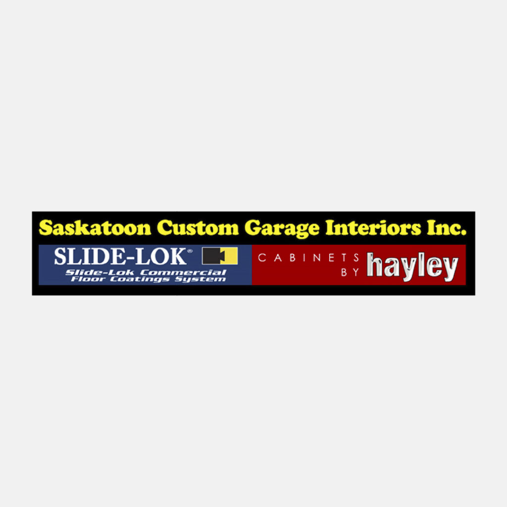
Autobox, formerly known as Saskatoon Custom Garage Interiors, needed a brand that could position them above the rest, for their quality products and exceptional customer service.
Despite being in business for over 13 years, Saskatoon Custom Garage Interiors had very little exposure as a brand. With a new owner and a new showroom being built, there was an immense opportunity to scale the business and capture more market share.
We wanted to position them as a premier garage interior design and product store. We decided to take inspiration from Italian automakers and high-end racers. In Italian ‘box auto’ translates to ‘garage’. We liked that it was one word, simple to remember, and sounded high-end. For the colour palette and the lines, we took inspiration from the original Ford GT40.
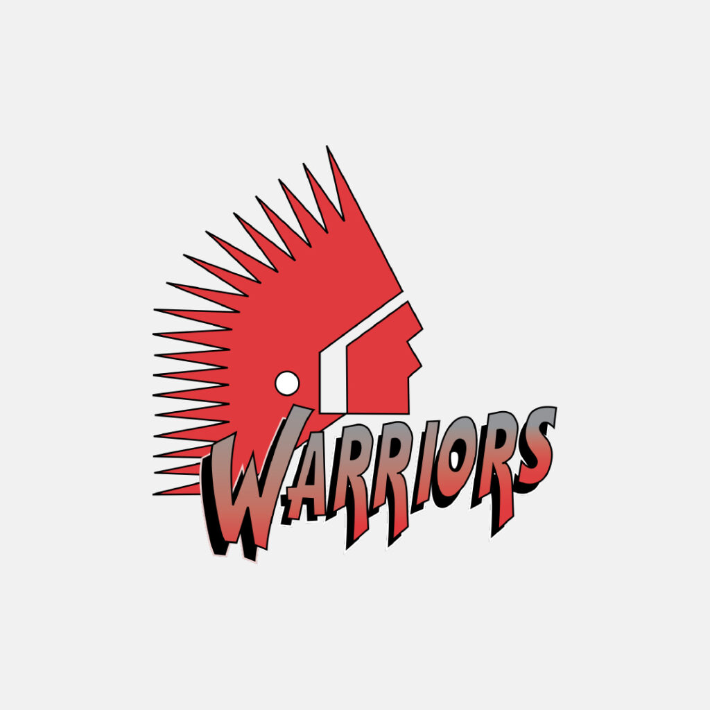
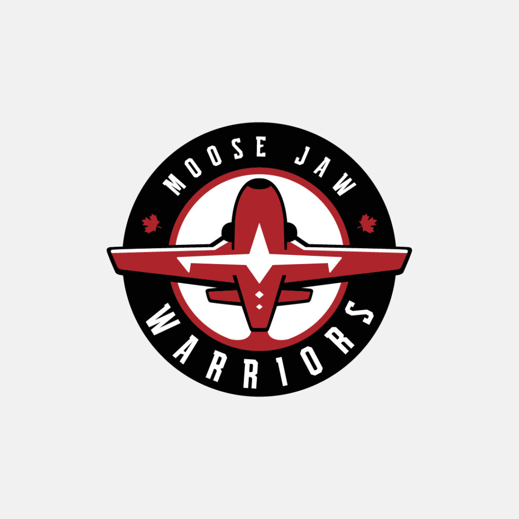
The Moose Jaw Warriors
A proud member of the Western Hockey League, the Moose Jaw Warriors released a new brand logo ahead of the 2022-23 season. The logo change comes after the Warriors announced an official review of their primary logo on October 1, 2020.
We were honoured and privileged to have worked alongside the Moose Jaw Warriors on this rebrand, creating an inclusive logo that represents Moose Jaw’s history.
A lot of thought and attention to detail went into the new logo. The design is inspired by the organization and the community’s connections with the Royal Canadian Air Force, 15 Wing Moose Jaw, and the Canadian Forces Snowbirds, 431 Air Demonstration Squadron. Over the years, the organization and the Snowbirds have built a strong relationship. In 2019, the Warriors were officially appointed as members of the Honorary Snowbird Society.
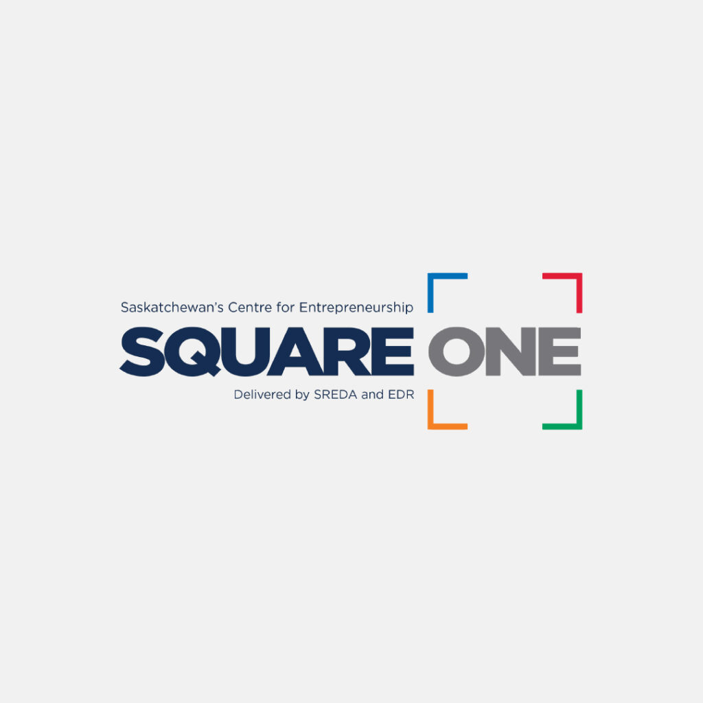

SK Startup Institute
SK Startup Institute, formerly known as Square One, came to us with the goal of renaming and rebranding the program in the hopes that it would reach more entrepreneurs across Saskatchewan. The ‘Square One’ name and brand wasn’t having the impact that the organization had envisioned.
The new logo is simple, yet powerful. The Saskatchewan icon representing our Prairie home sits next to the wordmark. Both work on their own, but come together to create a logo that perfectly encapsulates the program.
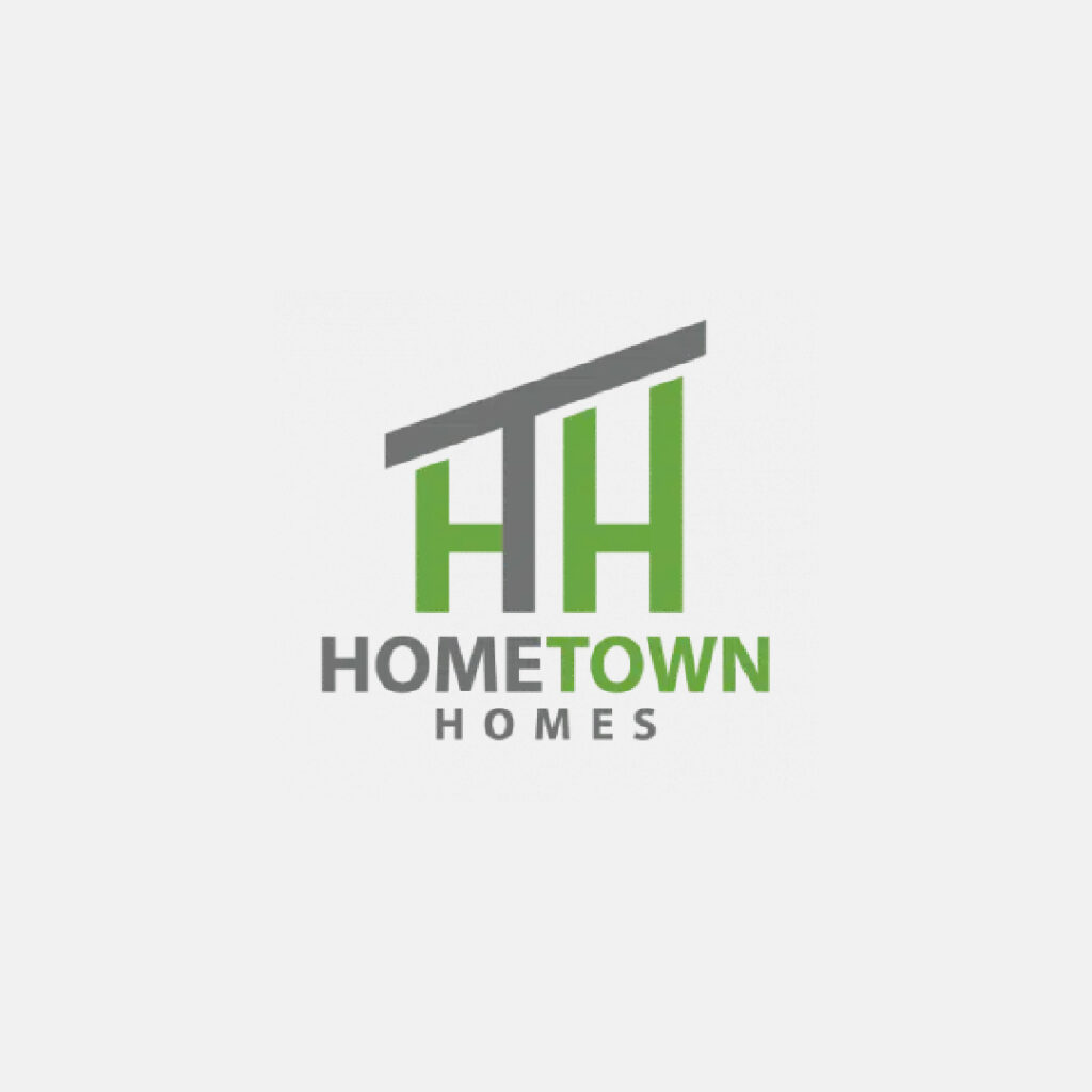
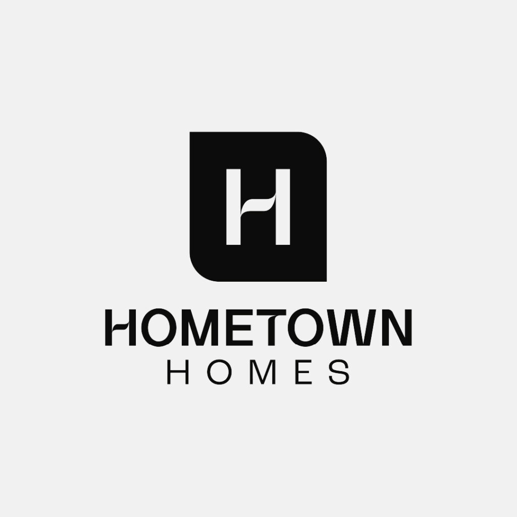
Hometown Homes
Custom home builder, Hometown Homes wanted a logo that represented their hometown roots. They are down-to-earth and grounded, and they wanted their colours and logo to reflect the feeling you get while working with them.
The new logo elevates their look and represents their commitment to quality. It’s warm and inviting; a brand that customers can feel at home with.
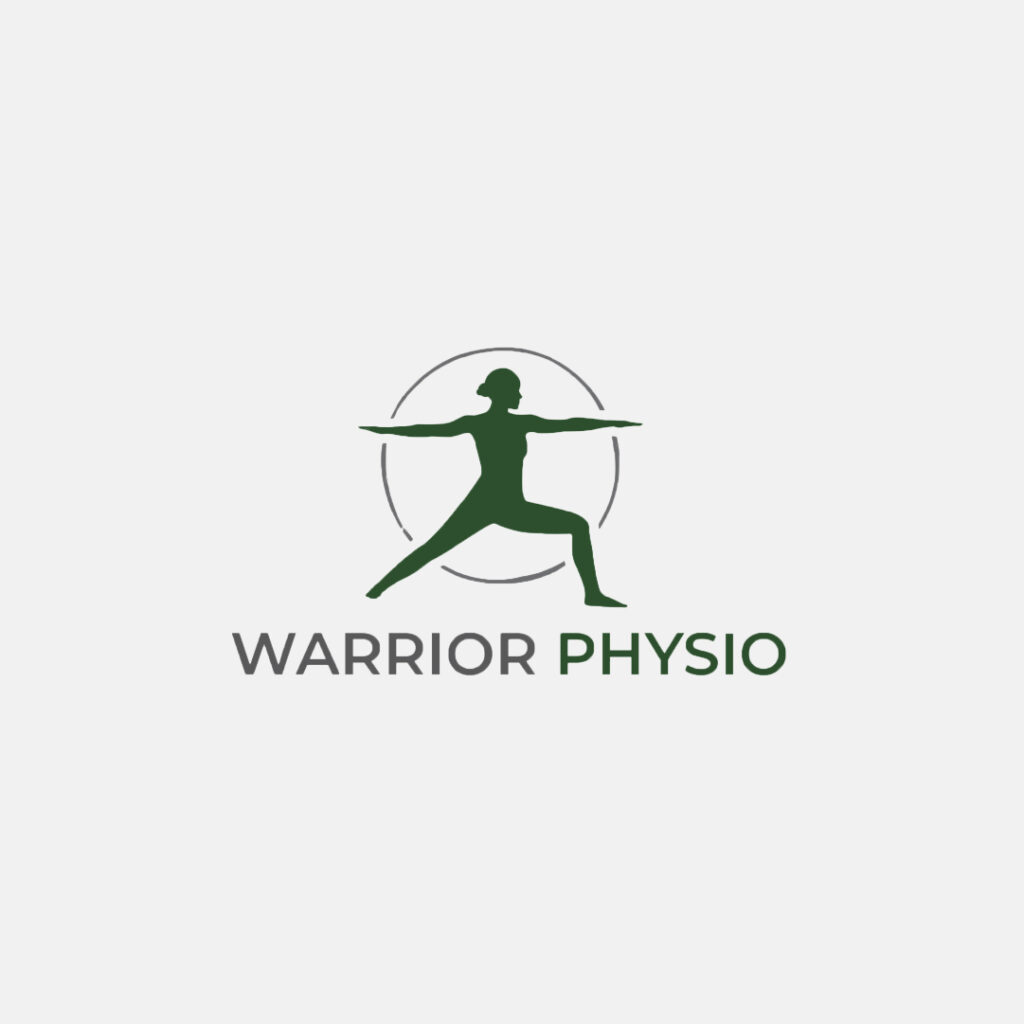
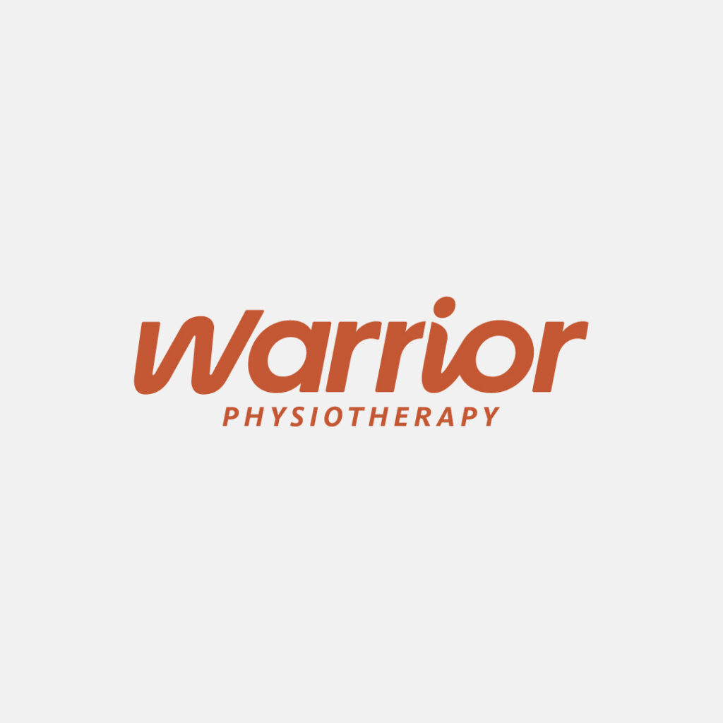
Warrior Physio
Warrior Physio wanted their mission to be evident in their brand identity but felt that it was lacking that connection. The old logo featured a yoga pose, which didn’t apply to their business, and the overall brand wasn’t speaking to the right audience.
We opted for a logo that is clean and simple. The word Warrior stands on its own and evokes strong feelings without the need for bells and whistles. The logo is bold and in motion. The movement in the letters creates a rhythm of movement that draws your eye to the word “warrior.” It is strong but also provides a welcoming feel to potential new customers.