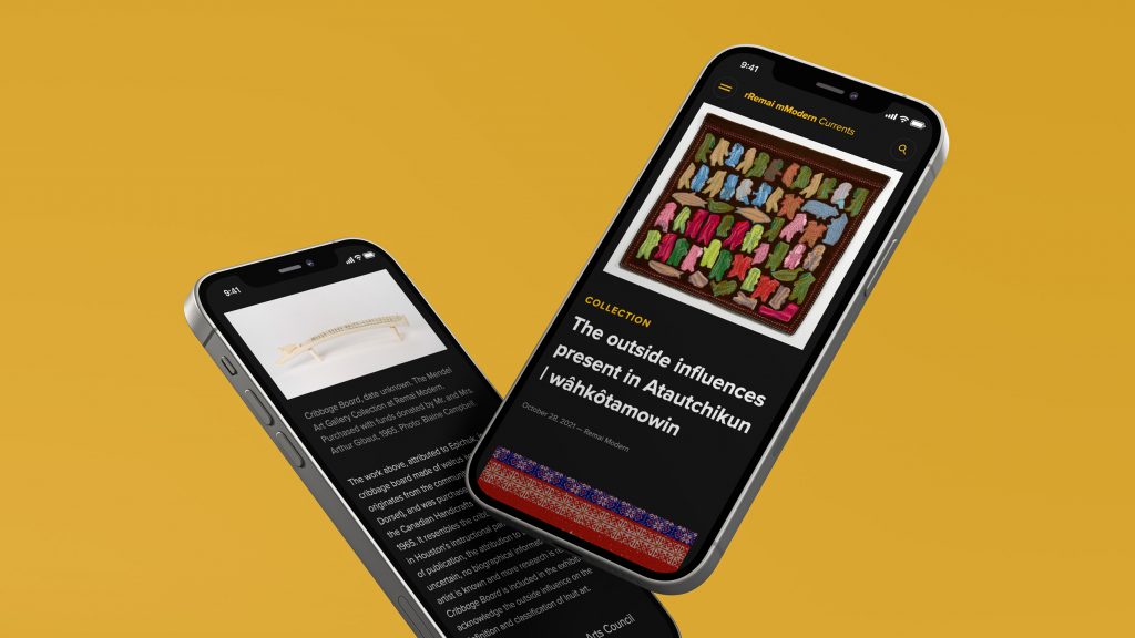
Remai Modern is a museum of modern and contemporary art in Saskatoon, SK.
The museum, which provides a Canadian and Saskatchewan perspective on these art movements, is a place for culture and community.
Remai Modern’s mission is to present art that connects, inspires, and challenges diverse audiences through equitable and accessible programs.
Keeping their mission top of mind, Remai Modern wanted a space for people to engage with the museum even if they could not physically be there. They wanted to make art accessible, while providing anyone with the opportunity to connect with and share content.
Through these goals, Remai Modern Currents was born.
The Problem
Remai Modern had been doing most of their storytelling through social media. They have an amazing team of content creators, but didn’t have a way to showcase their work in an approachable and flexible way.
We needed to create a platform that could act as a place for storytelling, while minimizing the barrier of entry for their audience. We wanted to make use of their existing content and maximize its reach, allowing people to connect with Remai and the art world on a deeper, more personal level.
This goal was even more important through COVID-19, as we wanted to create a virtual doorway to the museum that anyone could access at any time.
The Scope
The project scope included:
- Brand Sprint
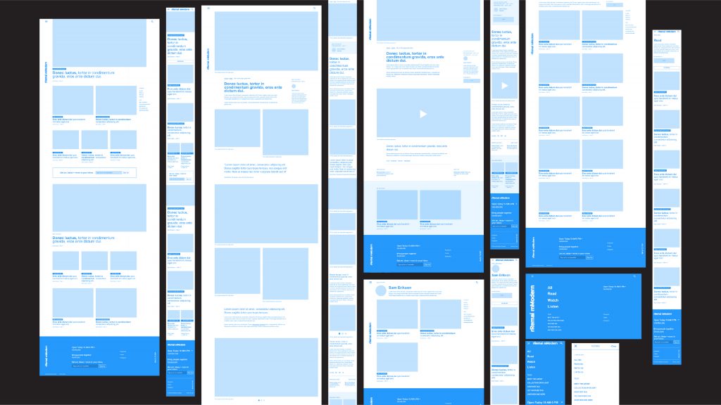
- Wireframes
- Custom WP blog including:
- Categories
- Keyword Tagging
- User profile set up
- Search
- Video & other multimedia integration
- Branding Guidelines
- Recommendations Report
- Adobe XD for future project implementation to house a full digital style guide
The Process
Brand Strategy
Creating a strong and unified brand strategy involved completing a brand workshop, building the wireframes, building upon existing brand guidelines, and developing a blog that is as functional as it is inviting.
Since accessibility is such a vital part of Remai Modern’s mission, we looked at every angle of the project from an accessible lens, ensuring that the content was suitable for every audience.
Accessibility
Accessibility improves the overall experience of a site. If your brand is inclusive, then your website should be too. It should be able to be used by all users, including those with disabilities. Creating an accessible website enhances a brand, drives innovation, and extends audience reach.
Visual Identity
When it comes to accessibility and visual design, we had to keep in mind a few things.
Size and colour of text
To make sure things are easily readable — especially on a blog. We built the site so that the typography scales to a readable size no matter what size of device the visitor is on.
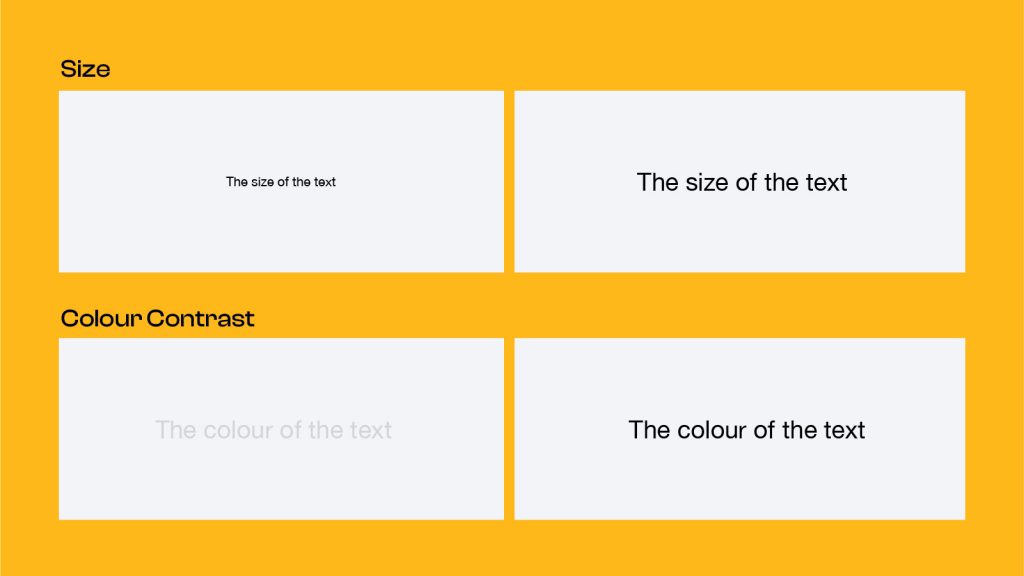
We also wanted to ensure that the contrast of the text against the background colour passed accessibility standards.
Text Alignment
When you center text, the starting place of each line changes, which forces users to work harder to read the content. Some people will even abandon content because of this.
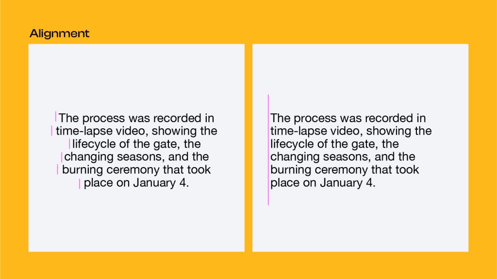
We wanted to ensure that alignment was consistent across the site to increase readability.
Shape
Readability is reduced when text is in all caps, because all words have a uniform rectangular shape. It’s harder for our brains to interpret the words as we have to think more about each letter.
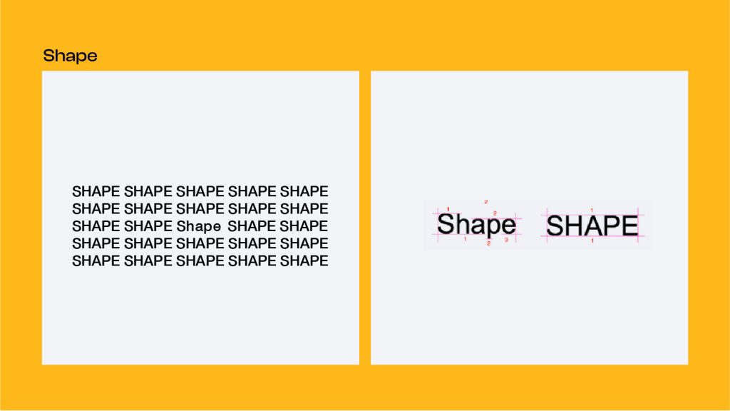
To ensure proper understanding and maximum accessibility, we chose to stay away from all-caps titles and headings.
Underlines
Since underlines are a big part of Remai’s brand, we wanted to come up with a way to keep the design, without reducing readability.
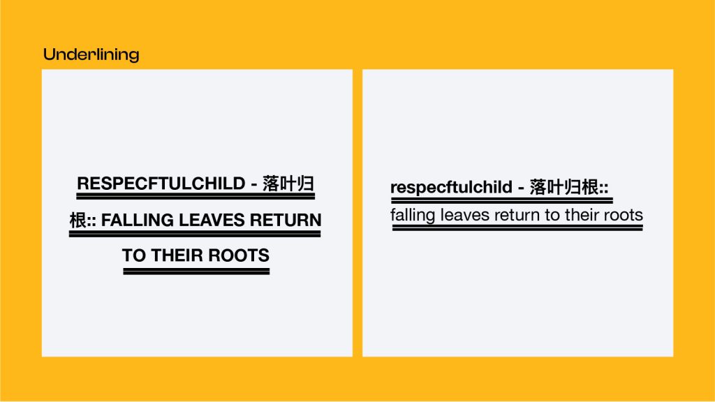
We decided to showcase the underlines in a more interactive way, with the underlines animating when hovered over. This offers delight to the audience, while keeping the site accessible.
To add some personality to the site we created the wave animation on all of the posts. This ties in with the name, Currents, and represents the South Saskatchewan River, which is such an integral part of Saskatoon’s identity.
Website
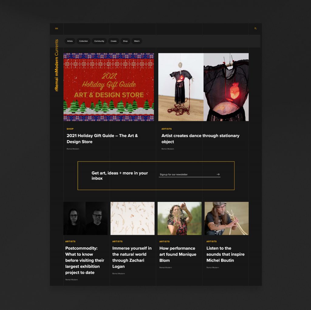
Creating the website was finding the balance between form and function. We wanted to let the art speak for itself and be the main focus. Our biggest challenge was making sure that the design didn’t take anything away from the amazing content.
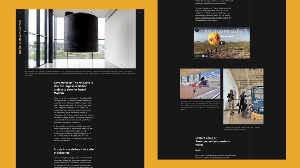
We also had to ensure that the art would not be compromised. We needed to display it exactly how you would see it in a museum, completely uncropped and unedited.
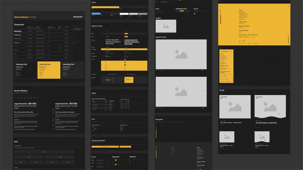
We followed their style guide strictly, but also built upon the existing guide to include the digital world.
“During the initial stages of the collaboration we were impressed with R&B’s thoroughness, their ability to listen to our particular needs and the work they put in to gain an understanding of our brand.”
Launch
From our initial meeting to the launch of the new site, we worked closely with Remai Modern to ensure that everything we created, from brand to design to the website, was reflective of their mission and vision for accessible art.
By giving their content a space to live and breathe on its own, we are able to increase national interest, create new sponsorship opportunities, and open the doors of Remai Modern to new audiences.
Outcomes
Working with Remai Modern, we were able to create something special that will resonate with and inspire so many people.
“We are always looking for new ways to connect our local audience and art-passionate people from around the world online to the exciting things happening at Remai Modern. As a vibrant contemporary art museum we are fortunate to have a wealth of stories and rich media to share, but are often disappointed with the limitations of just sharing via social media. Starting an online magazine had been in discussion for some time but an increased focus on digital content in 2020 gave us the push we needed to see it through.
We decided to collaborate on the project with Rock & Bloom because from the start they, more than other agencies we spoke with, understood our vision for the project and the scope of the work. During the initial stages of the collaboration we were impressed with R&B’s thoroughness, their ability to listen to our particular needs and the work they put in to gain an understanding of our brand.
Remai Modern is very specific with our branding and visual ID. R&B understood this immediately and had the expertise and creativity to not just meet our needs but to push us in some exciting new directions.
Add to that, they are great at client relations. They had quick answers for all of our questions and were always willing to collaboratively talk out any ideas we brought to the table.”
“We would recommend Rock & Bloom as an agency for anyone looking to expand their presence online.”
– Reilly Forbes, Content Coordinator
You can now interact with Remai Modern’s stunning art collections online in the comfort of your own home. Visit Remai Modern Currents for a unique and fulfilling digital experience.
