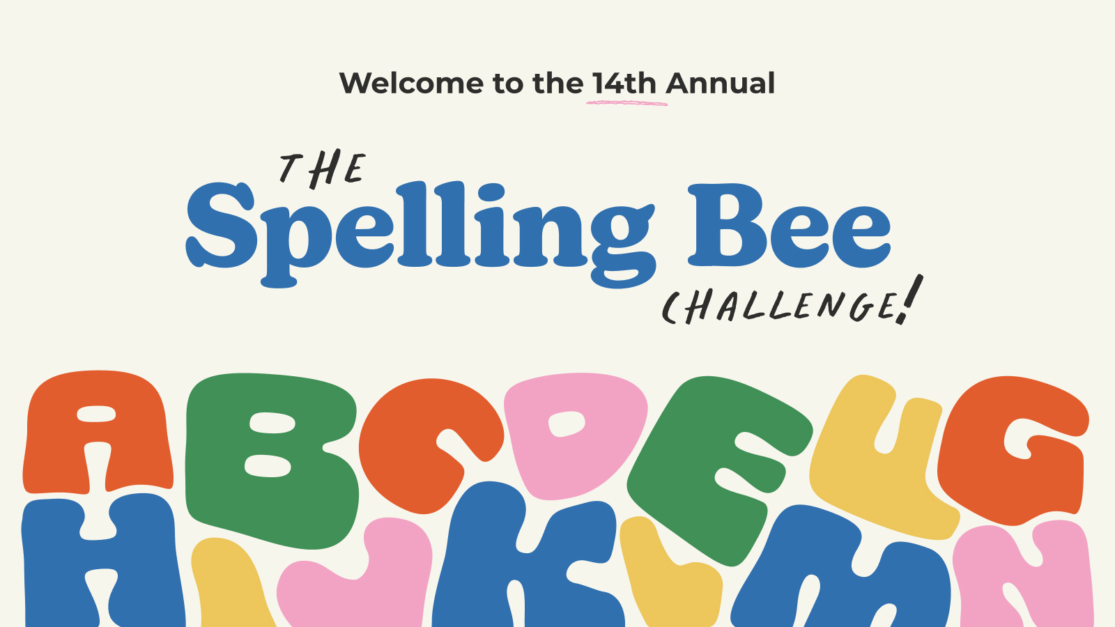
ONE TO ONE is a unique children’s literacy program that provides free one-to-one tutoring by trained volunteers to elementary school students in BC. Through these connections, the organization helps BC children develop literacy skills and reading confidence.
This ONE TO ONE Literacy Program hosts a team spelling fundraiser, supporting kids across BC. Business professionals, entrepreneurs and educators come together to network and compete for prizes, while working to improve opportunities for kids to succeed.
We partnered with ONE TO ONE as part of our Brand Aid Initiative, which helps a ‘Champion of Choice’ elevate their brand and tell their story through in-kind donated work. Our challenge was to create a distinct yet complementary brand for the Spelling Bee, one that intrigued potential donors, energized participants, and amplified the core values of ONE TO ONE.

Challenge Accepted
The goals of the project included:
- Build a new Spelling Bee brand that helps ONE TO ONE to engage potential donors
- Create intrigue, excitement, and notoriety of Spelling Bee among tutors, parents, donors, and students themselves
- Align with ONE TO ONE overall brand, while maintaining its own identity and messaging
- Continue to amplify the ONE TO ONE program, creating engaging visuals, copy and strategy for the Spelling Bee
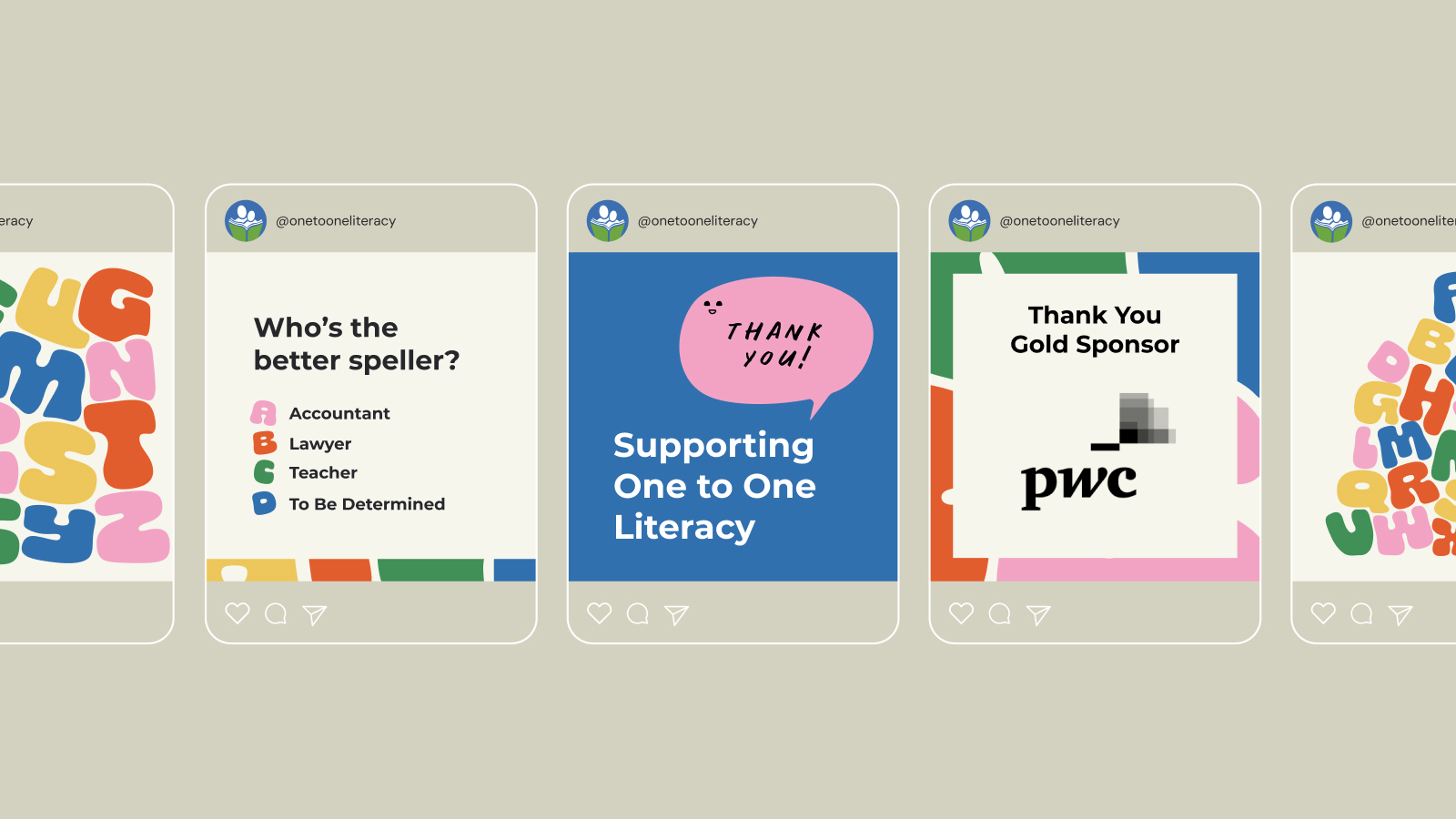
- Develop a suite of engaging materials: event promotional assets, including social media graphics, email templates, and posters to ensure success.
Getting Down to Business
Brand Strategy
Our process began with comprehensive strategy development, including persona creation and key messaging tailored to diverse audiences.
We crafted profiles for key audiences to ensure our messaging resonated across all touchpoints. We also crafted key messaging that highlighted the transformative power of literacy and the direct impact of the event.
Brand Identity
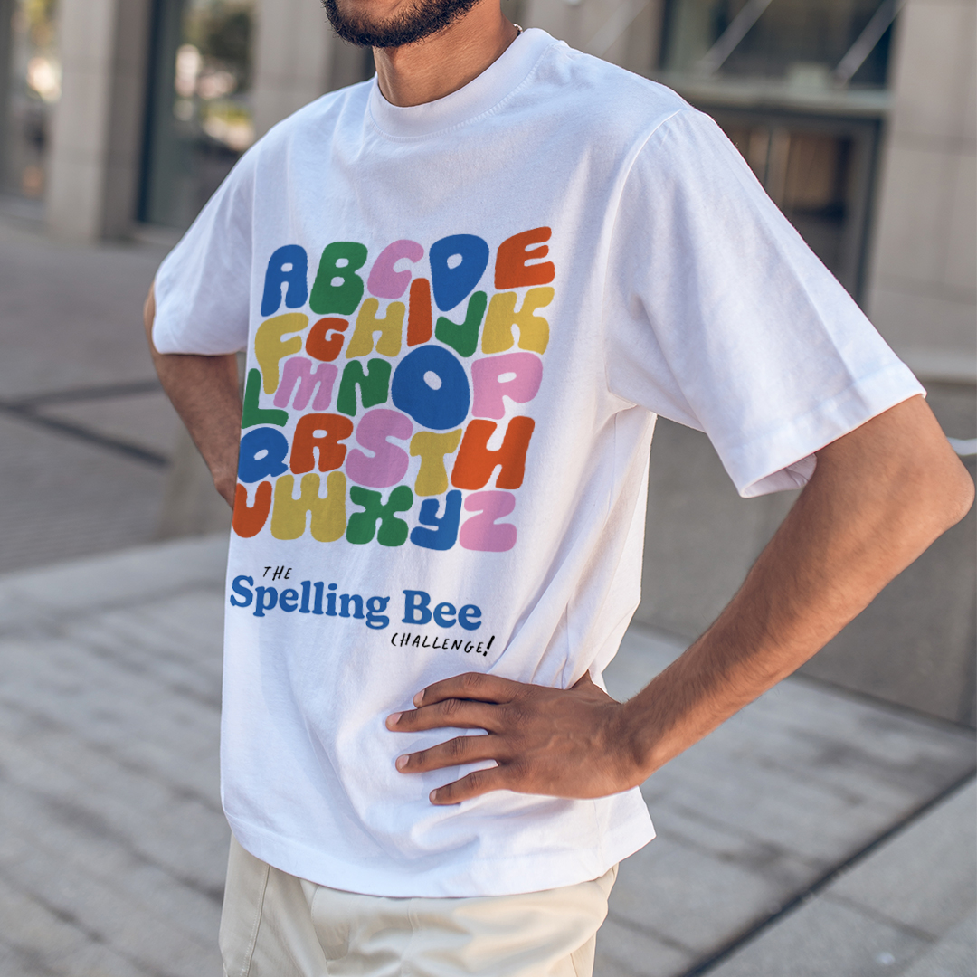
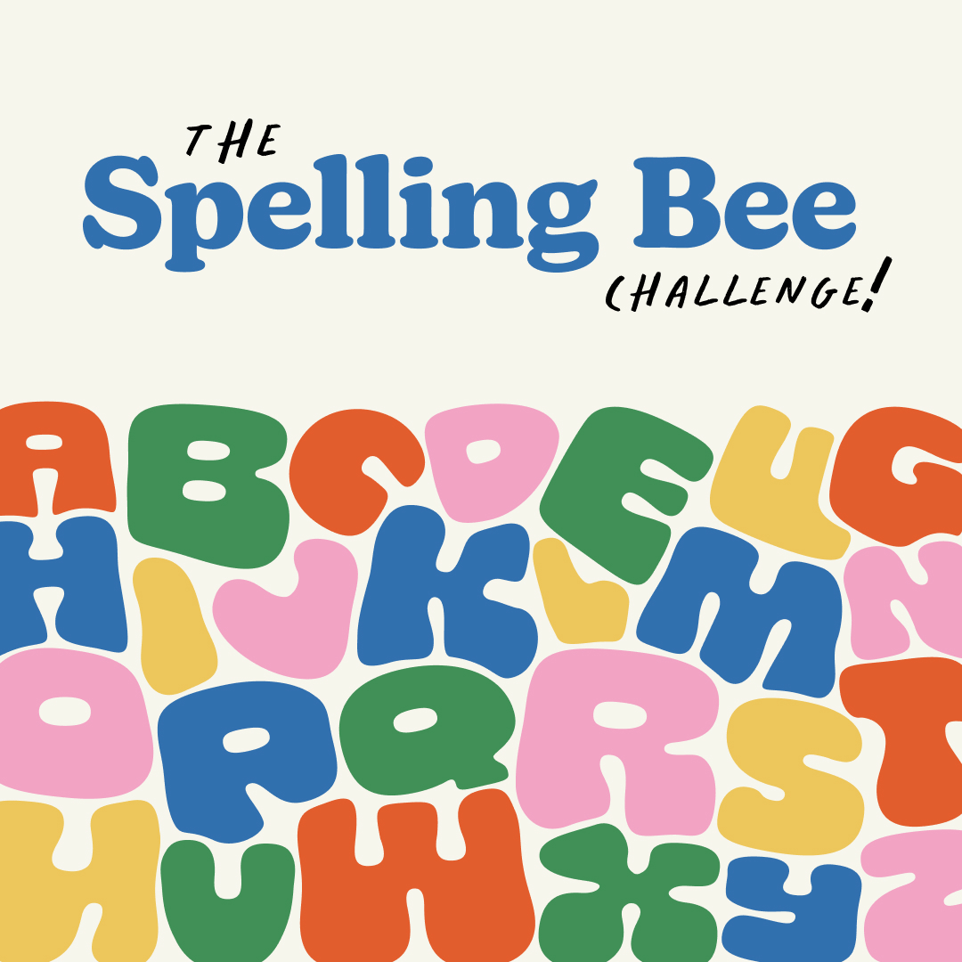
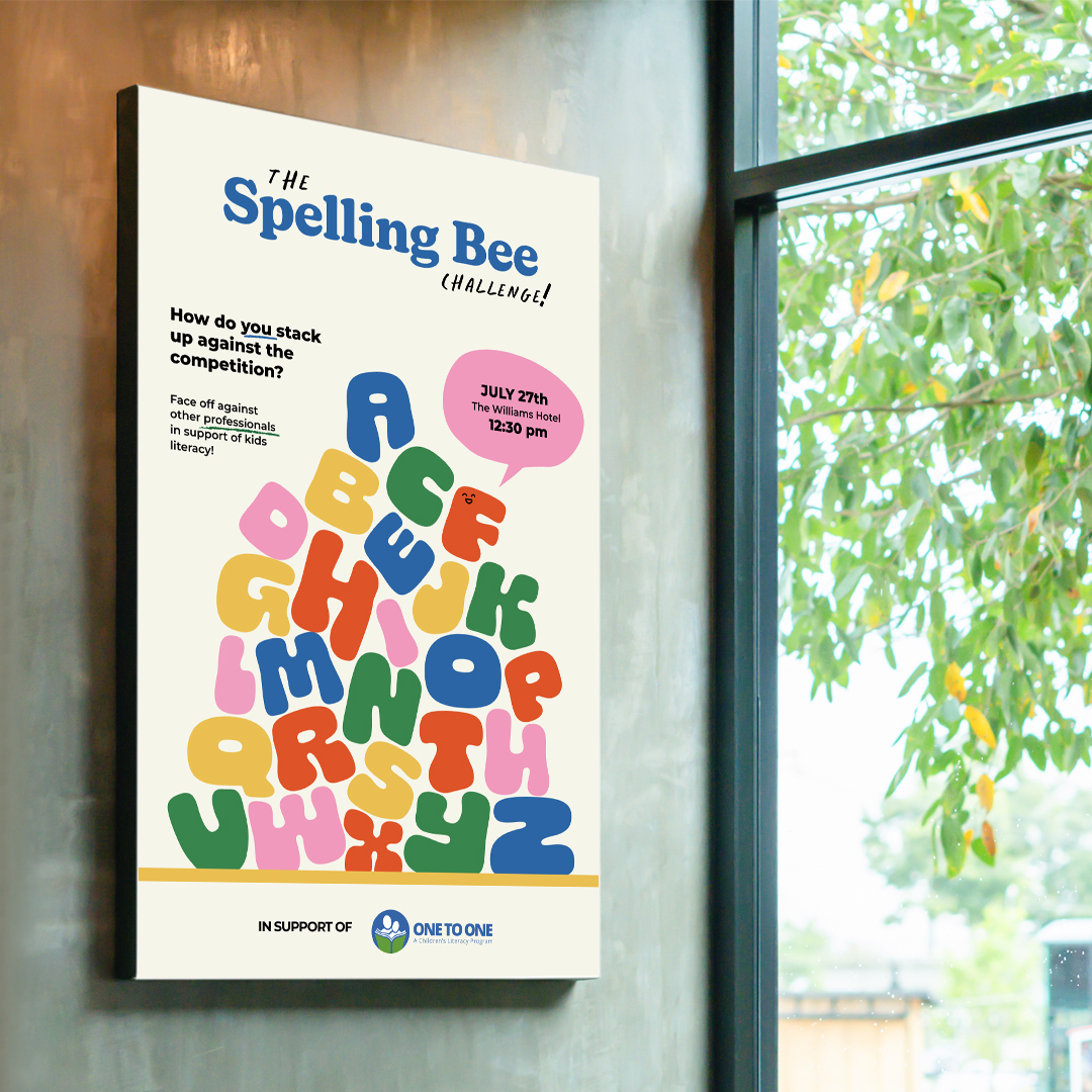
We designed a distinctive identity for the Spelling Bee Challenge that evoked warmth, nostalgia, and a sense of community.
We chose a bold typeface that is friendly, approachable, fun, and reminiscent of story book text. We paired this with a handwritten typeface, less polished, yet still approachable – a nod to children’s handwriting.
The letter imagery balances nicely with the logo. Playful and vibrant, the bubble letters represent diversity, childhood memories, and pair with our messaging: ‘How do you stack up against the competition?’
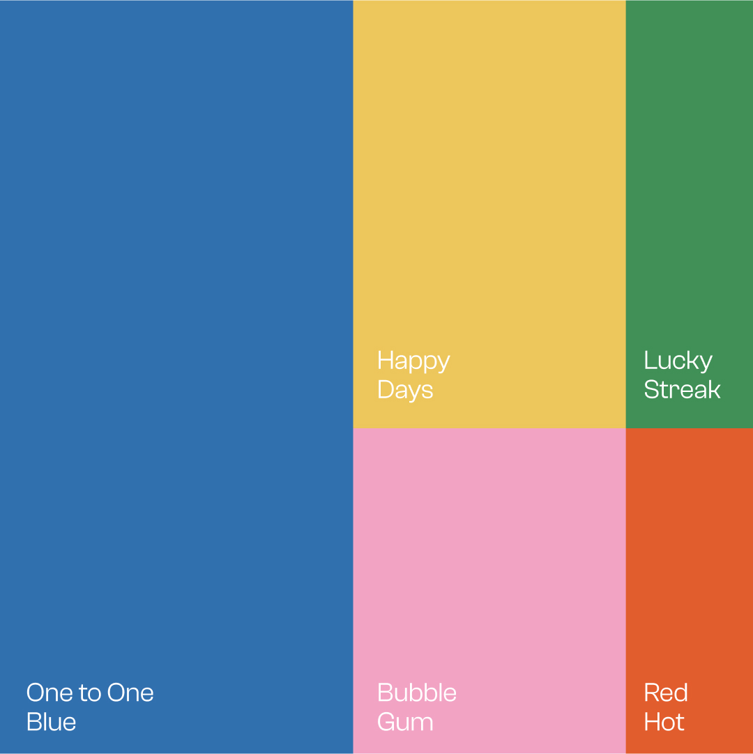
We used the original blue and green from the ONE TO ONE colour palette, but added more colours for flexibility and variety. The bright and fun colours pair nicely with the friendly fonts and subtle use of happy characters – peep the adorable smiley face.
Celebrating The Wins
The Spelling Bee Challenge stands out on its own, while reinforcing ONE TO ONE’s crucial mission. By blending nostalgia with purpose, our approach transformed the Spelling Bee into a strong brand identity that will last for years to come.
“Working with Rock & Bloom was a wonderful experience. We feel so fortunate to be part of their Brand Aid program. From the first time we connected, they were clear on expectations and scope, made it easy to contribute to the process, and provided lots of updates along the way.
Their creative team took on the tricky work of re-imagining and reviving the brand of our legacy fundraising event. We had an ambitious dual goal: creating something we could introduce to new audiences while holding on to what makes it special so previous attendees still felt welcome.
They more than hit the mark, creating a new brand that feels joyful, fresh, inviting and engaging!”
Carol, ONE TO ONE
